1993
1990
1988
1988
1986
1983
1983
1980
1971
1971
1971
1971
1968
1968
1967
1967
1966
1962
Selected articles, interviews and quotations
See list at the bottom of the page
I do not work with game theories; rather, I often establish situations where randomness is not only decisive but may even be the intended outcome. The aim is to reach unthinkable possibilities and constellations. Conscious compositions or compositional programmes result in outcomes that are too uninteresting, predictable, if not outright empty.
Conscious creation rarely contains anything the mind can derive an experience from.
In some of my works, I have sought to establish systems that, once defined, could themselves become creative, and which—once set in motion—could be entirely freed from my influence. The goal was to reach unconscious and previously hidden structures (not mysticism). I believe the current maximum potential for artistic expression lies in such depersonalization.
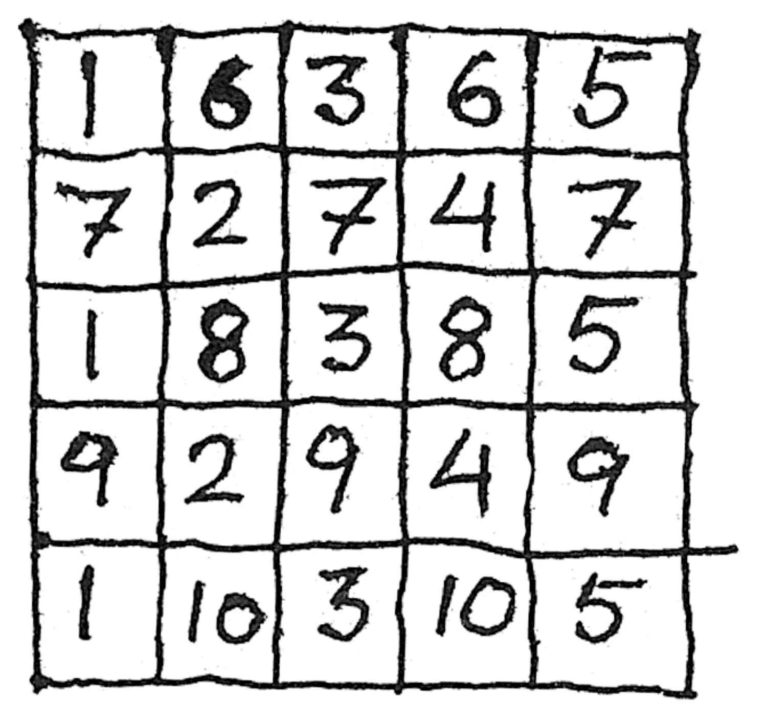
My Series No. 4 (1966) consists of 36 1x1 meter cardboard panels divided into six subcategories of six pieces each. Each panel is subdivided into 25 (5x5) equal squares, which are coloured using a total of 10 different colours (with a total of 360 different colors used). Five of these colours repeat three times, while the remaining five repeat twice. Positions 1, 3, and 5 in the first vertical row are the same colour, while positions 2 and 4 in the second row share another colour.
The 360 colours, each distinct, were painted on 360 cardboard strips (20x100 cm). The original idea was that the strips would be woven together. This was abandoned as I had chosen the wrong cardboard quality. Instead, the strips were cut into 20x20 cm squares, which were mounted in weaving order.
Initially, I had six distribution principles. If I had been able to identify more, the material would have been expanded accordingly. The reason for creating six works for each principle was to later compare the different principles and determine which might be “more valuable” than the others. In two of the principles, there are two different distribution possibilities, both of which I wanted to represent sufficiently to ensure that the evaluation could be reasonably objective.
The first principle could be called the principle of randomness or the lottery principle. It is based on random numbers, birth dates, or similar, used as selection numbers. After thorough mixing, I placed the coloured cardboards in a box like index cards. The selected ones were mounted in the order they were drawn, strictly following the numbers in the diagram.
The second principle could be called the selection principle. By flipping through, I selected colors that matched temperaments chosen in advance. Ten cool colours for a cool image, ten warm for a warm image, ten cheerful, ten gloomy, ten delicate, and ten “according to my own taste.”
The third and fourth principles were complementary and contrast colours. Complementary colors included red/green, orange-red/blue-green, orange/blue, yellow-orange/blue-violet. Contrast colors were black/white, orange/pink, light turquoise/ultramarine, ochre/gray, warm yellow/cold yellow, yellow-green/blue-green.
By flipping through the coloured cardboards, I selected those closest to the ideal pink, red, blue, etc. For mounting, there were three possibilities: (I) randomness, which I did not use; (II) five verticals in color 1, five horizontals in color 2, creating a checkerboard pattern; (III) blue placed in all rows with odd numbers, orange in all even rows, creating vertical stripes alternating blue and orange.
The fifth principle: A colour was chosen randomly, and the remaining nine were selected based on this one. For example, if ultramarine was chosen, the selected cards were those closest to ultramarine. The darkest might be almost black, and the lightest nearly white. Lavender blue could be considered light ultramarine.
Although 360 colours were available, there would not be ten identical ones, or even five at a time for principles 3 and 4. In principles 3-4-5, spectral deviations had to be as minimal as possible.
The sixth principle involved selection based on color intensity. If white is 100 and black is 0 (or vice versa), the grayscale, ranging from white to black, can be divided into six equal intervals: 0-20-40-60-80-100. It is easy to select the lightest (100) and darkest (0), but more challenging to find 20, 40, 60, and 80. This can be done using a carefully executed grayscale with cutouts at 20, 40, 60, and 80 to measure the black-white value of a colour. Here, as with principles 3-4-5, there can only be an approximation to the ideal pure 20-40 or pure violet, etc.
My starting point was 360 differently coloured strips, which would have been consumed in 36 weavings of 10 strips each. Since weaving was not possible, I divided the strips, obtaining 1,800 pieces. The consumption was 900, and as I returned the leftovers to the index (since two or three are used each time a “colour” is selected, leaving two or three of each colour leftover), the selection was always sufficiently large.
This somewhat contradicted the original intentions, where the entire material would have been used. However, this would also ultimately have made the possibility of approaching the ideal color rather speculative.
Poul Gernes: "Spillesystemer eller bare systemer" [Game systems or simply systems]. I ta’ 2. 1967. Quoted from Jane Pedersen: Der er dejligt i Danmark – viser Poul Gernes. Copenhagen 1971, p. 86-89. Translated by Klara Karolines Fond.
1993
1990
1988
1988
1986
1983
1983
1980
1971
1971
1971
1971
1968
1968
1967
1967
1966
1962