Decoration
Decoration
Vesthimmerland Upper Secondary School
My first meeting with Poul and Aase Gernes took place on a late afternoon in the autumn of 1982. The school was deserted, and it was dark outside. As the art teacher, I had promised to go and greet the two because the school’s principal, Willy Mathiesen, was off at a meeting with the county authorities. It was a long wait before they finally showed up, in their crammed Volvo station wagon.
The first thing that Poul did was to sneak his way in to the school’s copying room with his handwritten sheets. At that time, he was busy crusading against modern art. For Aase, things seemed to be moving fast enough. I was only familiar with some photographs of a young and handsome Poul Gernes and was taken aback to see by his grey and somewhat slumping posture. Later, I learned that Poul was suffering from a serious kidney disorder.
After the copying was done, our walk led us around the school’s new annex, which has been designed by Friis & Moltke. The only thing that was not commented on was Per Kirkeby’s large painting, which had been unveiled the year before. Otherwise, a certain distance was taken from the architects’ tasteful colour scheme and lighting, along with the yellow masonry that stifled all colour. The curtains were dark green and the doors were dark red. Poul called the colour “dodenkop” (caput mortuum). Also, the chairs were dark green and were perceived as being dark grey on account of the light. The analysis evolved into a speech about colours and on setting colour schemes, on the basis of the colour scale that Poul himself had developed in his decorations. I had no answers ready, but I certainly was being given something to think about.
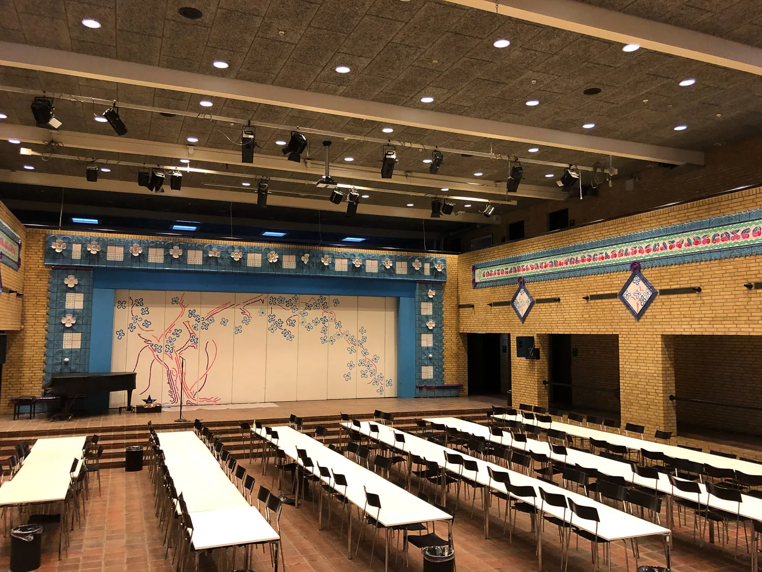
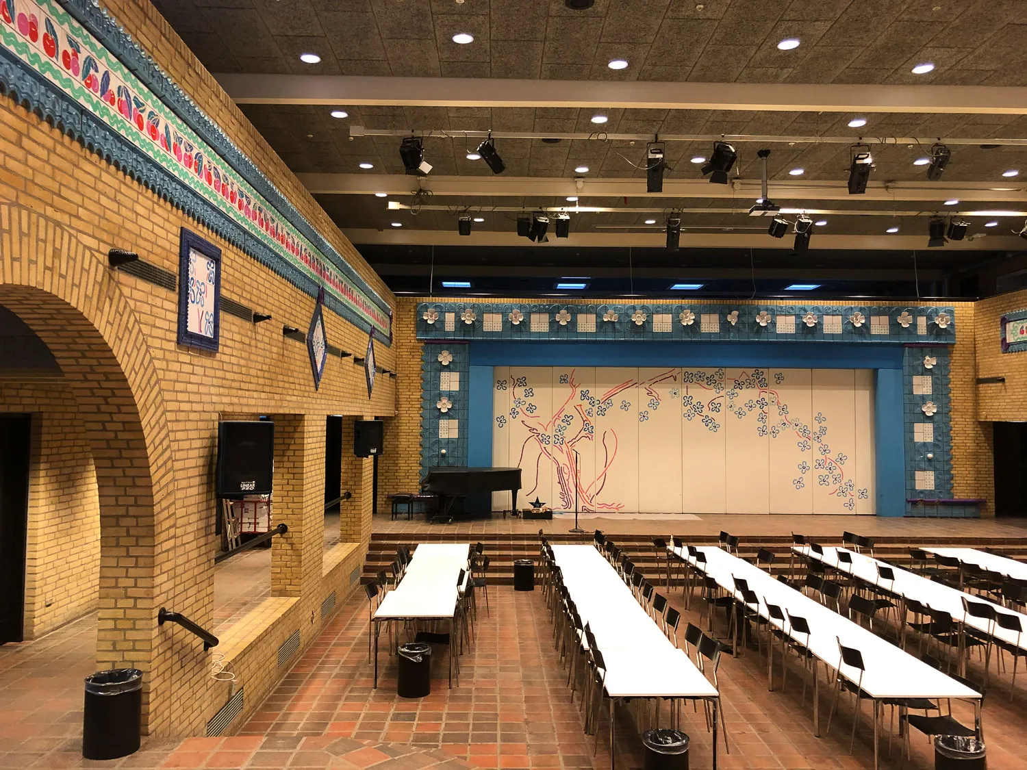
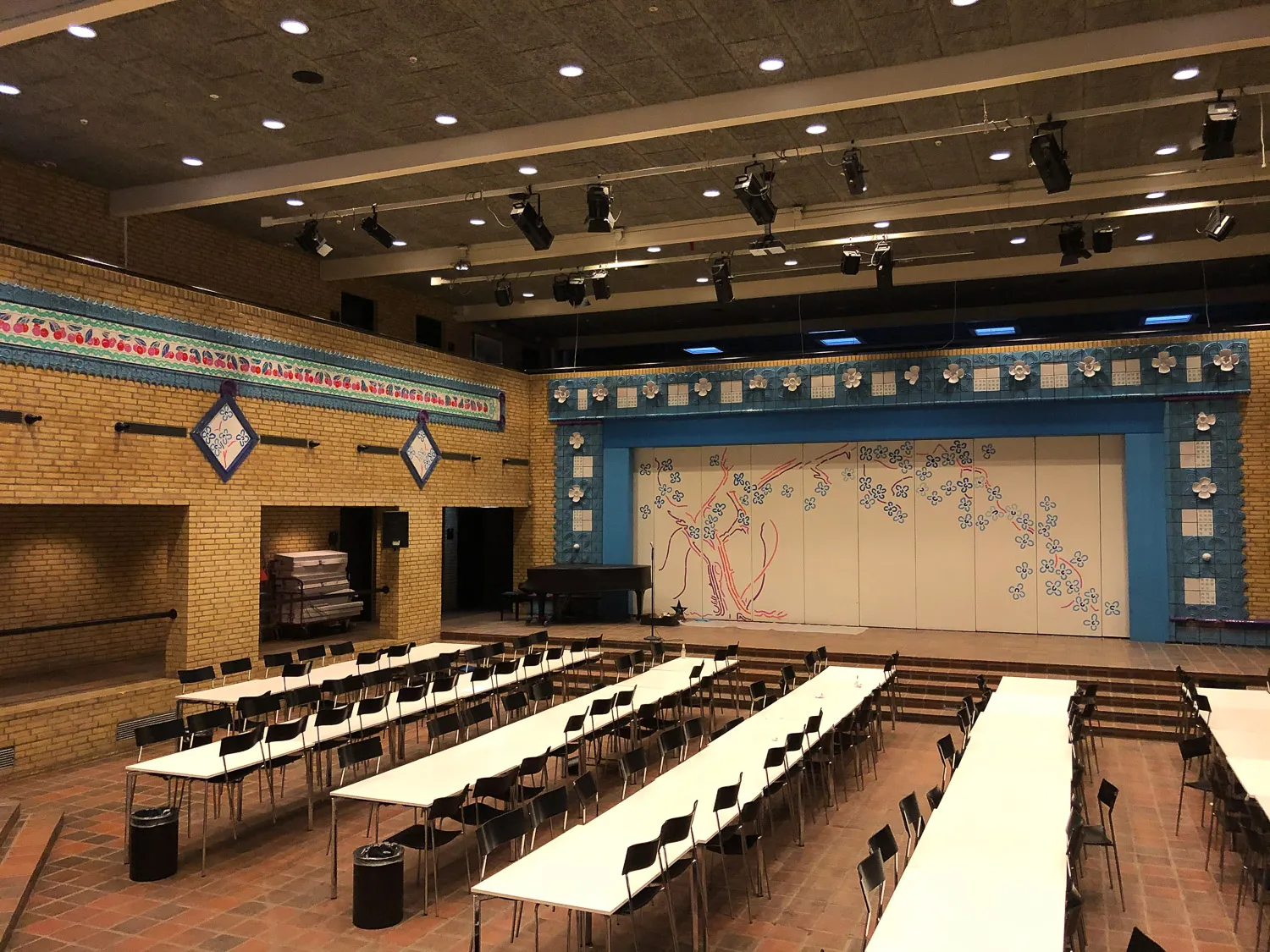
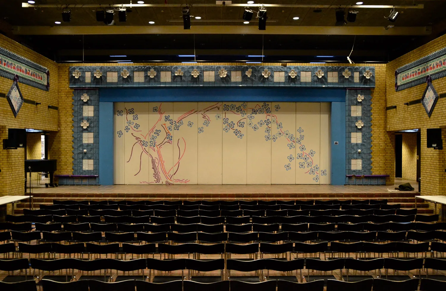
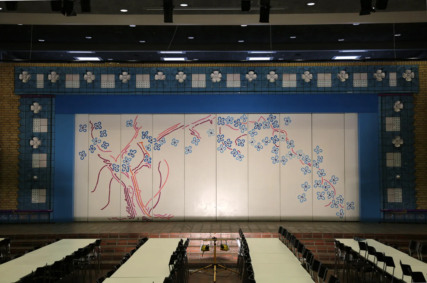
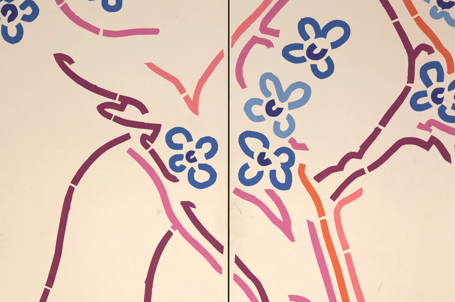
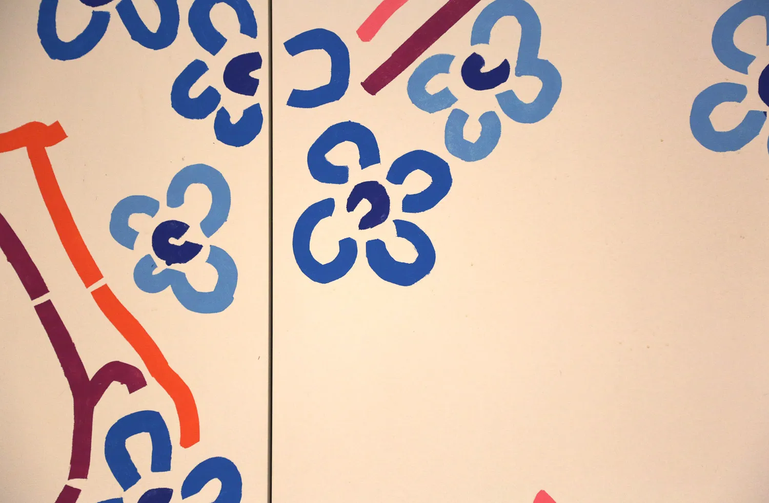
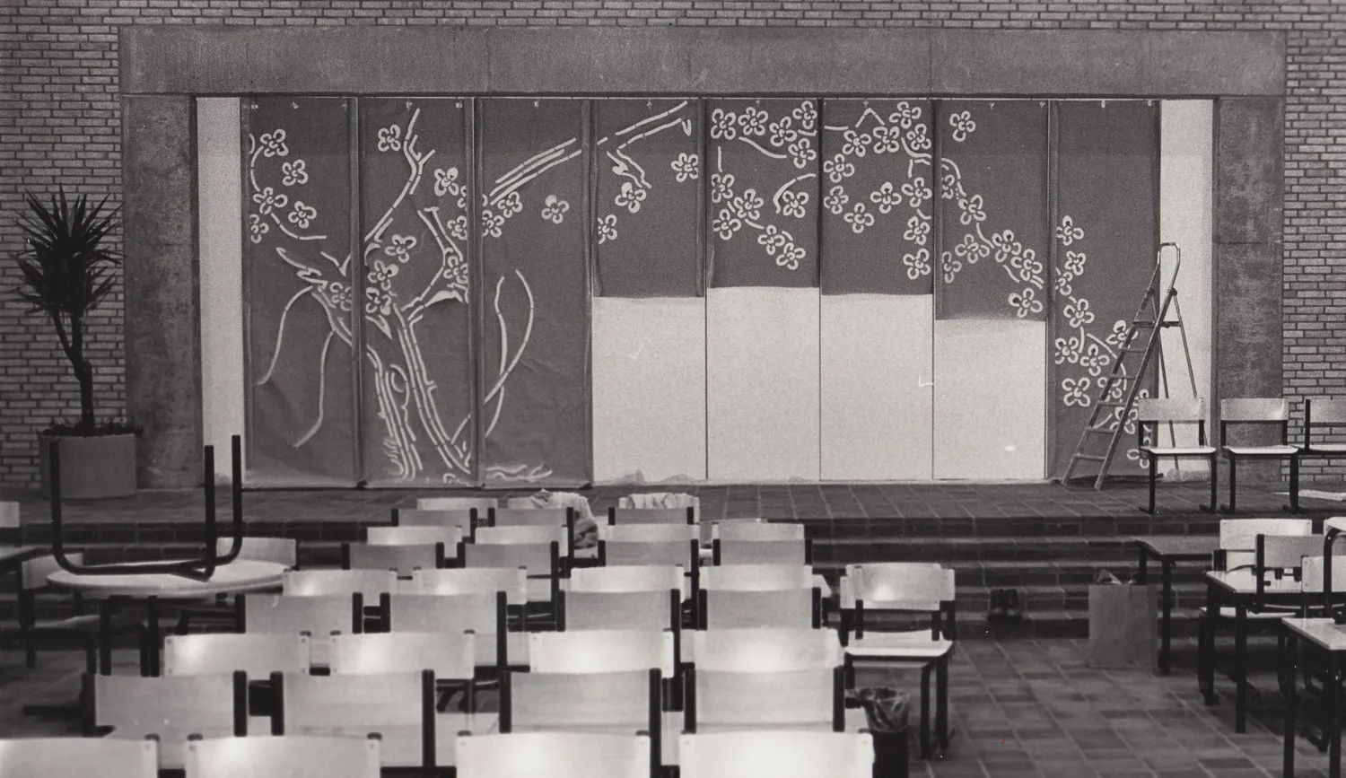
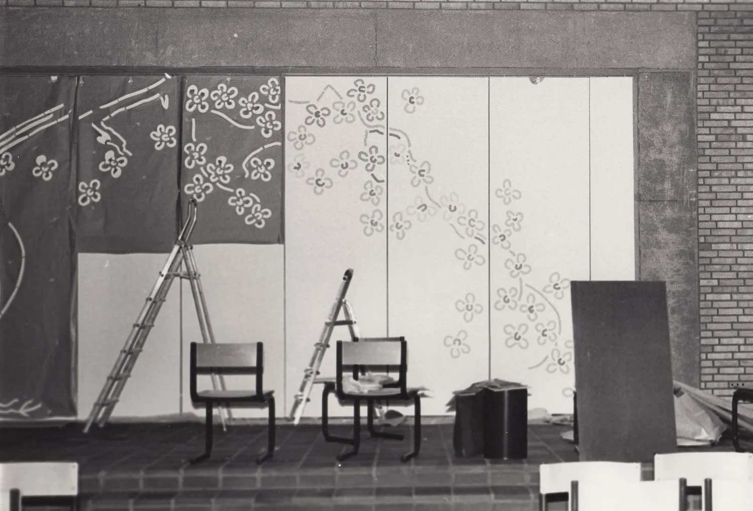
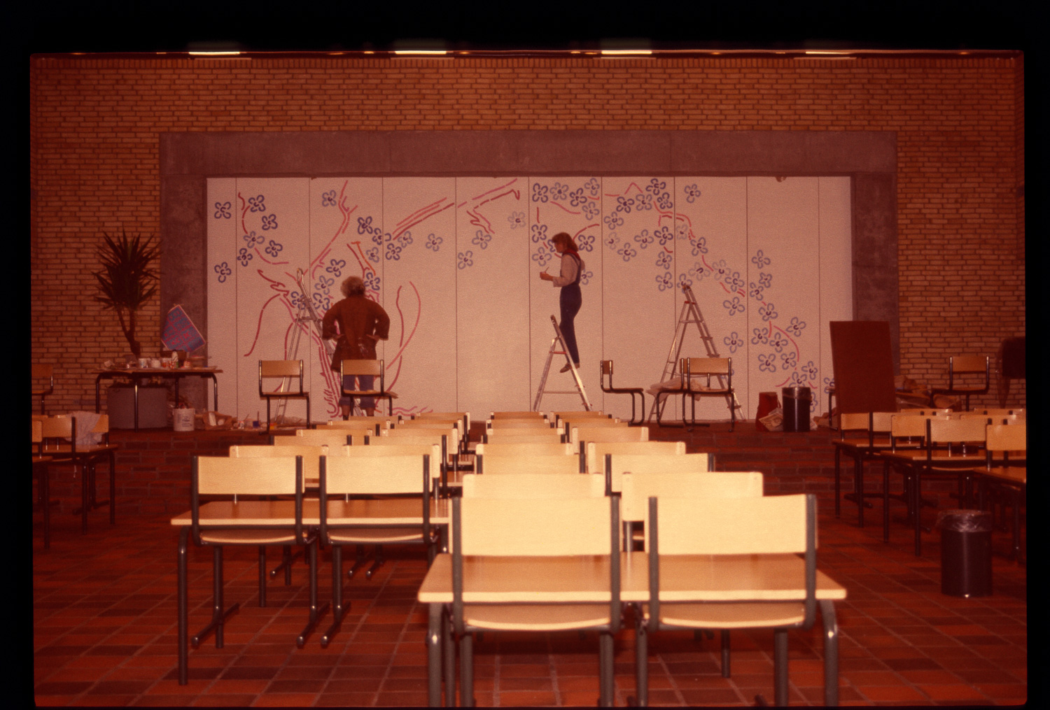
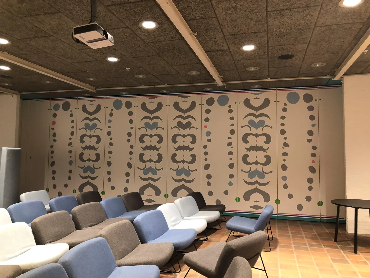
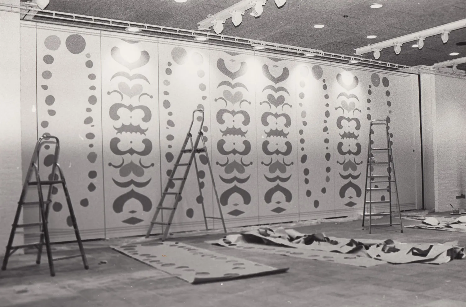
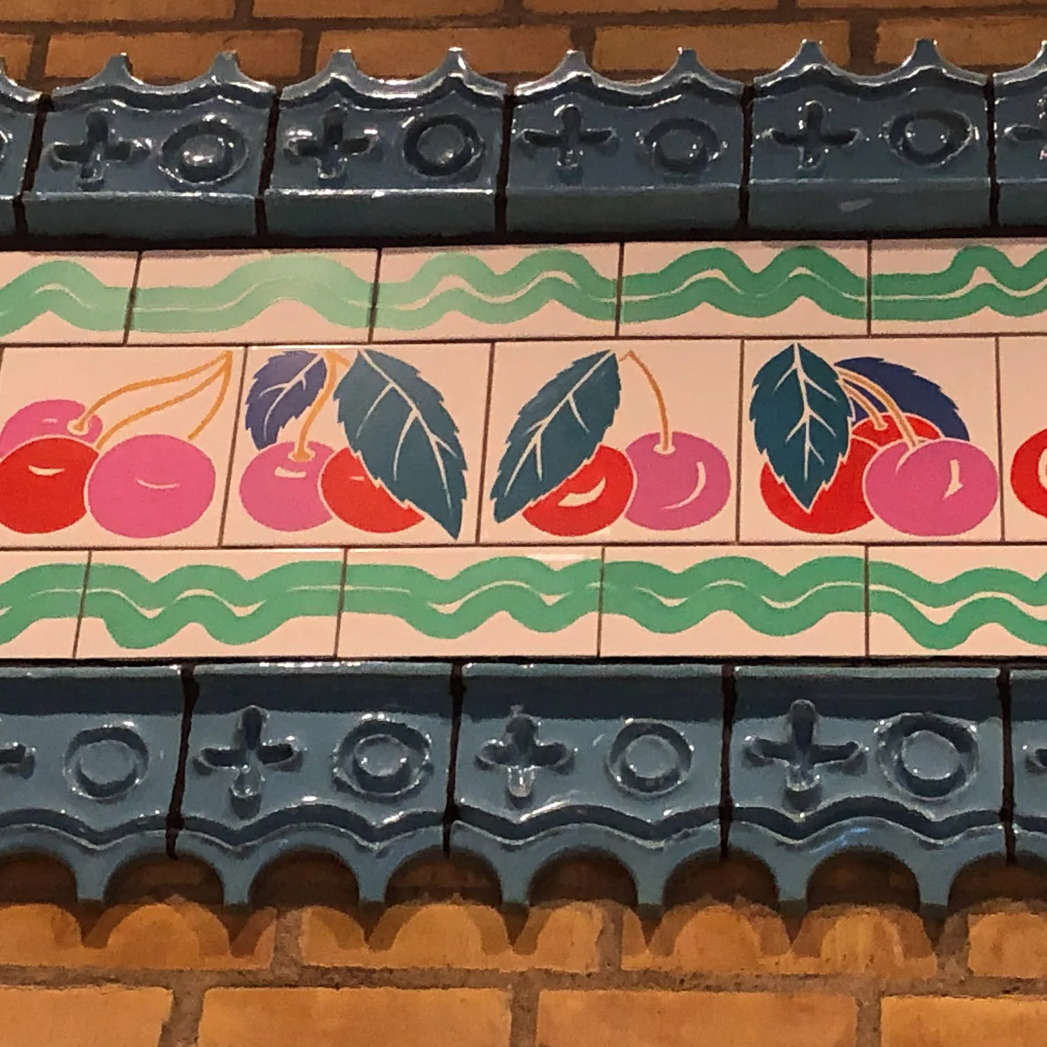
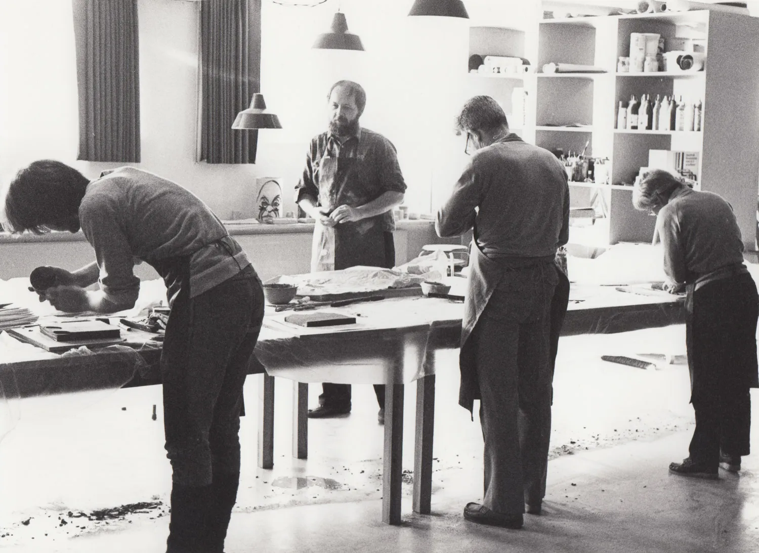
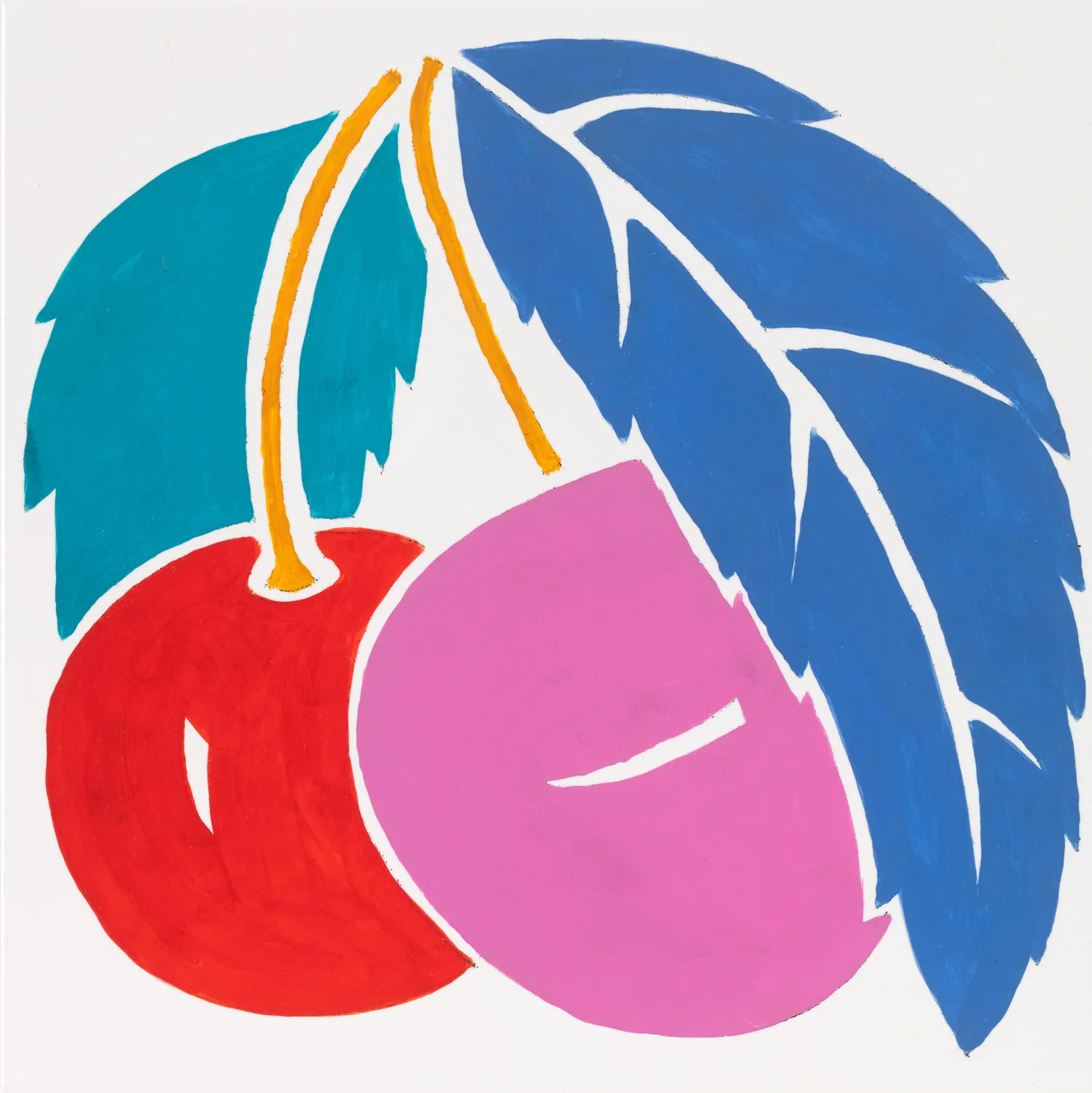
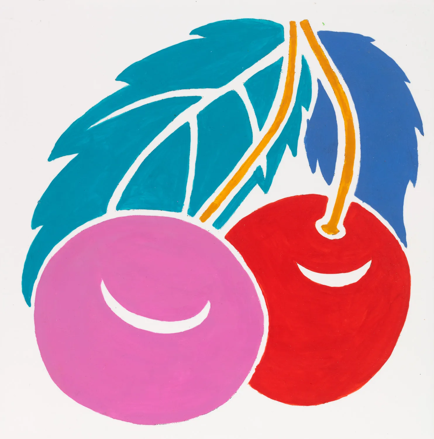
During the Easter break in 1983, the painting company was lodged in at the school. The company was Poul’s designation for the work collective that consisted of Poul and Aase and their daughter Ulrikka, along with several others. The concrete around the folding wall was roughhewn and grey, but was later painted blue in two strong nuances, following Poul's instructions. The technique chosen for making for the folding wall was template, as is typically known in forms of borders in stairwells found in older residential buildings. Here, the technique was used freely, without repetition. The motif was an old cherry tree, the trunk of which was placed on the wall’s left side, and whose branches, with blossoms, were spread out in a large arch toward the right.
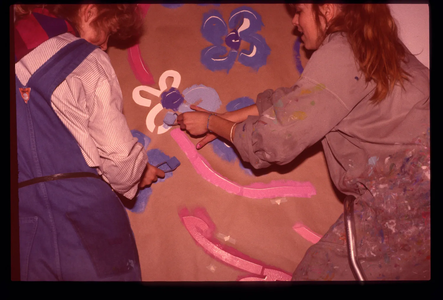
Based on his sketch prototype, Poul drew and cut out the motif, in lengths of brown wrapping paper, which were subsequently hung on the folding wall. They were supposed to hang there until the next day, in order to absorb the room's humidity. With small paint rollers, the different colours were then painted, by the assistants, on top of the cut-out areas on the paper, with practiced routine. As something extra, Poul made a decoration on the folding wall’s back side. He knew that this room was being used for meetings when there was no theatrical performance being presented. The same motif (hearts and theatre masks?) recurs on every other section and is re-doubled around the central axis. Every now and then, there’s a symmetrical repetition of round forms, like strings of pearls. He explained, merrily, that the subdued grey scale and colours have been chosen in response to the room’s light, and also that the gentle and hovering decoration has been chosen so that one would be able, during teacher council meetings, to escape having to listen to all of the tedious agenda by letting his/her eye wander around in the decoration.
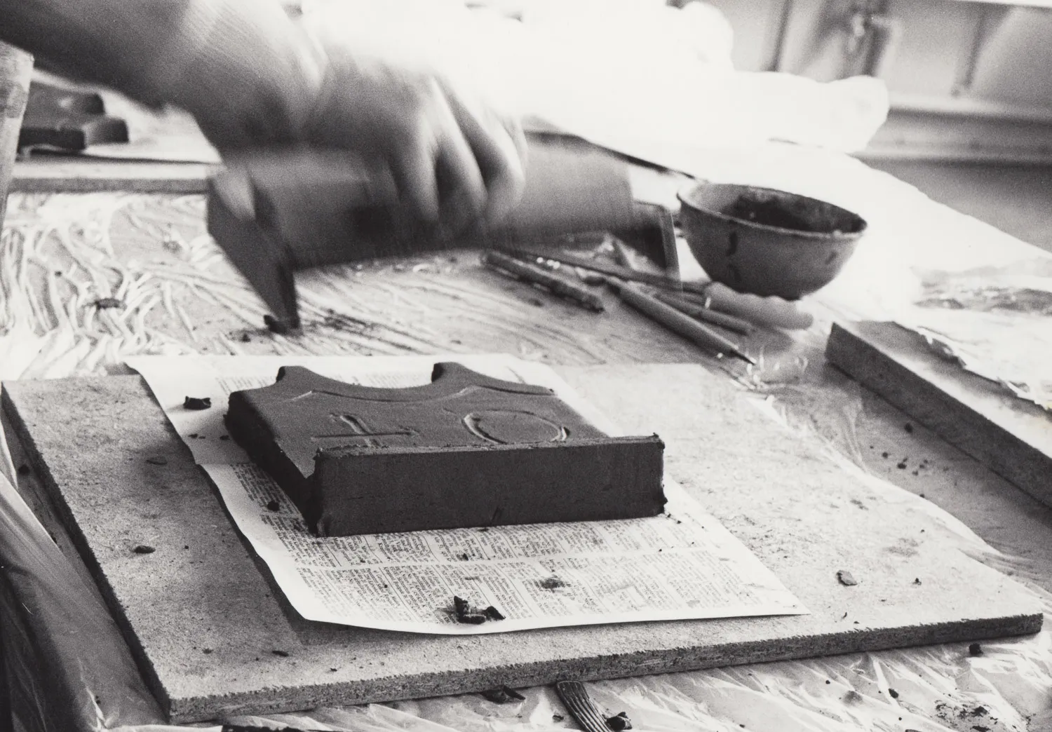
In the time that followed, the further decoration of the high school was thoroughly weighed. Poul wanted to make a frieze with cherries as the motif. The fruits from the cherry tree on the folding wall were going to continue down into the hall and encircle the spectators who were watching what was happening on at the stage – of art and culture – framed in by the tree’s arch and flowering. And moreover, the frieze was going to be made on site by the users of the room: the students and the teachers. At first, there was a lengthy phase of preparation. Poul drew and painted pieces of cardboard with the cherry frieze, which were hung in the hall for purposes of calculating the frieze’s placement. I copied and drew the cherry motifs, tile by tile, from Poul’s pieces of cardboard onto transparent paper, so they could also be used again in a laterally reversed way. With the help of a light box, the motifs were then transferred to ordinary copy paper, which the participants used, together with tracing paper, to transfer the outlines of the motifs onto the tiles, which were painted after doing this.
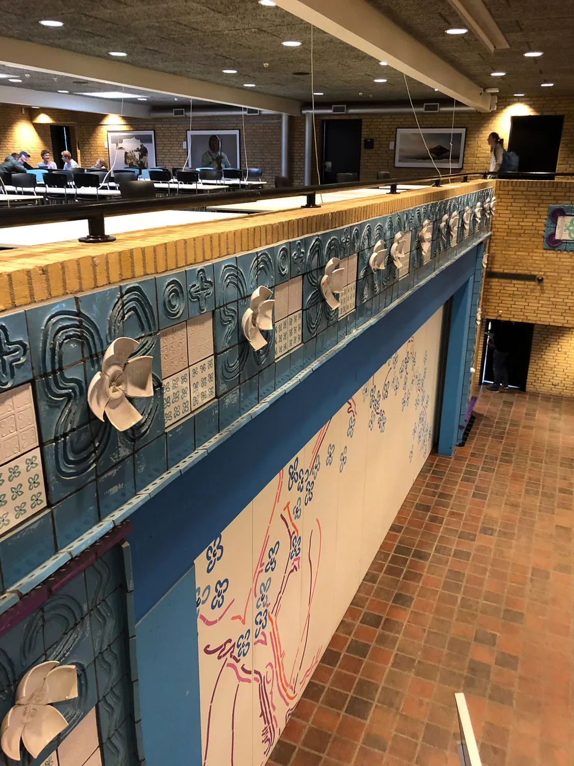
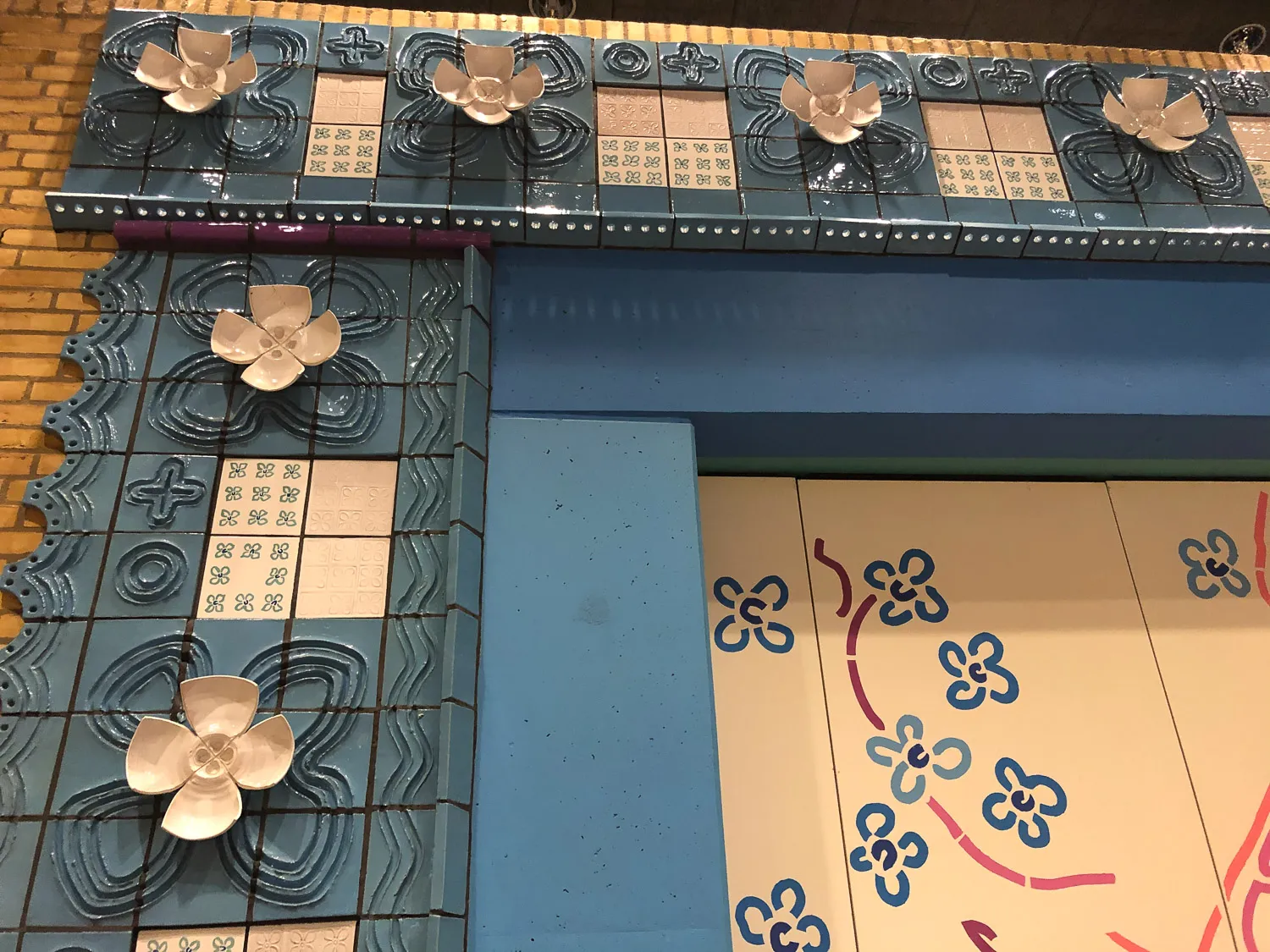
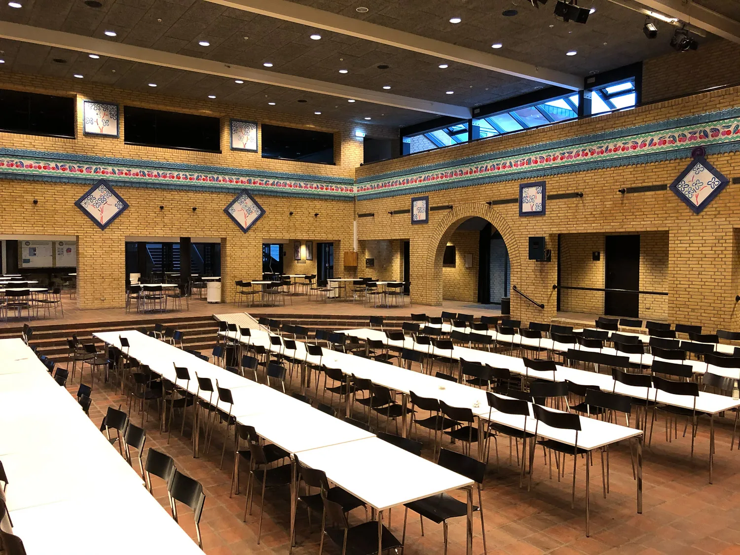
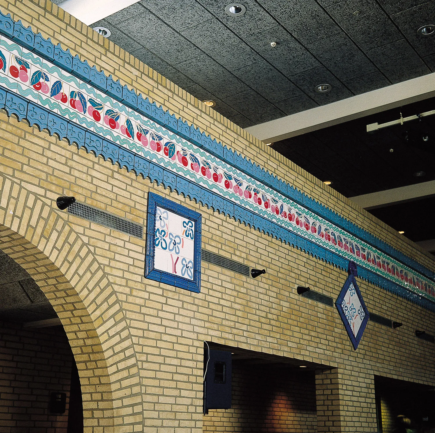
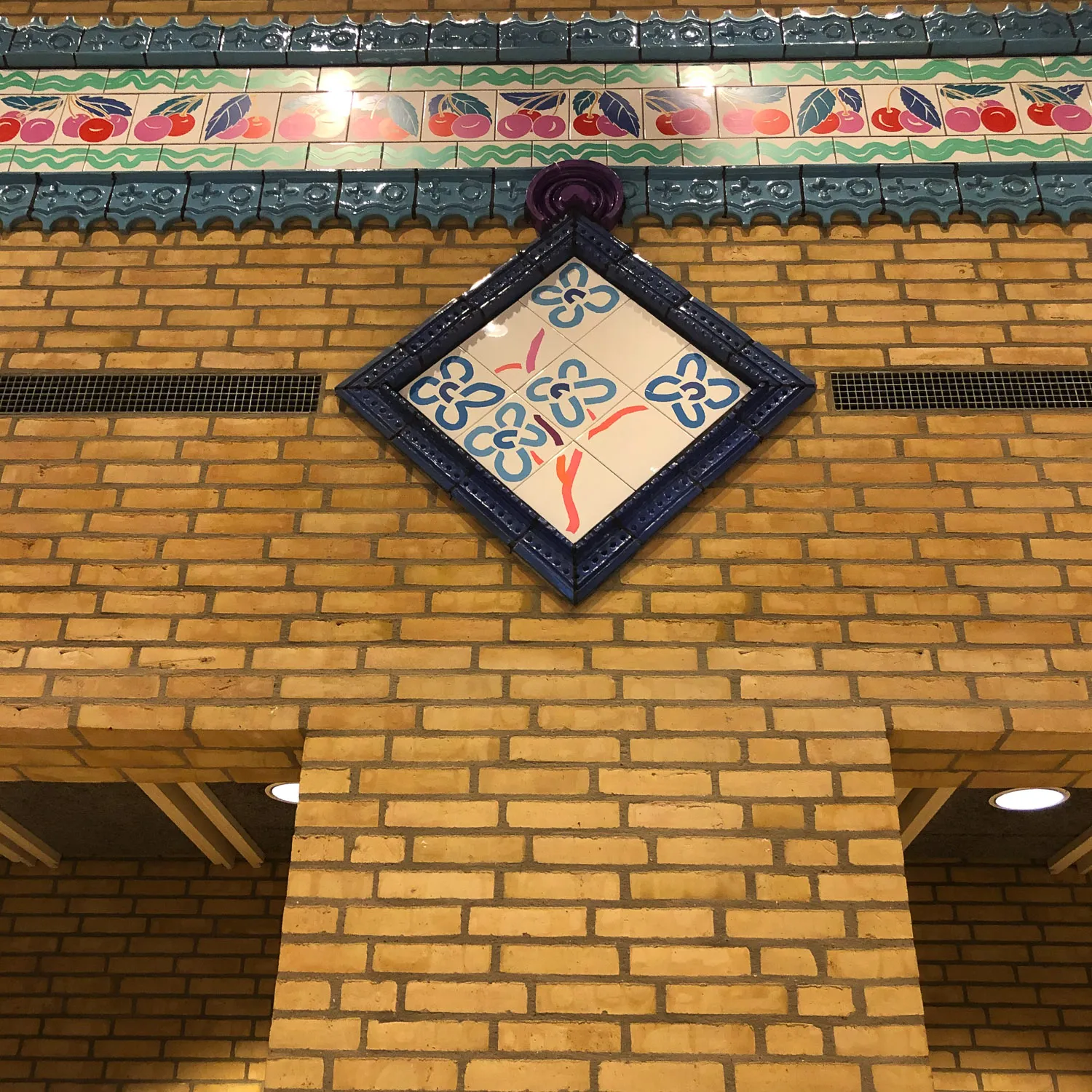
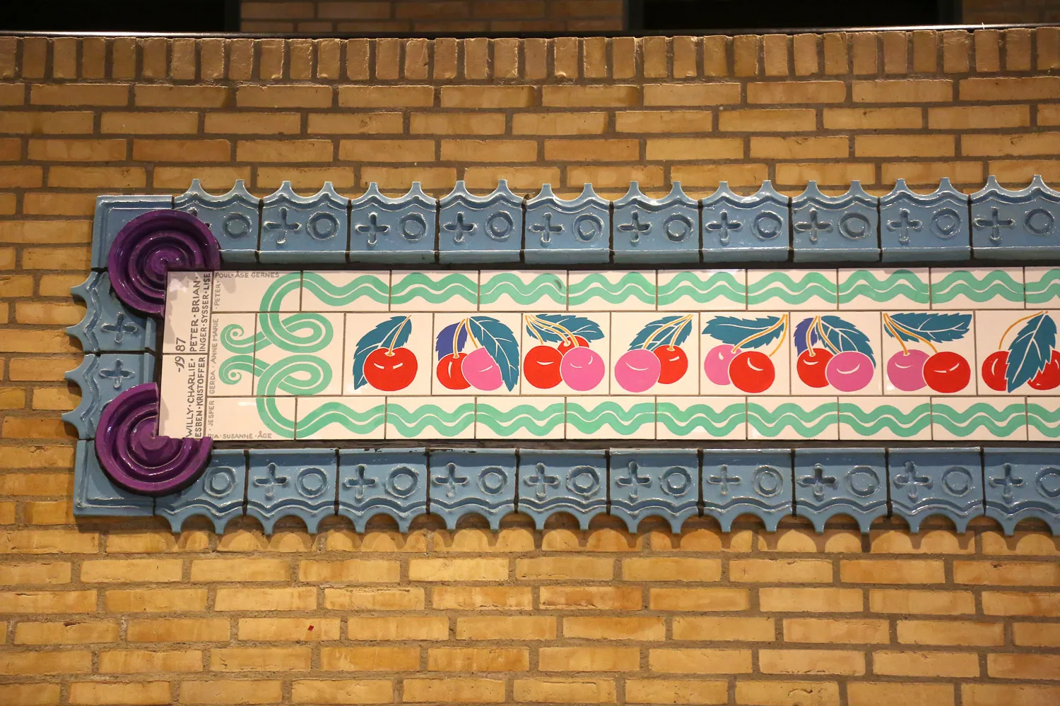
Above and below, they were framed in by a wavy green trimming, which consisted of a free combination of blue, green and white. Up against the stage, on either side, this trimming-border was terminated in a Viking-like serpent’s head, which the art teacher, I, had painted. It is also here that the signatures of the participating students and teachers were placed. Placed below the frieze, at regular intervals, were square tile fields (standing on their corners) with branches and flowers created with the same template technique as the tree. They were later on conjoined to the frieze by large circular hinges, which Poul called gramophone records. Poul told us that these square fields had been inspired by Swedish congregation houses, where the customary practice was to hang flowering branches or floral bouquets on the walls.
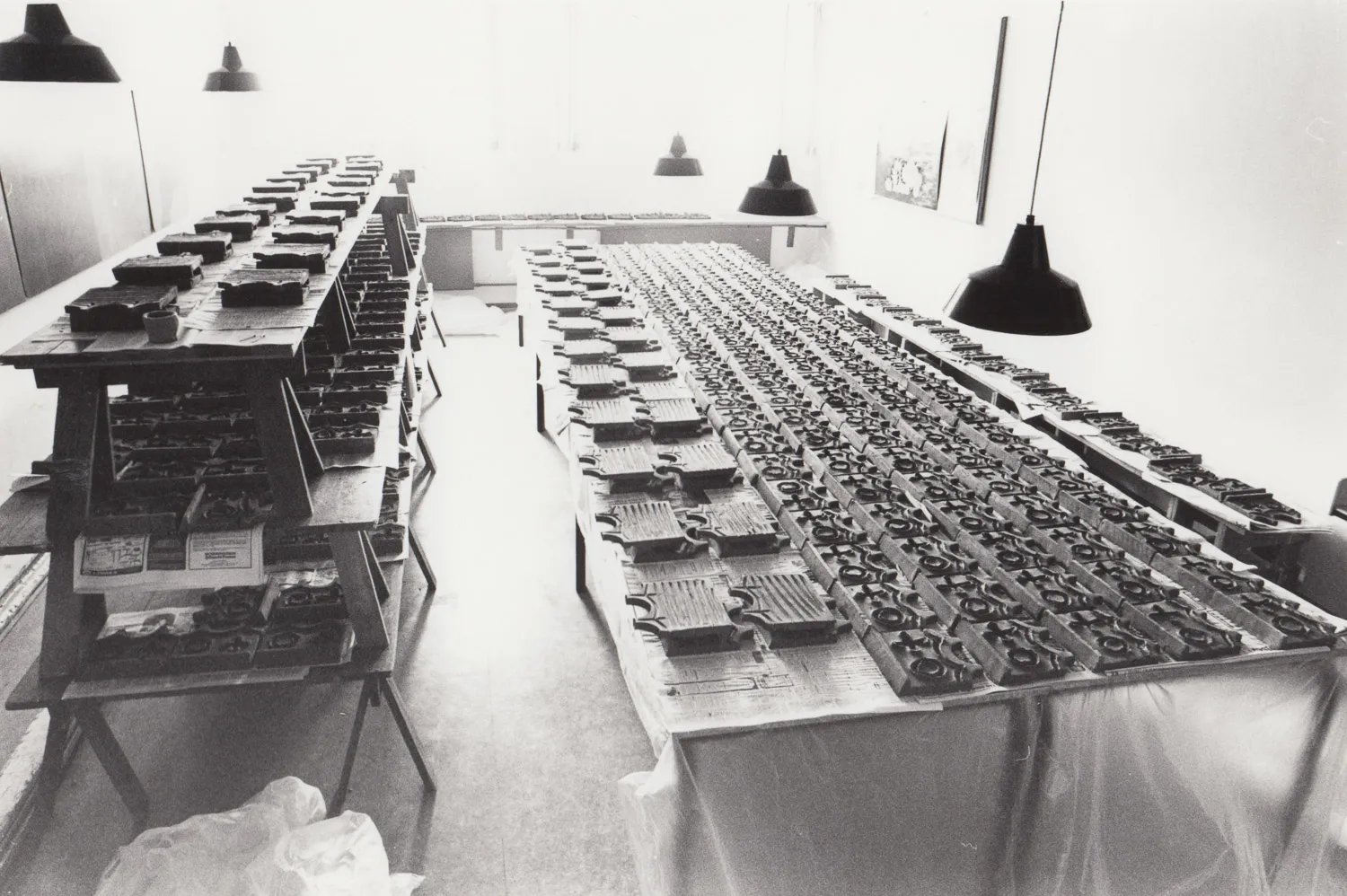
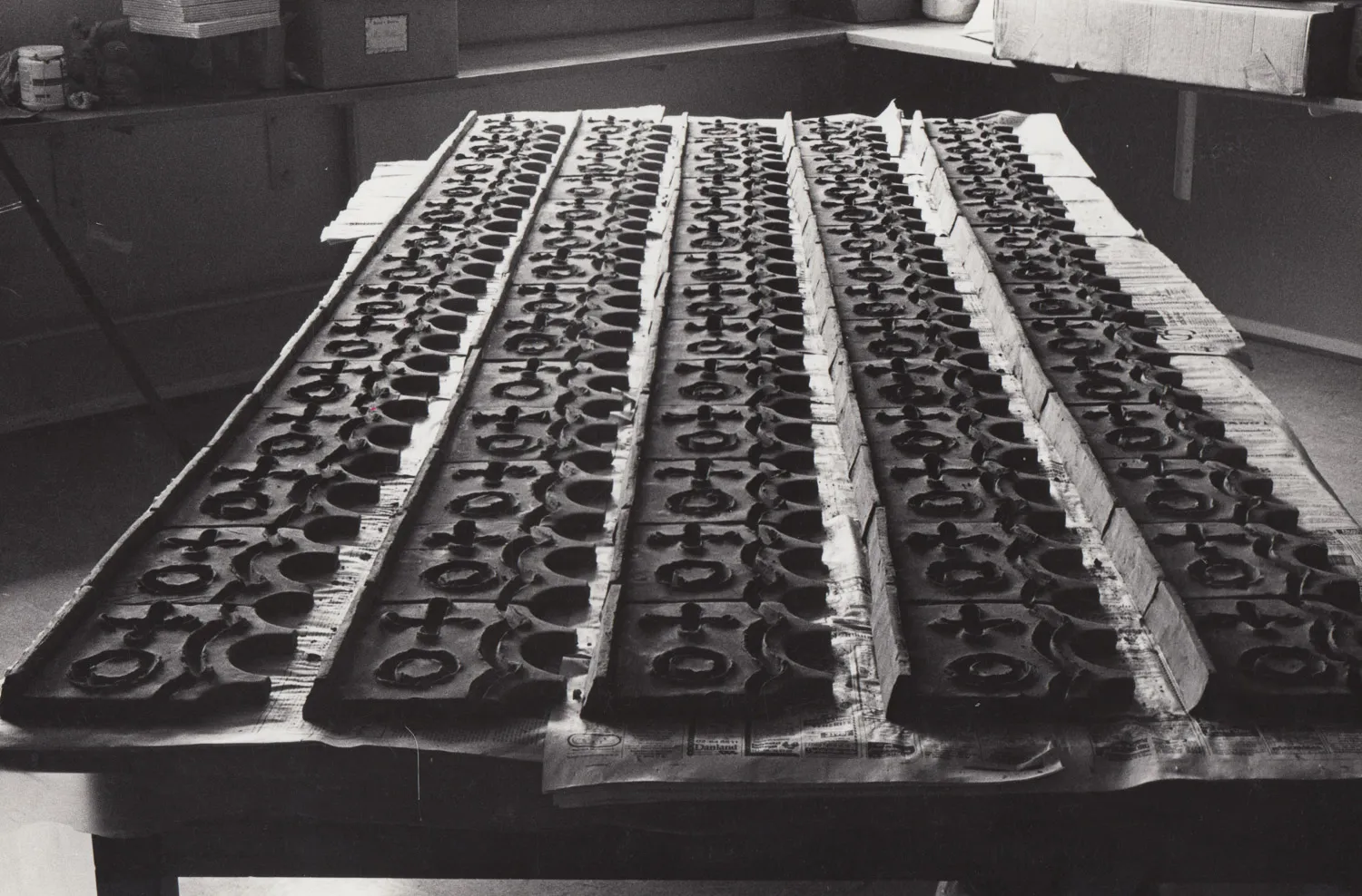
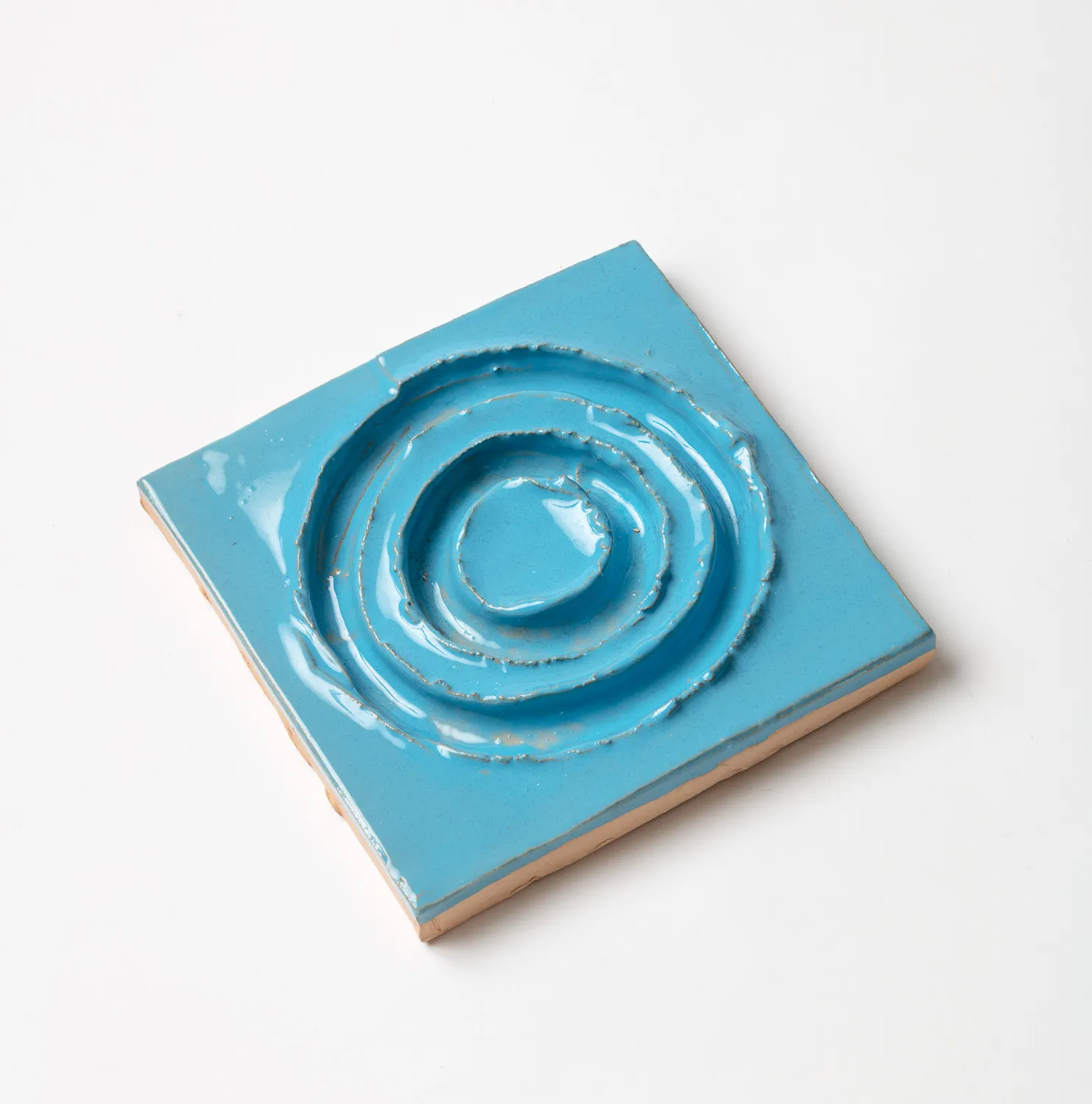
The frieze takes up approximately 52 metres in length, with each of the cherry tiles measuring 20 x 20 cm and the tiles with the trimming-border measuring 20 x 10 cm. The motifs have been painted onto the surfaces with Colormix, using a total of five colours: red, blue, green, ochre, and a special pink, which Poul called nun’s-belly red. The motifs appear in a total of 25 different versions and in a corresponding number of laterally reversed tiles, each one appearing about five times. That is to say, there are approximately 250 tiles with cherries and approximately 500 with trimming-border. On the basis of certain very elemental compositional principles, it was left up to us to determine the sequence of the motifs, which apparently ought to appear accidental/natural. We grouped the 50 different motifs five different times, in order to ensure an equal distribution of them across the frieze. Otherwise, the sequence was determined by what motifs we felt fit together. The result was an extraordinary free and natural course, where thinner and sparser sections alternate – seemingly randomly – with the more compact and denser sections.
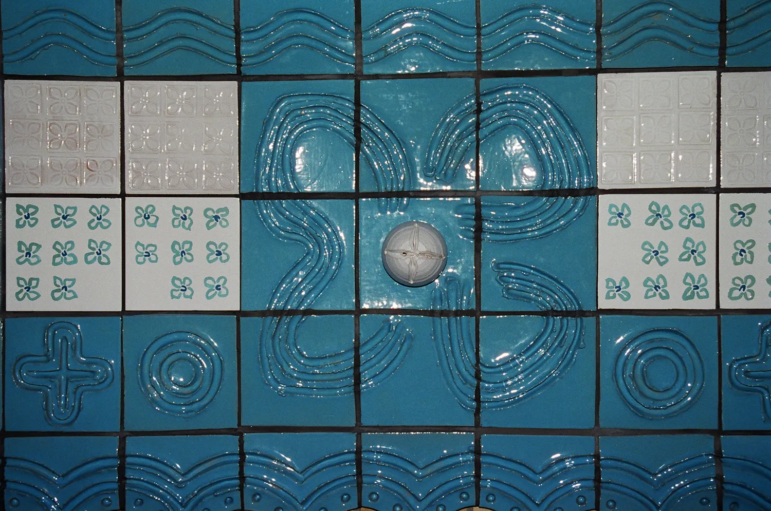
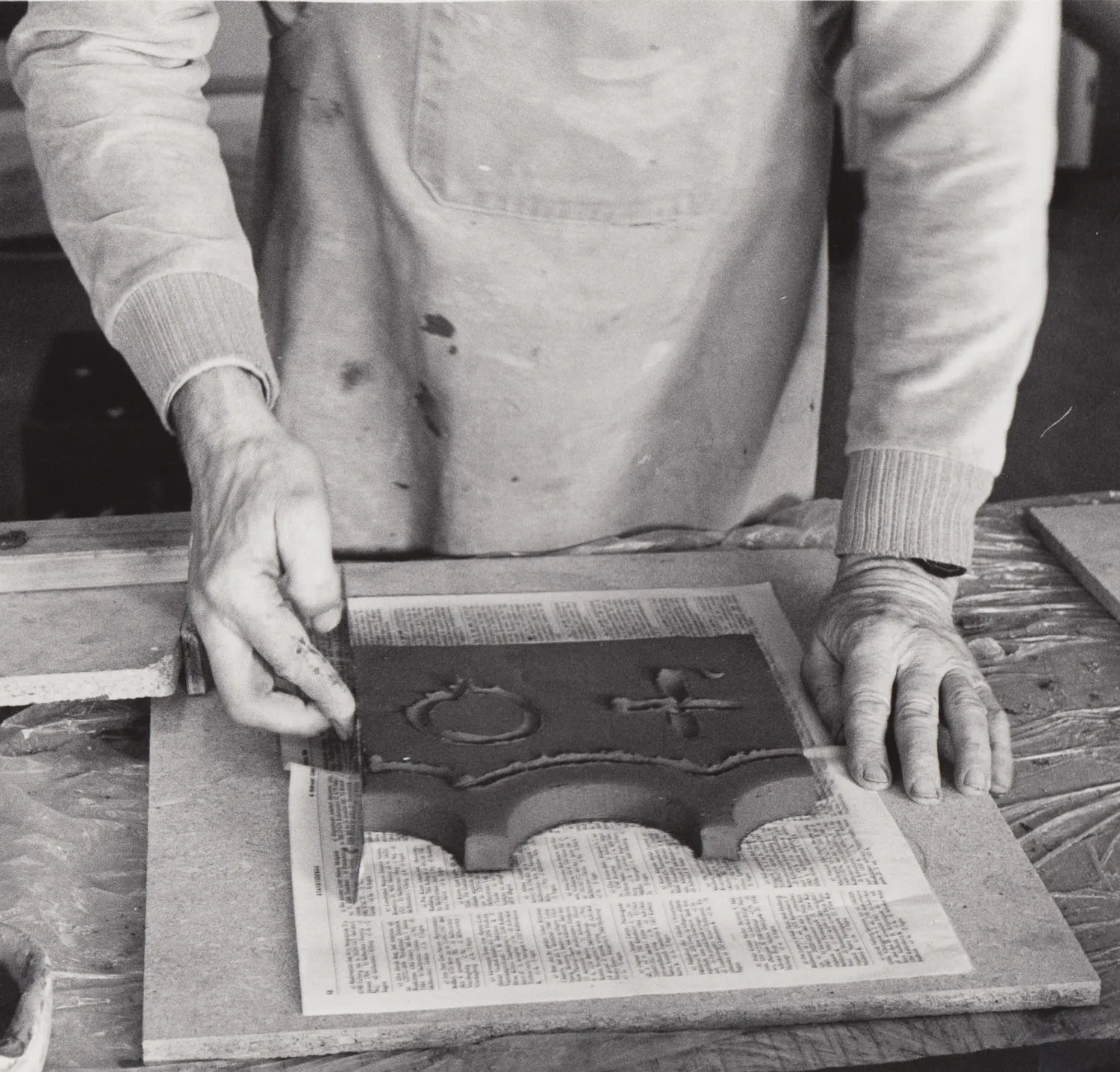
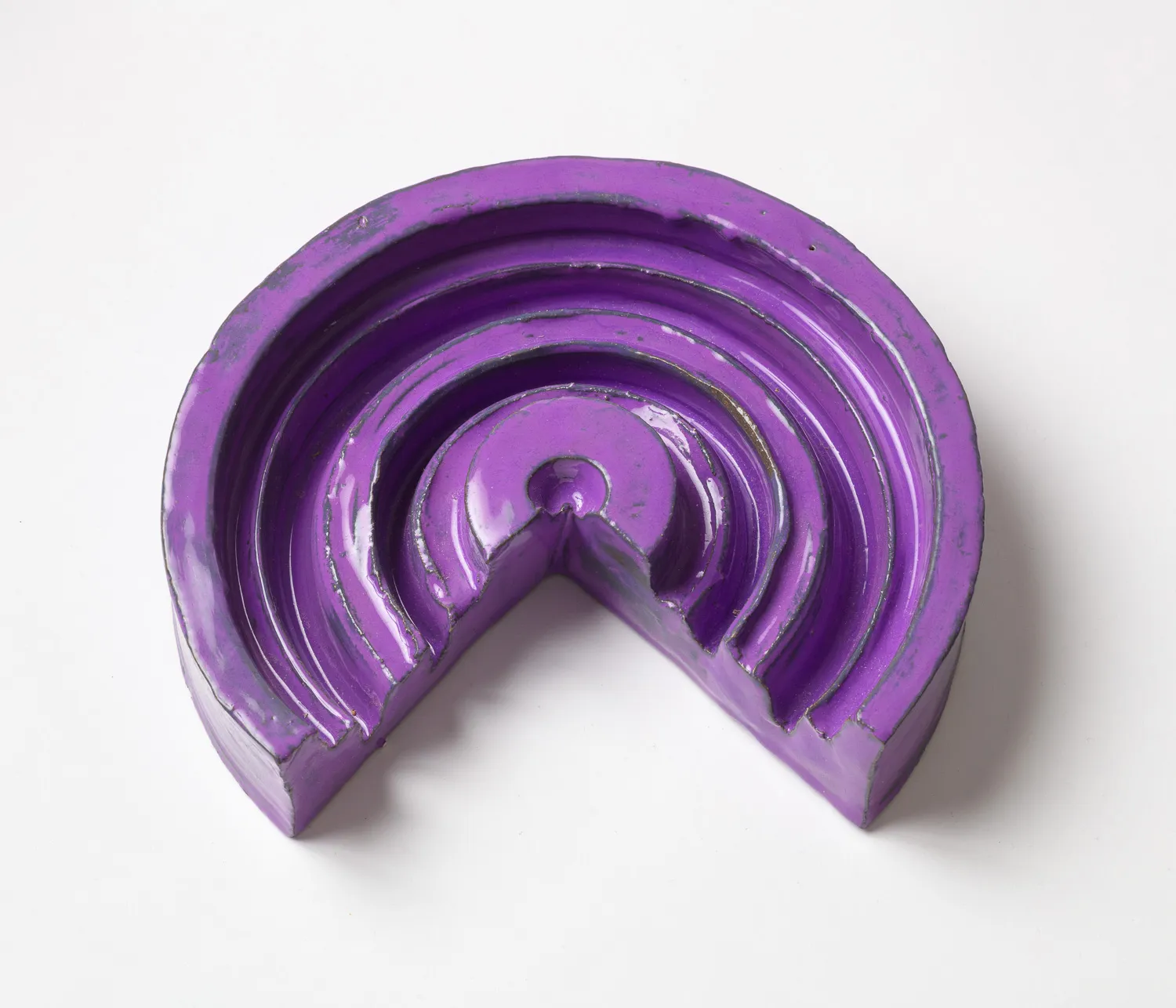
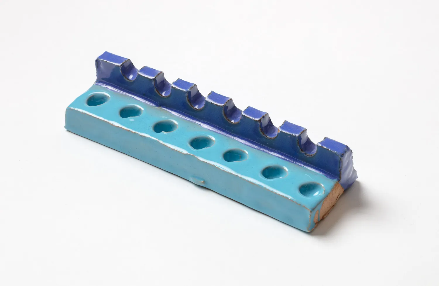
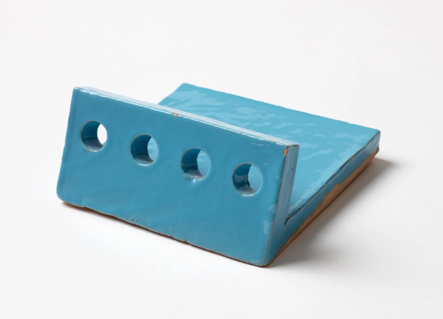
Poul wanted to finish off the frieze with a blue-glazed clay tile for framing in the cherries and for posing a contrast to the yellow masonry. He designed a tile that measured 20 x 20 cm, so the frieze would wind up being approx. 80 cm in height. The tile was terminated at its top with a wave incision that was supposed to be made with the help of empty tin cans as the cutting tools, with the result that for some time, many meals prepared using canned tomatoes were served and eaten in the little home. The wave motion was supposed to be repeated by a finger drawing in the clay and underneath this, there was a decoration that was also supposed to be drawn with the finger. Poul called this “cross and bun”, but I called it “life and death” when Poul wasn’t there to hear. The cross was just that: a cross. And the bun was a sun sign. At the bottom, the tile was terminated by a tile of a high edge that was supposed to frame in the cherries. Peter the custodian made the templates for the waves and the “cross and bun” symbols, and he invented a most clever implement for the participants so that the edge could be shaped uniformly. The process of shaping the tiles came to turn into a kind of manufactory, even if we called the tools machines.
Many students and teachers took part after school was out and continued to work into the evening. If you were not particularly good with your hands, you could still participate in the kneading and rolling of the clay into plates. Or else you could bake pizzas for the shared dining that followed. Poul would have smacked his lips over the process he had initiated. I was the local rope keeper, and at the same time I was undergoing my craftsman’s apprenticeship. I became an expert in the handling of fireclay, in the drying out of tiles, in their pre-glazing, in their glazing and in managing the risky positioning of the tiles inside the kiln. At all times of the day, around the clock, there was a fire burning in the school’s small ceramic kiln that had to be looked after night and day. Some of the participating students were so enthusiastic they signed up to decorate the Rebæk Søpark student housing in Hvidovre (1983-84).
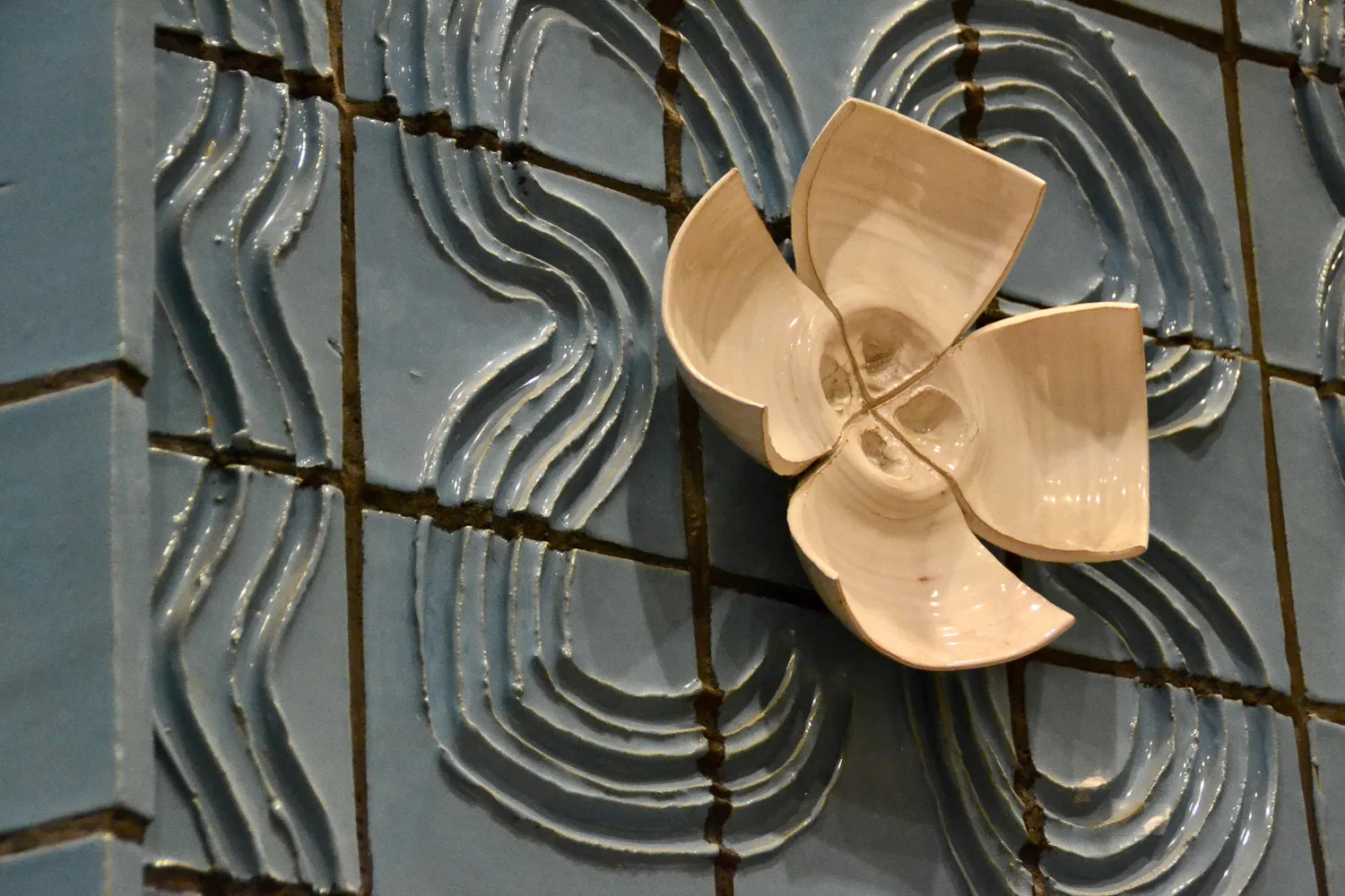
The framing of the stage opening was done later point. This was accomplished by a crew of academy students. Poul sent us a coloured drawing of the project, and we accepted the proposal after some reflection. The decoration became a tour de force in floral motifs, which were being unfolded in a number of different techniques. The wave motif and the cross and bun theme from the frieze were being developed further. The fingerprint in the clay was made with double strokes, and finger-drawn flowers spread across nine tiles, as a framing-in of twisted white flowers. Thrown clay bowls were broken up in equal parts, and the parts were laid out like petals. At the bottom, on either side, was a blossom bud. Placed in between the large flowers were white and pink tiles, some of them made as stamp prints and others were rendered in glaze paint. The thrown flowers and the square white fields established a repetitive rhythm, both vertically and horizontally. The effect was luxurious, but maybe not for delicate souls.
Palle Rønde Møller: “A glance back in time.” in Ulrikka S. Gernes & Bibi Saugman Henriksen (ed.): Kærlighed & Kirsebær – Love & Cherries. Poul Gernes i Aars. Frederiksberg 2020. Abbreviated. Translated by Dan A. Marmorstein.
Vesthimmerland Upper Secondary School
Photo: Finn Thybo Andersen
Vesthimmerland Upper Secondary School
Photo: Finn Thybo Andersen
Vesthimmerland Upper Secondary School
Photo: Finn Thybo Andersen
Vesthimmerland Upper Secondary School
Photo: Klara Karolines Fond
Vesthimmerland Upper Secondary School
Photo: Klara Karolines Fond
Vesthimmerland Upper Secondary School
Photo: Klara Karolines Fond
Vesthimmerland Upper Secondary School
Photo: Finn Thybo Andersen
Vesthimmerland Upper Secondary School
Photo: Palle Rønde Møller
Vesthimmerland Upper Secondary School
Photo: Palle Rønde Møller
Vesthimmerland Upper Secondary School
Photo: Palle Rønde Møller
Vesthimmerland Upper Secondary School
Photo: Palle Rønde Møller
Vesthimmerland Upper Secondary School
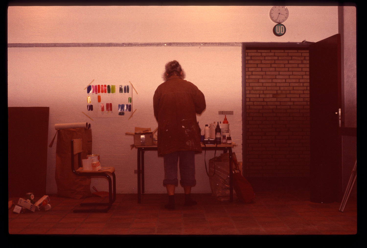
Aase Gernes mixing colors
Photo: Palle Rønde Møller
Vesthimmerland Upper Secondary School
Photo: Klara Karolines Fond
Vesthimmerland Upper Secondary School
Photo: Palle Rønde Møller
Vesthimmerland Upper Secondary School
Photo: Klara Karolines Fond
Vesthimmerland Upper Secondary School
Photo: Klara Karolines Fond
Vesthimmerland Upper Secondary School
Photo: Klara Karolines Fond
Vesthimmerland Upper Secondary School
Photo: Klara Karolines Fond
Vesthimmerland Upper Secondary School
Photo: Finn Thybo Andersen
Vesthimmerland Upper Secondary School
Photo: Klara Karolines Fond
Vesthimmerland Upper Secondary School
Photo: Finn Thybo Andersen
Vesthimmerland Upper Secondary School
Photo: Finn Thybo Andersen
Vesthimmerland Upper Secondary School
Photo: Finn Thybo Andersen
Vesthimmerland Upper Secondary School
Photo: Palle Rønde Møller
Vesthimmerland Upper Secondary School
Photo: Palle Rønde Møller
Vesthimmerland Upper Secondary School
Photo: Palle Rønde Møller
Vesthimmerland Upper Secondary School
Photo: Palle Rønde Møller
Vesthimmerland Upper Secondary School
Photo: Palle Rønde Møller

Vesthimmerland Upper Secondary School
Photo: Anders Sune Berg
Vesthimmerland Upper Secondary School
Photo: Anders Sune Berg
Vesthimmerland Upper Secondary School
Photo: Anders Sune Berg
Vesthimmerland Upper Secondary School
Photo: Anders Sune Berg
Vesthimmerland Upper Secondary School
Photo: Anders Sune Berg
Vesthimmerland Upper Secondary School
20 (h) x 20 (w) cm
Photo: Anders Sune Berg
Vesthimmerland Upper Secondary School
20 (h) x 20 (w) cm
Photo: Anders Sune Berg