Decoration
Decoration
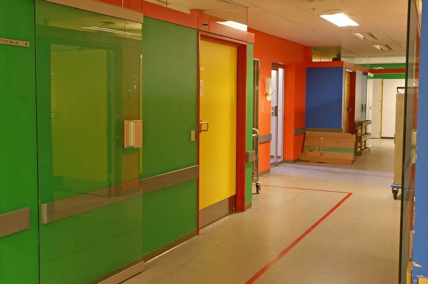
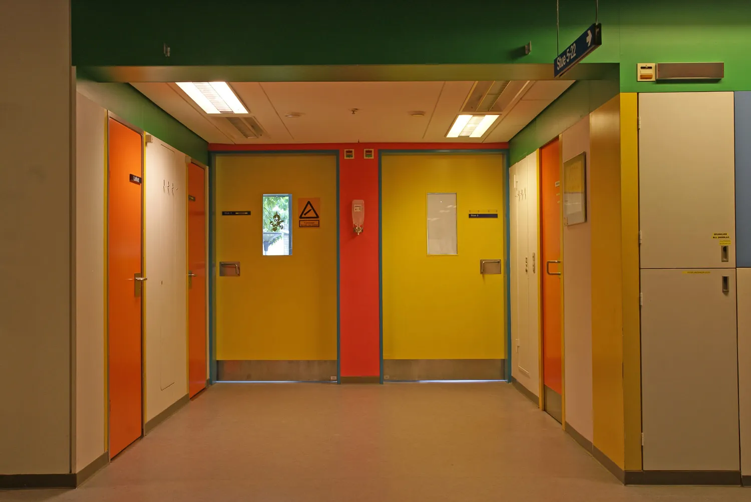
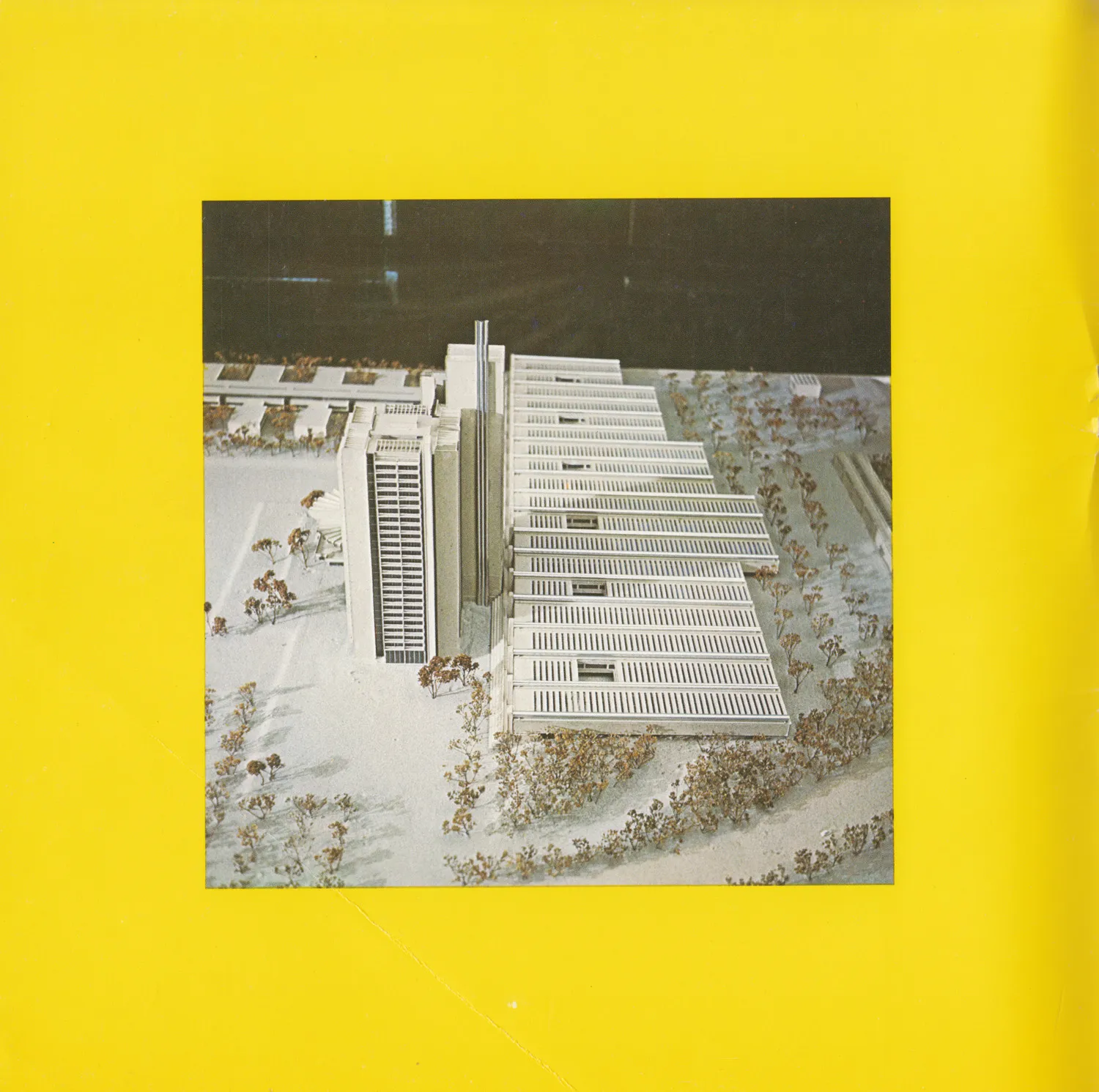
Herlev Test Module, Gentofte Hospital
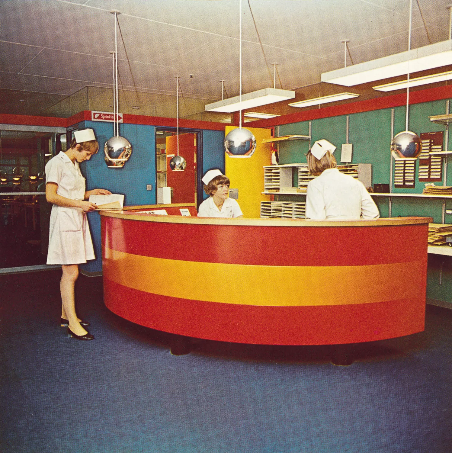
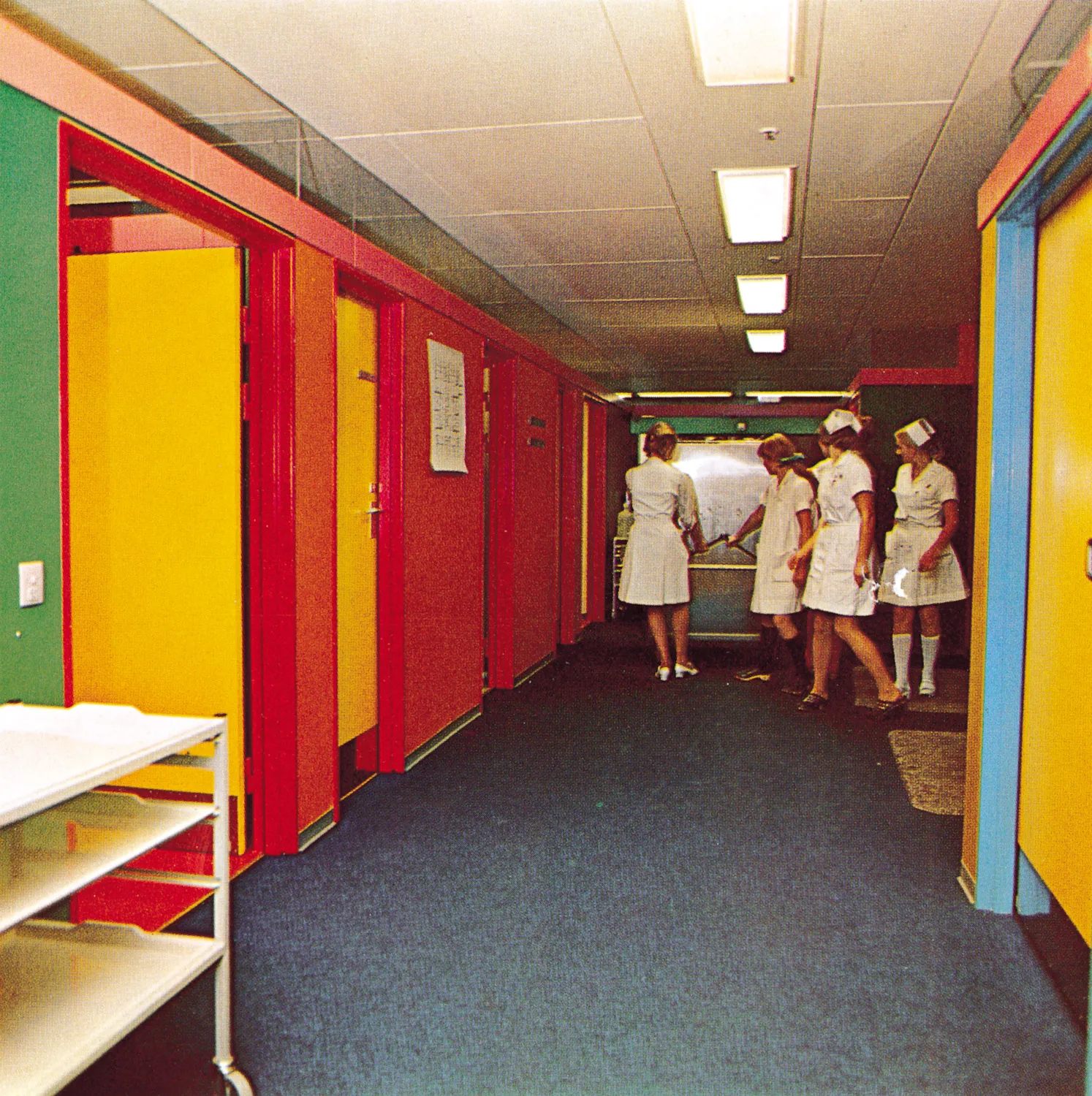
A module which corresponded to one storey at the hospital in Herlev was constructed at Gentofte Hospital. Seen in isolation it was not the appearance that was the most interesting – not yet! – but rather the medicinal and mental health-related consequences of the new polychrome environment. For this reason, the experimental module amounted to much more than a mere mock-up. It was rather an actual dress rehearsal for a hospital environment, its new colour scheme and similarly its new inventory. Among other things, there was a wish to try out some of the new and very advanced technical aids with which the new hospital was to be equipped.
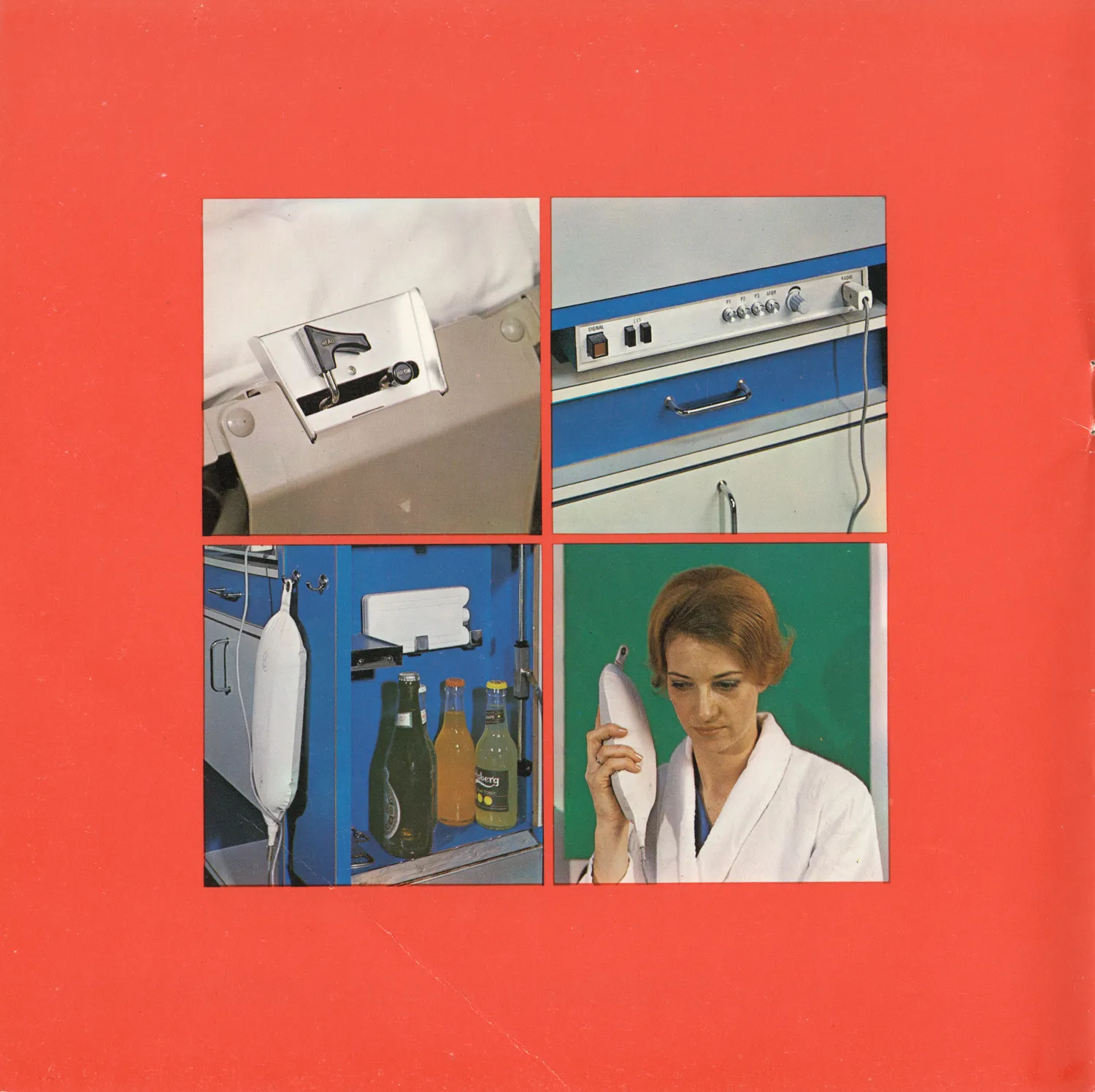
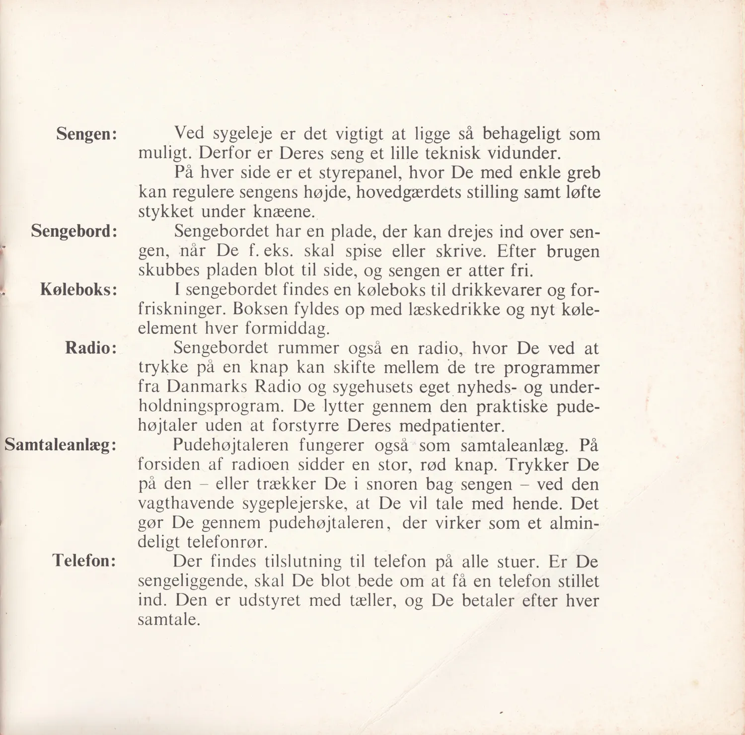
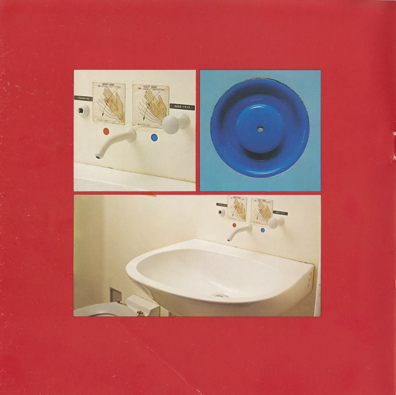
For example, it was novel that the beds could be adjusted by the patients. From the bed, they could raise or lower the blinds and curtains in the room by pushing a button. The water tap in the basin was activated by a wave of the hand. It wasn’t only a matter of convenience, but also of hygiene and economy.
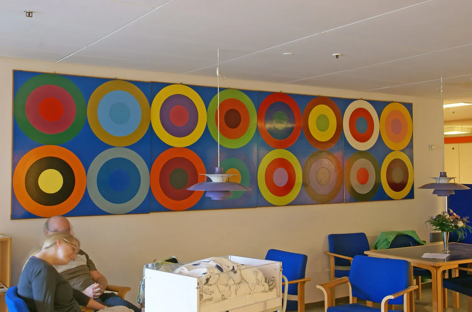
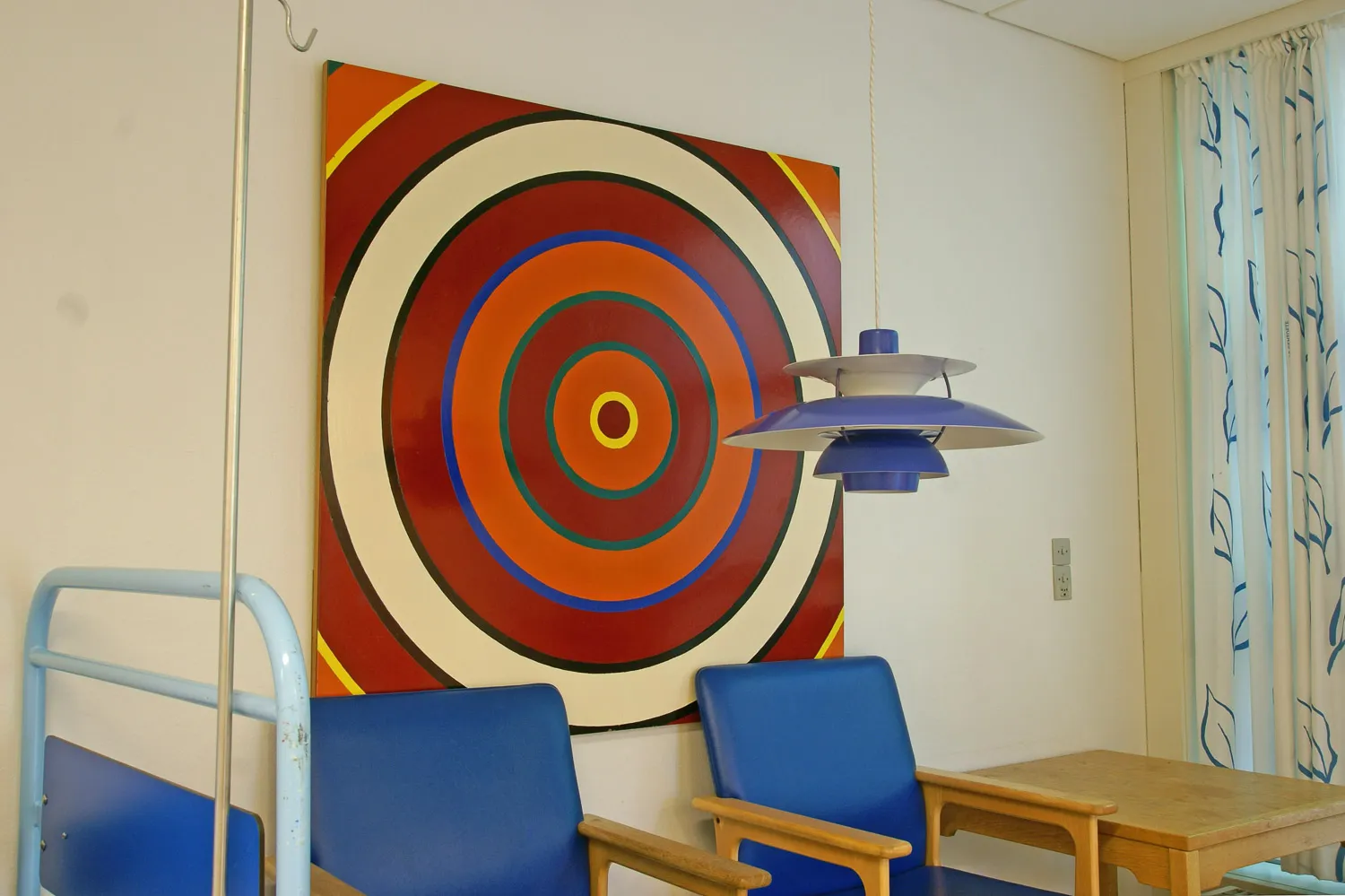
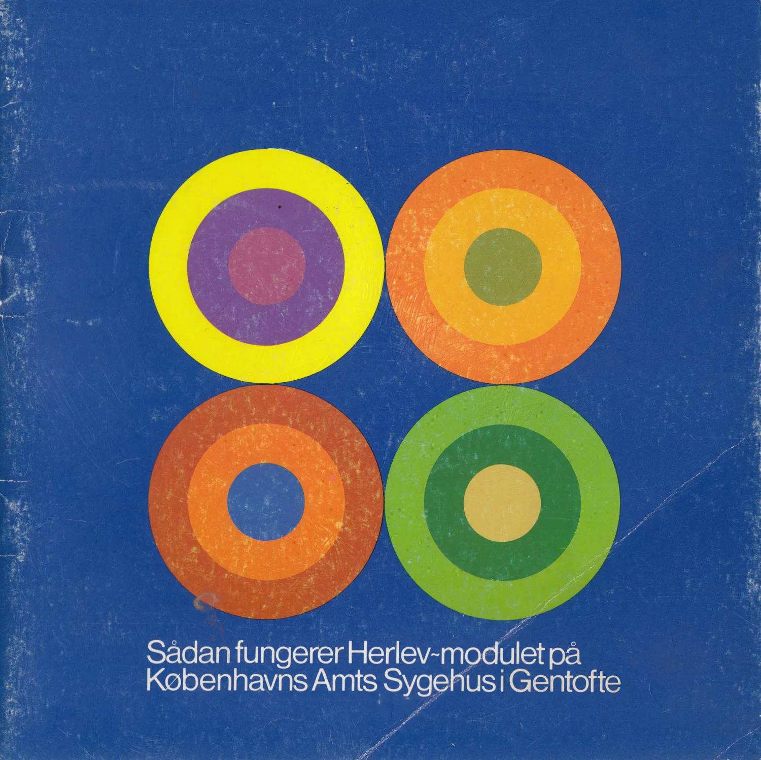
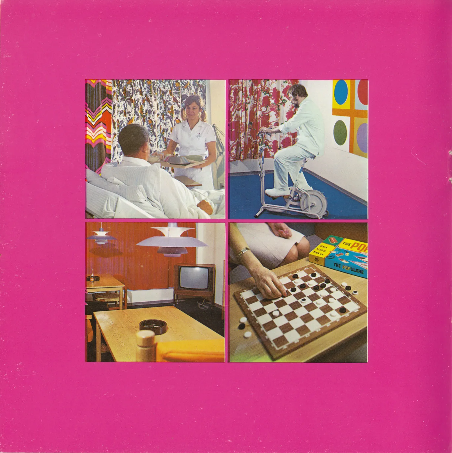
But the most daring of all was, of course, Poul Gernes’ colour scheme. The artist and his wife, Aase Seidler Gernes, virtually lived at the construction site in Gentofte while painting the walls and fittings with a couple of decoration painters. The application of colours included carpets, which were blue, and the furniture itself. The curtains were printed with patterns of parrots and large flowers. A veritable orgy of colour.
A clinical experiment was implemented to determine whether the polychrome environment would function according to its express purposes. This was done by different departments moving in to test the module by turns. Over a period of approximately three months, reactions of both patients and staff were observed. What could be registered was that the colour scheme, on the whole, had a positive effect on the surroundings. The colour was perceived as a psychosomatic asset, an invigorating remedy, which could be ingested without pills or injections. You just had to use your senses and look around.
A few negative remarks were also heard. The tabloid Ekstra-Bladet (November 18th, 1970) printed some of them. “Good heavens, this parrot cage is truly awful,” exclaimed one patient. Another added, “when I woke up after anaesthesia and saw those colours, I was convinced I had a brain haemorrhage.”
But most of the reactions were positive, and some were even enthusiastic, such as this one: “it’s more wonderful here that at the most expensive luxury hotel. The only thing I actually miss is a bar.” Or “I hope it’ll take at least a few more weeks before I’m well, because I’ve never experienced such lovely surroundings.”
A nurse concluded to Ekstra-Bladet: “It takes a while to get used to the surroundings, but afterwards, it’s hard to feel comfortable anywhere else.” That was what others experienced: the strong colours certainly required a certain period of acclimatization. On the other hand, they were extremely addictive.
What would typically happen when a new team of doctors, nurses and patients moved into the new rooms, was that their first reaction to the colour scheme was one of shock, even indignation. And for good reason: never before had they experienced such a thing in a hospital setting. But when the same people, after three months, had to move back into their old departments, they were not happy to return to the drudgery of their old interiors.
A sequence of questionnaires was handed out to the users of the test module and a sociologist was asked to analyze the answers. The results were awaited with bated breath, but certainly not by the artist. He already knew the result. He had never been in doubt. In theory, one could keep primary colours in a medicine chest, because colours possess both a preventive and a healing effect.
Ulrikka S. Gernes & Peter Michael Hornung: Farvernes Medicin / The Medicine of Colours – Poul Gernes og Amtssygehuset i Herlev / Poul Gernes and Copenhagen University Hospital at Herlev. Copenhagen 2003, p. 47-49. Translated by Dan A. Marmorstein. Abbreviated.
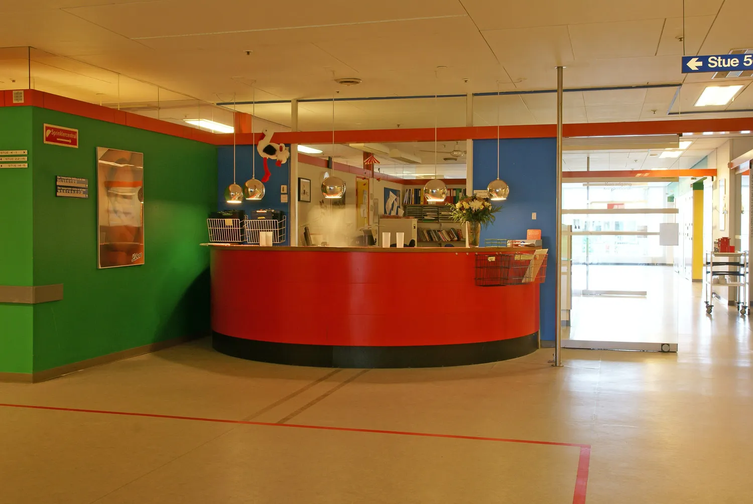
The test wing for the hospital in Herlev, built on the site of the County Hospital in Gentofte, constitutes a polychrome colour environment, which also includes curtains and pictures in the patient rooms. Various circumstances surrounding the task dictated that it became intense and strong. Poul Gernes set a requirement for himself that the colours should be at full intensity, the most striking ones he could possibly find. That was the first condition. The second condition he set was that it had to be approved, and in order to gain approval, it had to, in addition to being strong and intense, also be reasonable in some way.
He completed the task, stepped away from it, and took on another assignment in the hospital’s basement. There, he used the same colour palette, as it was still the same building, and the rooms had, to some extent, the same proportions, the same materials, and the same people moving through them. However, he found that in the basement, he made various mistakes – it turned out worse than what he had created in the main ward.
Later, when he could see that there were errors, that something wasn’t working, he began asking himself what the difference was. He then realized that in the main ward, the colours had been placed in very specific systems, which he had been unaware of while carrying out the work and which had likely only emerged due to the pressured situation where he had been forced to push himself to the limit, whereas he had relaxed more when working in the basement.
In the systems in which he unconsciously placed the colours, he claims to have discovered a law-like principle: that the colours are oriented according to the cardinal directions. One can refer to Steen Ejler Rasmussen’s observation that warm colours should face south and cool colours should face north. He can confirm this, but he believes he has taken it a step further. It is not enough to consider only north and south – there is also an east/west factor. His claim goes so far as to say that he is fully convinced that even rooms used only at night and therefore seen only in artificial light should be oriented according to the cardinal directions.
He believes it is a natural law. He thinks that humans always have an instinctive need to orient themselves. Humans, consciously or unconsciously – at least the sensitive ones – have an awareness of where south and north are, where the sun is and where it is not; they can find south and north unconsciously, even at night and in unfamiliar places. He believes that, without knowing it, people have a need for rooms facing north to be in northern colours in order to be in harmony with themselves and not to be frustrating or have a negative influence on people.
If you have a room somewhere, regardless of its orientation, you could paint it red one day, green the next, blue the third day, and so on. You would find that one of these colours would be the right one. You would simply be able to feel it.
There are three factors that determine which colour is best. The first is the room’s dimensions—height, width, depth, possibly also window openings, doors, and similar elements. The second is its orientation relative to the cardinal directions. The third is its function. However, one could imagine conducting a test series where the room’s function was left undetermined. It is only when the colour aligns with all three factors that the room reaches its maximum potential.
Jane Pedersen: Der er dejligt i Danmark – viser Poul Gernes. Copenhagen 1971 p. 108-9. Excerpt. Translation by Klara Karolines Fond.
Herlev Test Module, Gentofte Hospital
Photo: ukendt
Herlev Test Module, Gentofte Hospital
Photo: ukendt
Herlev Test Module, Gentofte Hospital
Photo: Finn Thybo Andersen
Herlev Test Module, Gentofte Hospital
Photo: Finn Thybo Andersen
Herlev Test Module, Gentofte Hospital
Photo: Finn Thybo Andersen
Herlev Test Module, Gentofte Hospital
Photo: Finn Thybo Andersen
Herlev Test Module, Gentofte Hospital
Photo: Finn Thybo Andersen
Herlev Test Module, Gentofte Hospital
Photo: Finn Thybo Andersen
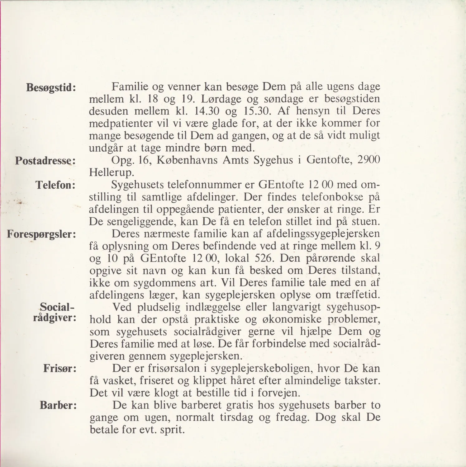
Herlev Test Module, Gentofte Hospital
Patient information booklet 1970
Photo: skan
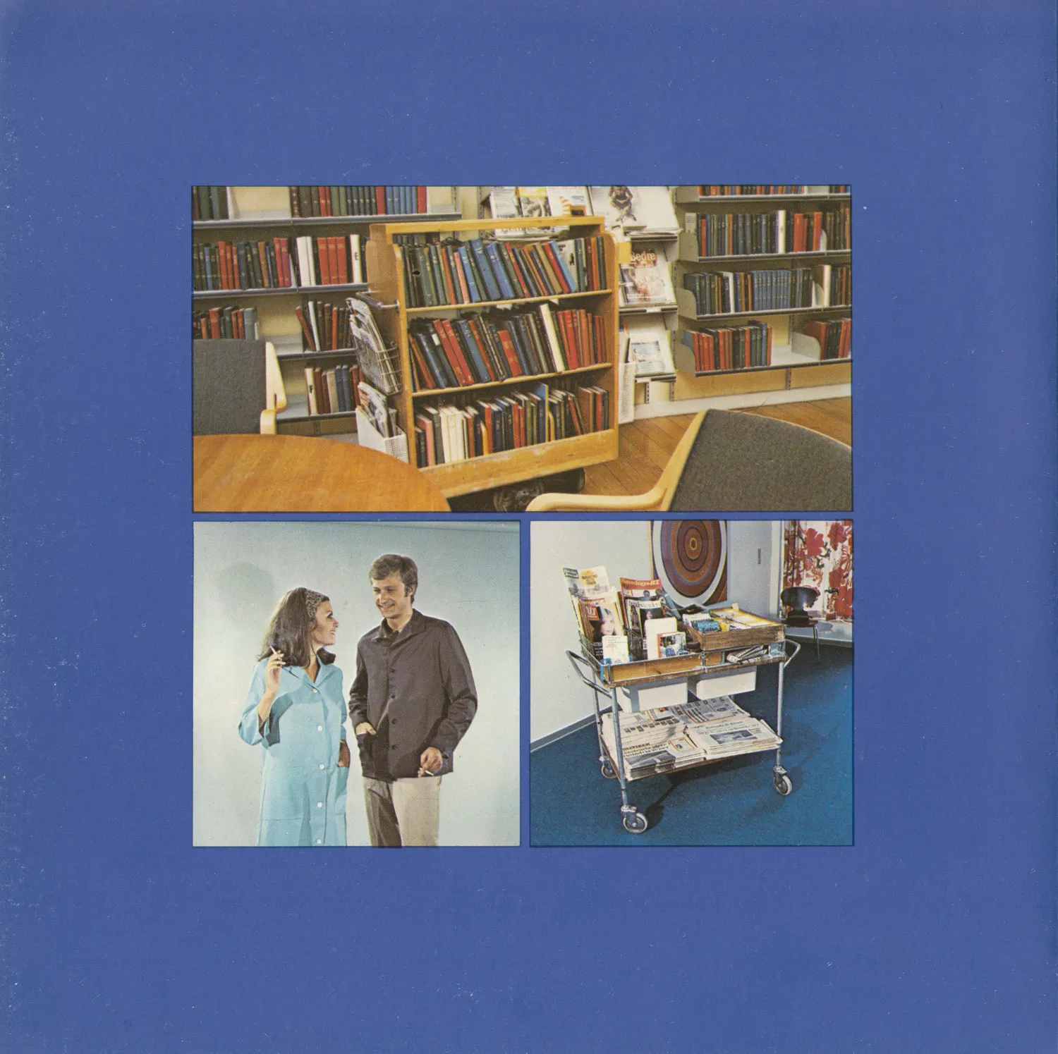
Herlev Test Module, Gentofte Hospital
Patient information booklet 1970
Photo: skan
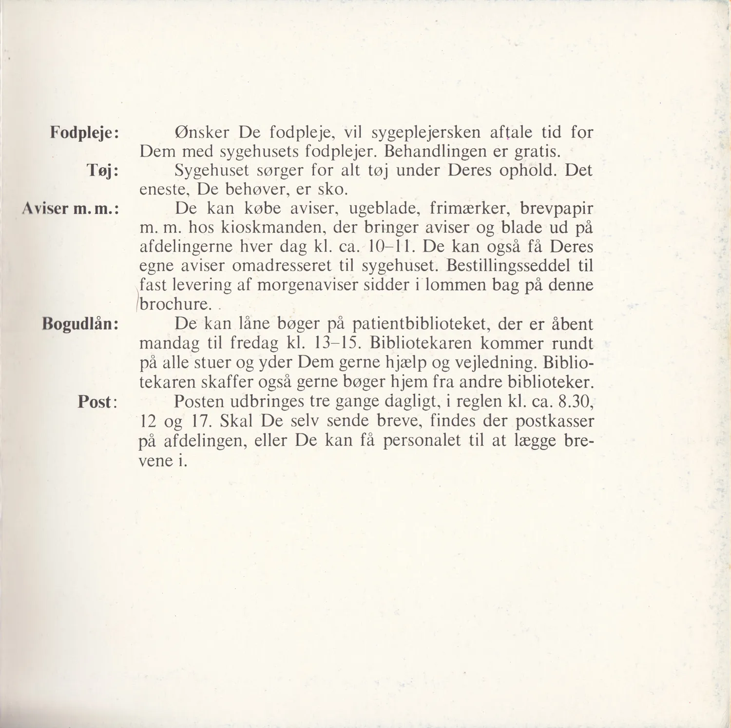
Herlev Test Module, Gentofte Hospital
Patient information booklet 1970
Photo: skan
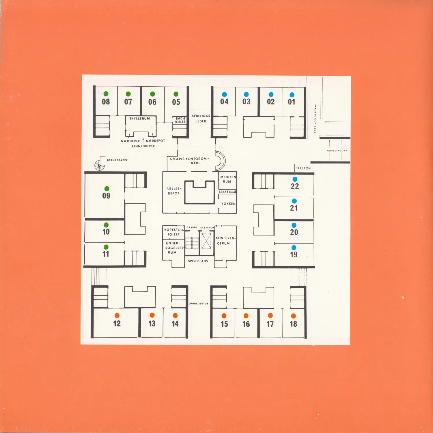
Herlev Test Module, Gentofte Hospital
Patient information booklet 1970
Photo: skan
Herlev Test Module, Gentofte Hospital
Patient information booklet 1970
Photo: skan
Herlev Test Module, Gentofte Hospital
Patient information booklet 1970
Photo: skan
Herlev Test Module, Gentofte Hospital
Patient information booklet 1970
Photo: skan
Herlev Test Module, Gentofte Hospital
Patient information booklet 1970
Photo: skan
Herlev Test Module, Gentofte Hospital
Patient information booklet 1970
Photo: skan
Herlev Test Module, Gentofte Hospital
Patient information booklet 1970
Photo: skan
Herlev Test Module, Gentofte Hospital
Patient information booklet 1970
Photo: skan
Herlev Test Module, Gentofte Hospital
Patient information booklet 1970
Photo: skan
Herlev Test Module, Gentofte Hospital
Patient information booklet 1970
Photo: skan
Herlev Test Module, Gentofte Hospital
Patient information booklet 1970
Photo: skan
Herlev Test Module, Gentofte Hospital
Patient information booklet 1970
Photo: skan
Herlev Test Module, Gentofte Hospital
Patient information booklet 1970
Photo: skan
Herlev Test Module, Gentofte Hospital
Patient information booklet 1970
Photo: skan
Herlev Test Module, Gentofte Hospital
Patient information booklet 1970
Photo: skan