Decoration
Decoration
Herlev Hospital, treatment departments
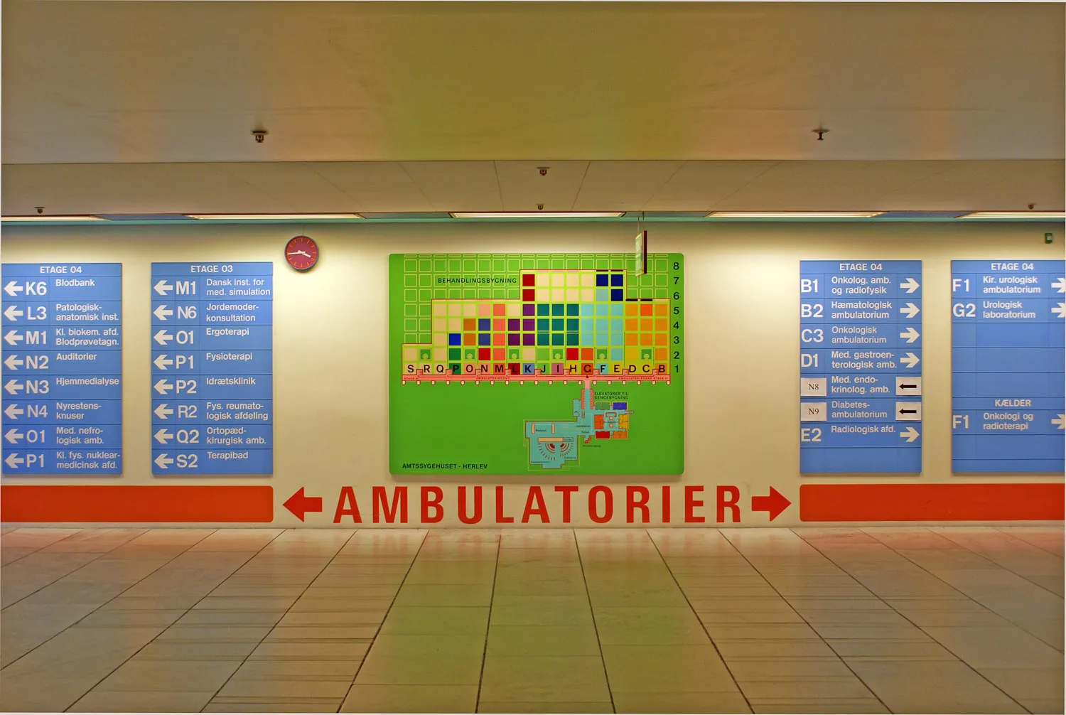
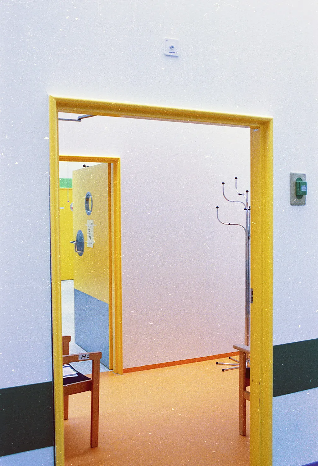
The treatment section has been constructed as systematically as a garrison town. The treatment level itself was built from standard units in a square system where each module measures 15 times 15 metres, separated by corridors that are three metres wide. All corridors aligned in the north-south direction are distribution corridors, while those in the perpendicular east-west axis are treatment corridors. From the treatment corridors, one gains access to the individual treatment sections, all of which are illuminated by skylights. These include the department of radiology, the x-ray department, ear-nose-throat, and the blood bank. Every one of the clinics occupies at least one, and frequently several squares.
The treatment building is primarily white, in order to underscore its difference from the lying-in areas. But “primarily” is not to be taken as meaning “exclusively,” because here the artist has employed a smaller selection of colours as hints or symbolic references. It could be said that the colours operate as a sign system. At one spot, the colours have been allotted a symbolic or pedagogic function, while at another, they are functional and practical. Nothing is accidental – and in any event, nothing is inconsequential – for anybody concerned. Everywhere, the choice of colour has been conceived in relation to a collective field of functions, signals and systems. The aesthetic experience is almost a side effect.
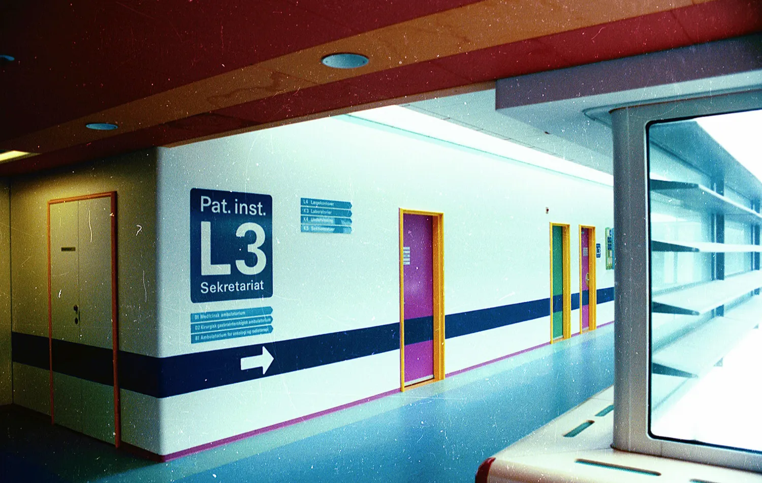
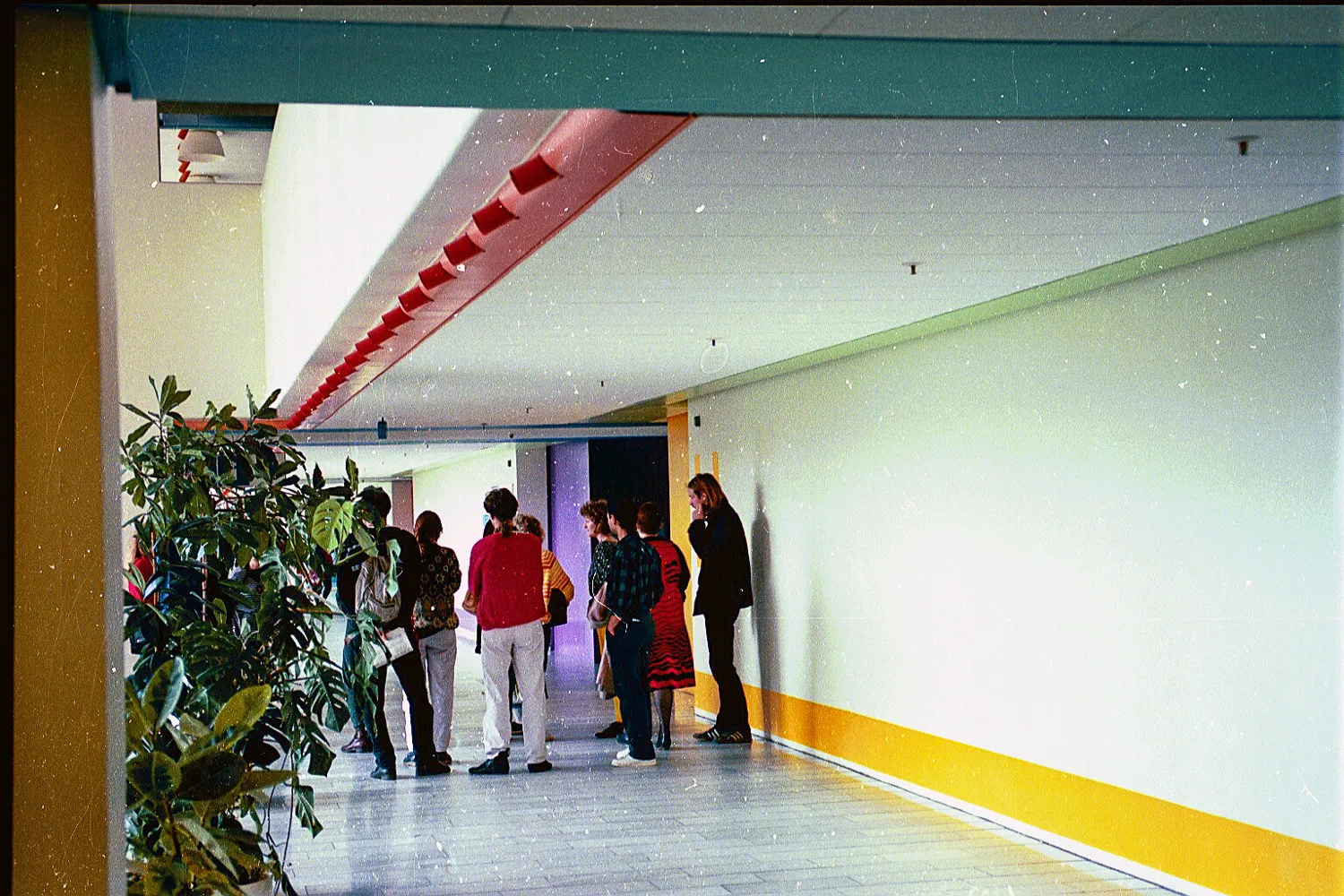
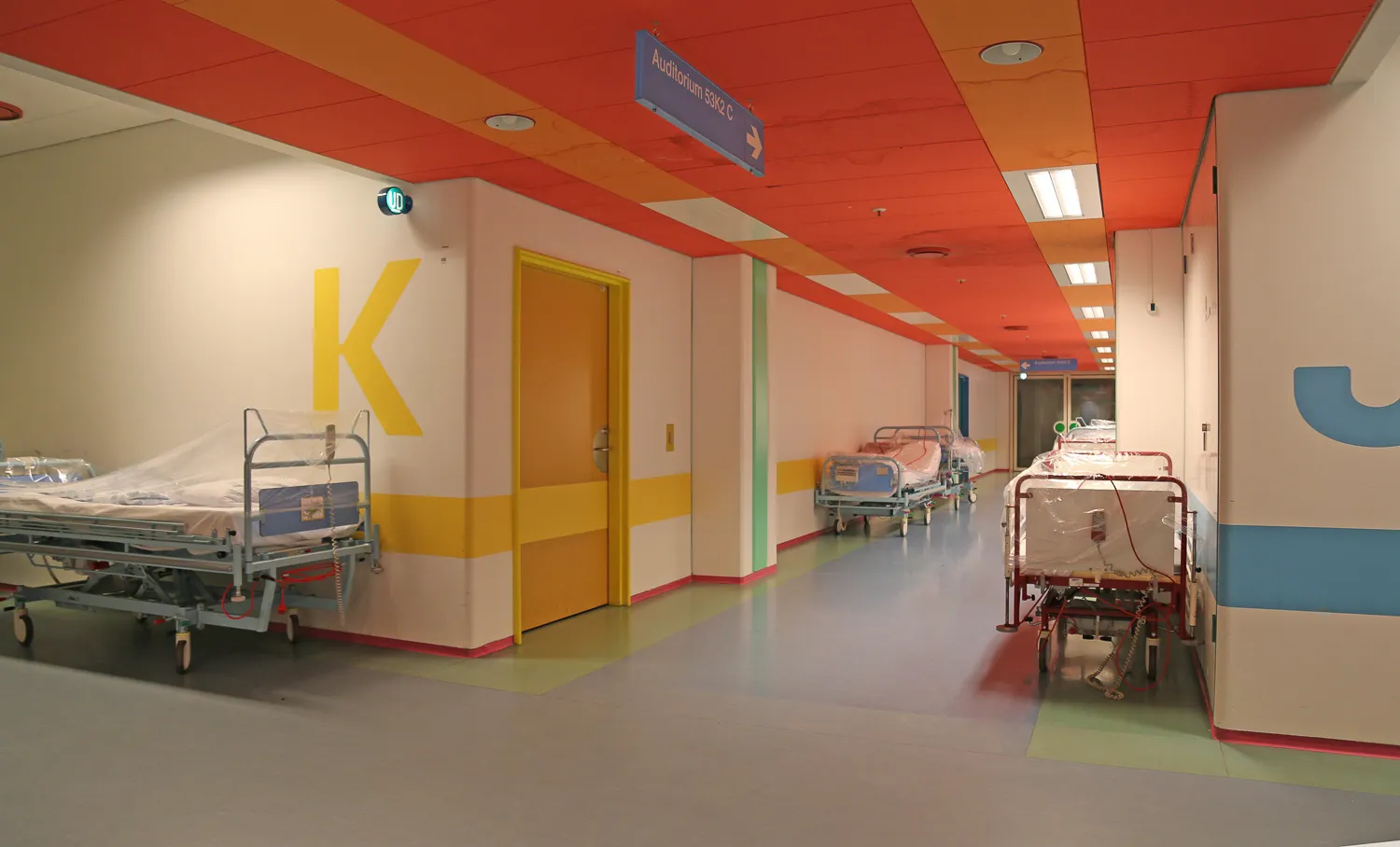
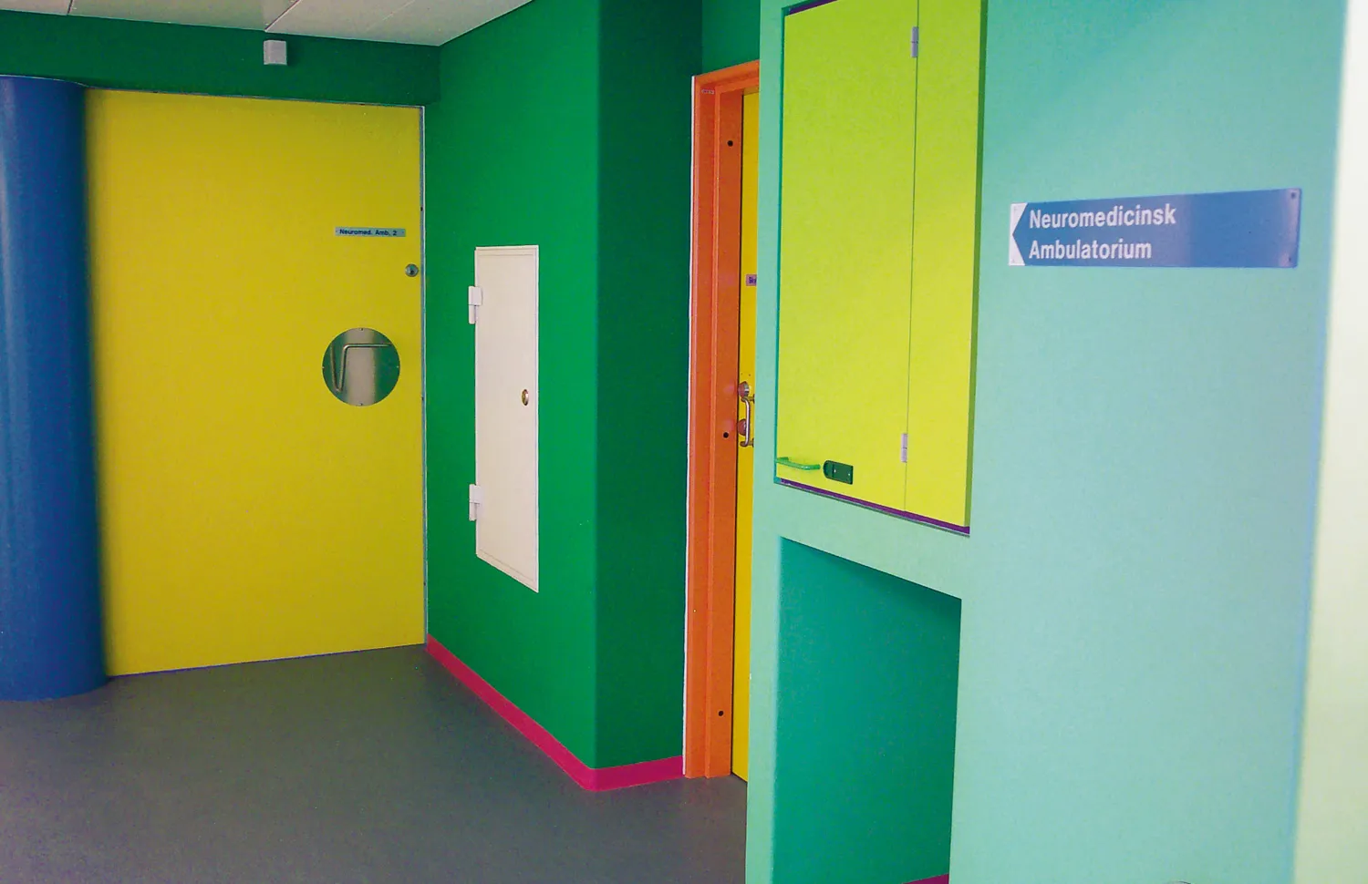
The entirety of the hospital has been thoroughly envisioned, all the way down to the interior layout of the individual rooms and every visible detail, in an admixture of practical considerations and positively stimulating visual experiences. The overall corridor floorage in the treatment building is enormous, and it’s easy to lose one’s bearings. In order to separate the individual outpatient clinics from one another, they have each been marked with a coloured frieze. The purpose of these friezes or “bellybands” – as architect Erik Schytt Poulsen called them – is to give people a quick and somewhat reliable pointer indicating the specialization of each section. Almost all the colours chosen by the artist, posses a distinctly associative value.
They operate as a function determined colour symbolism. Spring green, for example, has been used for the maternity ward. Ox-blood red has been used for the blood bank. Blue-violet is used for the pathological department, and light blue is used for the eye clinic (since light blue is the colour of the sky we see above us). Other colours are a little more difficult to decipher, but they work, nonetheless. These is chrome orange for the department of oncology, dark green for the emergency room and operating rooms, cyclamen-pink for the training and physical therapy departments, a soft skin-tone colour for plastic surgery, lemon yellow for the department of rheumatology, and so on. Moreover, the friezes contain arrows and explanations that guides the way.
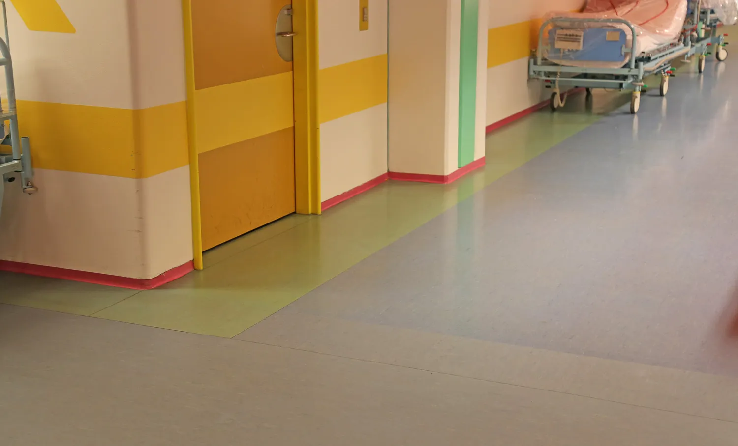
Apart from the information aspect, the “bellybands” satisfy another practical function. They have been positioned at a particular height, precisely at the distance from the floor where the walls are exposed to the greatest wear and tear due to the transport of the beds and other clinical traffic. In case of damage, one does not need to repair a whole surface of wall. It’s enough to paint the belt. Generally speaking, damages and scratches will not seem as conspicuous on a painted surface as they would on a white wall.
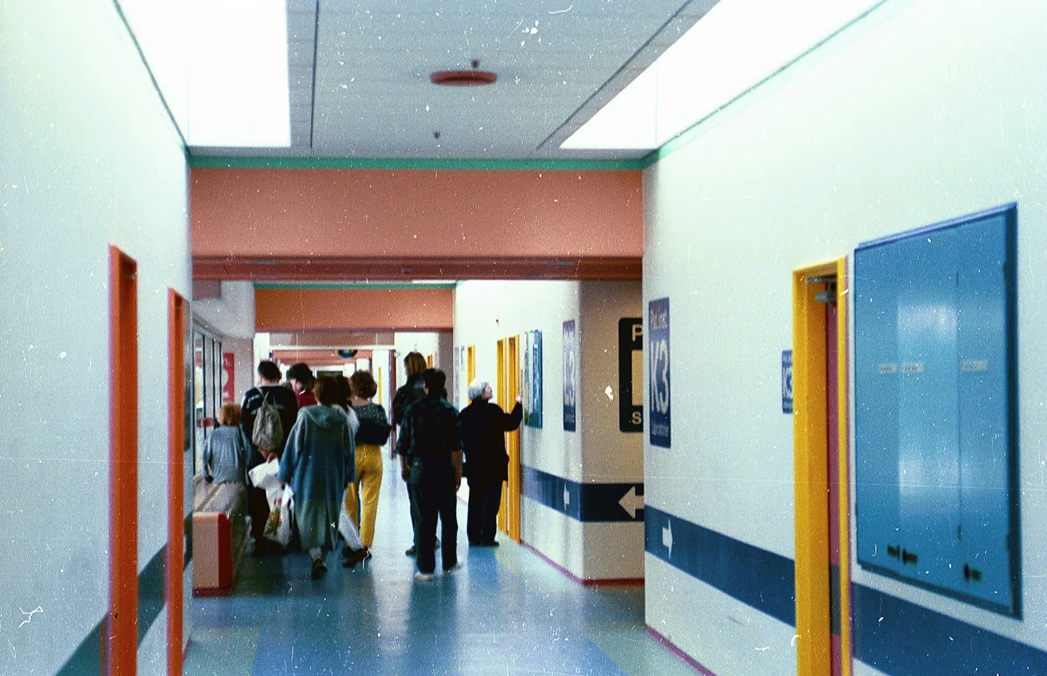
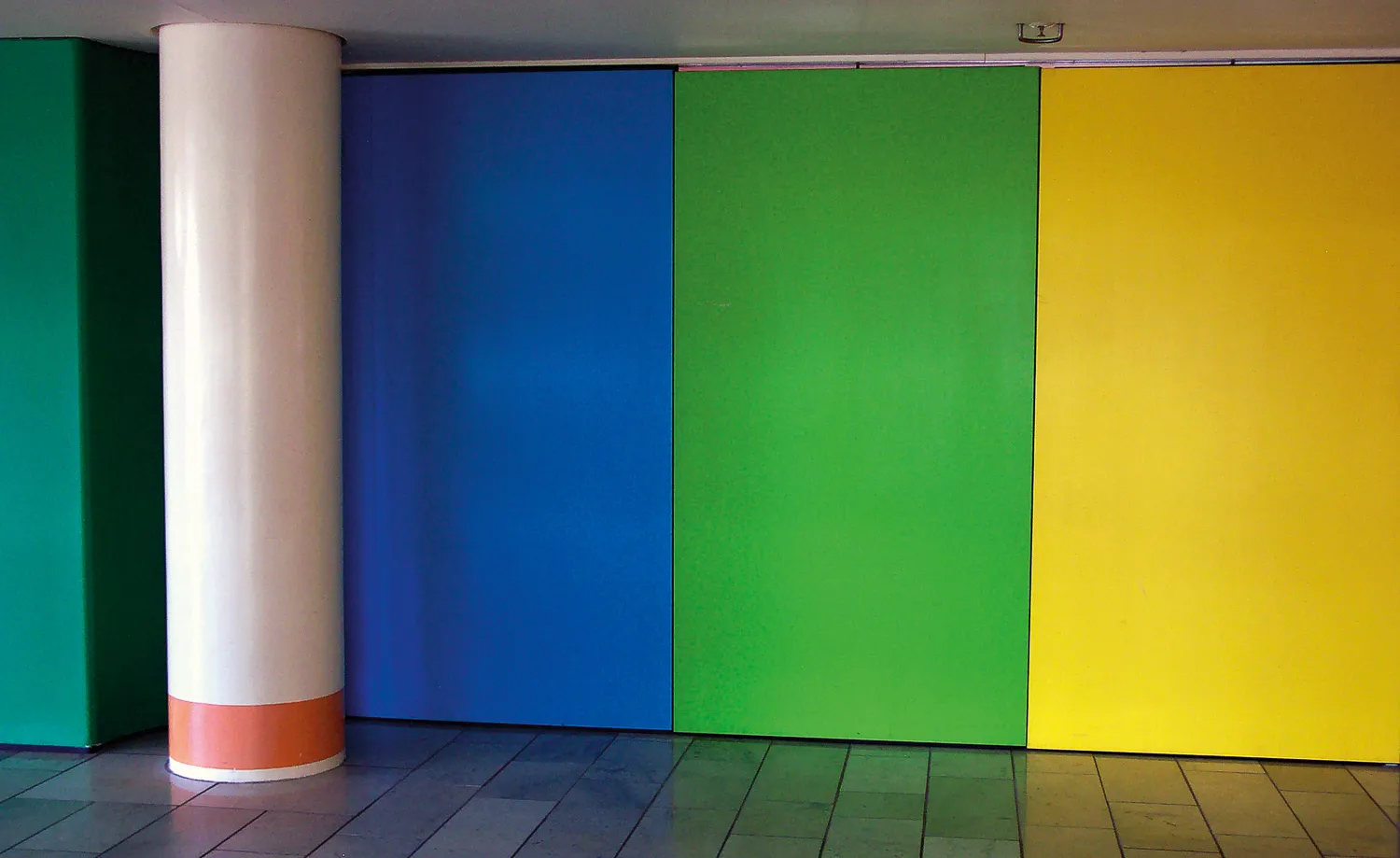
Since there are practical concerns behind almost all of the colour schemes in the building, something as fundamental as the floor has naturally also been embraced by the colourist programme. The blue flooring in the corridor areas has been chosen on the basis of considerations about traffic safety. Blue is generally considered to be the most “yielding” colour in the spectrum. You might say that it “pushes” forward in our field of vision everything that is placed in front of it or passes over it. At the same time, blue is a practical colour for a floor that is incessantly being worn down by pedestrian and light-vehicular traffic. Here the elderly and the very young, the sick and the healthy are moving amongst each other and here, electrically powered vehicles carrying different kinds of apparatus move to and fro.
The signposting in the hospital has been executed in such a way that that sign into the areas are blue, while those out are green. The blue triggers associations with the blue inside the hospital’s confines, while the green naturallyrefers to the lawn areas outside the building. Prohibitions, on the other hand, are signalled in red, as they are in road traffic.
In order to maximize traffic safety inside the building, the glass doors have been equipped with red borders. Corridor-transport trucks sport sensational cyclamen-pink stripes and the bumpers are red. Moreover, warning colours have been laid into the floors, and parking areas are marked with green. The transport vehicles are also coloured according to what loads they are carrying.
Ulrikka S. Gernes & Peter Michael Hornung: Farvernes Medicin / The Medicine of Colours – Poul Gernes og Amtssygehuset i Herlev / Poul Gernes and Copenhagen University Hospital at Herlev. Copenhagen 2003, p.62-64. Translated by Dan A. Marmorstein.
Artistic decoration can be experienced in most public and many large private buildings, and there are numerous fine and successful examples, such as Thorvaldsens Museum, Copenhagen City Hall, and Herning Art Museum in the former Angli factories, among others. However, few places have implemented the artistic vision as comprehensively as here, where every room reflects a single artist’s holistic concept and a determined realization that continues to captivate.
The artistic decoration was and is intended for the everyday lives of patients, their relatives, and the staff.
In this context, the hospital’s foyer serves as an overture to what users of the building will encounter throughout its spaces. Through the intervention of the Danish Arts Foundation, the hospital acquired two significant works—by Else Fischer-Hansen and Poul Gernes—which address all those who frequent this large building.
However, the architects and Poul Gernes aimed for more than foyer decoration. Poul Gernes’ ideas about a broad, popular art and the architects’ desire for a rich interior colour palette led to the trial of a polychromatic colour scheme in a full-scale test floor for the ward building, constructed at Gentofte Hospital. It turned out that the experiment resonated with both patients and staff, and, most importantly, with the decision-making regional politicians.
For Poul Gernes, the task of decorating and colour-coordinating a hospital aligned perfectly with his ethical and artistic principles of creating a popular, humanistic, and democratic art deeply integrated into everyday life.
Although Poul Gernes occasionally flirted with a “randomness principle” in the application of colours, his use of colour at Herlev Hospital is never random. He exclusively used pure, clear spectral colours, never mixed hues, and developed meticulously thought-out principles for the application of colours in the spaces, considering their function and orientation towards the cardinal directions. There were also specific guidelines for the colours of furniture, fixtures, and technical installations. Furthermore, considerations were made regarding wayfinding within the large hospital, as well as factors related to maintenance, budgeting, workflow, and cleaning procedures.
In 1977, the architectural firm Bornebusch, Brüel, and Selchau prepared an operational manual for Herlev Hospital, which detailed approximately 200 colour codes, types of paint, colours, manufacturers, and product numbers for the materials used in the construction. This section of the operational manual was expanded in 1983 with a colour manual prepared by the architectural firm Stærmose and Isager. This manual defined all applied colours with their NCS colour codes, specifying the paint type, gloss level, and application location. Poul Gernes himself approved this manual as the foundation for general maintenance and future modifications to the hospital building.
It is important to note that Poul Gernes’ colour scheme encompasses all the hospital’s floors, walls, and ceilings, as well as doors, door frames, baseboards, fixtures, signage, and built-in furniture. Additionally, he designed the colours for all loose furniture, curtains, hospital beds, and internal transport containers. The colour white, alongside the polychromatic hues, was deliberately included in the overall colour scheme.
In an unpublished appendix to the Operational Manual dated July 1, 1977, regarding Herlev Hospital’s colour system, the architect and artist listed the following:
The colour programme covers, beyond the ward building’s wall colours, which are oriented towards the cardinal directions (6 x 5 shades), the following main themes:
Door colours: There are 21 different colours, each indicating what lies behind the door. For instance, YELLOW 21 always leads to patient rooms, operating rooms, or senior staff offices. Colour 26 CYCLAMEN always leads to secretary offices, while Colour 31 BLUE always indicates examination rooms, doctors’ washrooms, induction rooms, etc.
Band colours: divide the hospital into treatment areas. For example, the maternity ward is recognizable by Colour 177 SPRING GREEN, while the ophthalmology clinic is identified by Colour 172 LIGHT BLUE.
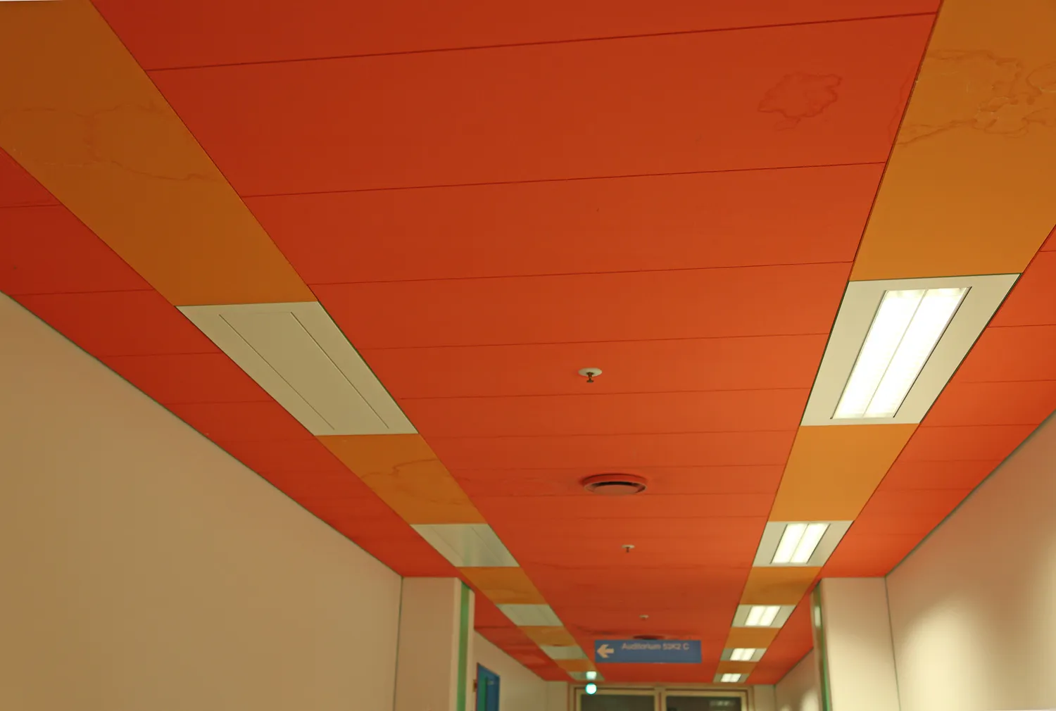
Doorframe colours: assist with orientation within the building. All frames in the southern row of squares are RED, the second row ORANGE, the third YELLOW, the fourth GREEN, the fifth BLUE, the sixth ULTRAMARINE, and the seventh VIOLET (the last two not yet implemented). Additionally, east-west corridor ceilings are WHITE, while north-south corridors have RED ceilings.
Fixtures: The towers in the ward building are aligned with the cardinal directions. RED, being the warmest colour, indicates south, while BLUE indicates north, and so on.
Flooring: In the treatment building’s corridors, two colours are used: BLUE marks traffic lanes, while GREEN marks parking areas. In the ward building, floor colours correspond to the cardinal directions: RED, ORANGE, and BLUE.
Transport Carts: These are also colour-coded. Clean, unclean, food, and medication transport are each assigned distinct colours.
Signposts: Colour is also incorporated into the signage. Directional signs leading into areas are BLUE, exits are GREEN, prohibition signs are RED, and other markings correspond to the colours of their respective areas.
Traffic Safety: Colours are also used for safety purposes: red edge strips on glass doors, CYCLAMEN striping on trucks, RED protective barriers, warning colours in floor coverings, and more contribute to safety.
Summary
On Colours: The above primarily concerns the practical use of colours.
On Environment: An equally important aspect of the colour scheme is its role in shaping the environment. The aim was to create a welcoming, engaging, and friendly atmosphere for the benefit of patients and their families, while also fostering a positive work environment for staff. A significant contribution also comes from the wide range of coloured details and a curtain programme offering extensive choice.
On Economy: Maintenance costs for repainting can be significantly reduced because the multicoloured interior is considerably more durable than the conventional hospital interior.
The quotation above does not explicitly state that the wall colours in the ward building are carefully attuned to natural light conditions characteristic of their orientation. Thus, cool blue and green shades dominate in rooms facing north, yellow and apricot shades dominate in east- and west-facing rooms, and warm red hues characterize patient rooms facing south. This colour scheme not only gives each room its unique character but also creates a striking visual effect when darkness falls, as the hospital’s interior lighting enhances the play of colours from the outside.
Additionally, it was the intent of both the architect and the artist that high-quality, preferably Danish, original art - including paintings and graphic works - should complement the overall decoration. These artworks were consciously placed in patient rooms, lounges, waiting areas, and staff offices, making Herlev Hospital home to a significant collection of graphic works by Danish artists.
Recommendation
The comprehensive artistic treatment of Herlev Hospital’s colour scheme makes this integrated work a unique achievement in modern Danish art and architecture.
The precise guidelines of the Operational Manual and Colour Manual have been followed in both maintenance and renovation work, with one notable and unfortunate exception on floor 03 of the ward building (Block 01). It has generally been possible to source current paint types and pre-coloured materials, ensuring that Poul Gernes’ artistic vision remains realizable.
The greatest challenges have involved the smallest details, such as switches, buttons, and installation outlets. Some margin must be expected when sourcing standard commercial products, though smaller, custom-ordered batches can often be produced to match specific colour requests. This was evident when a proposed reorder of Poul Gernes’ multicoloured clock for Herlev Hospital was considered.
A anecdote tells of the hospital’s first head nurse, who initially opposed Poul Gernes’ bright colours for hospital beds, believing that her patients should not die in a parrot-coloured bed. However, she later regretted this decision, and when additional beds were later procured for Herlev Hospital, the light blue colour was selected from Poul Gernes’ workshop through the intervention of Jørgen Selchau and Gehrdt Bornebusch.
Sven Felding: Herlev Hospital som Kulturarv – Bevaringsvejledning. Kulturstyrelsen 2014. Excerpt. Translation by Klara Karolines Fond.
Herlev Hospital, treatment departments
Photo: Finn Thybo Andersen
Herlev Hospital, treatment departments
Photo: Claus Jørgensen Muldstrup
Herlev Hospital, treatment departments
Photo: Claus Jørgensen Muldstrup
Herlev Hospital, treatment departments
Photo: Claus Jørgensen Muldstrup
Herlev Hospital, treatment departments
Photo: Claus Jørgensen Muldstrup
Herlev Hospital, treatment departments
Photo: Finn Thybo Andersen
Herlev Hospital, treatment departments
Photo: Finn Thybo Andersen
Herlev Hospital, treatment departments
Photo: Finn Thybo Andersen
Herlev Hospital, treatment departments
Photo: Finn Thybo Andersen
Herlev Hospital, treatment departments
Photo: Finn Thybo Andersen