painting
Untitled (Rockwool variation)
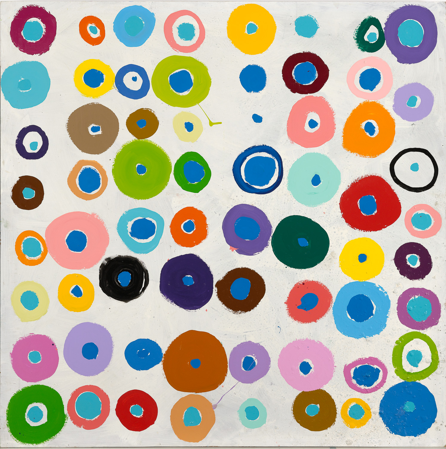
I believe this is not a completely insignificant painting – it is very kind, so kind that it is almost naive. It is also amusing. It is hardly self-important – even though, in a way, it is solemn enough. At the same time, it is forceful, firm, and tight, very straightforward without concealing anything, without trying to be condescending, clever, or overly intellectual. If it is also entertaining, communicative, and lively – which I myself believe – then it is possible that the painting is folksy, which I very much wish it to be, since being folksy is one of my ambitions.
Regarding the painting, it can be said that it is a preliminary work – for a decoration at a paint factory. The fact that it was a paint factory almost dictated the color scheme and the splatter painting. Much could be said about that, but there are two other aspects that should be mentioned. The first: although the painting appears chaotic, there is actually a system to it. There is one color that appears only once. Then there are 24 colors that appear twice each. Then there is one color that appears 24 times, and the last color appears 25 times. And why is that? Well, through experimentation, I have come to the conclusion that the human eye cannot manage or maintain an overview of more than 25 different colors.
The second aspect to mention here: the painting has numerous predecessors over the years of more or less the same kind, so it is not merely a random impulse. For instance, there is one hanging at Copenhagen County Hospital in Herlev, which is clearly a precursor.
I have also thought that the individual owner of “my painting” should choose for themselves which way is up and which is down. For no matter how it is hung, I do not believe it will take long before almost anyone will observe that there are four different images to choose from. Personally, at the moment, I prefer the orientation where the dark green figure sits at the bottom left. That figure, along with the three nearest ones, can form a small, isolated image, probably the most melancholic of all possible variations. If one – or I – then expands that small image by adding the nearest five elements to make a 3 x 3 grid, it becomes an entirely different and much less melancholic picture, which is calm and neat compared to the much more boisterous and lively one formed, for example, by the nearest 3 x 4 grid to its right.
And finally, I would like to take this opportunity to say that, contrary to many of my colleagues, I believe that a reproduction of a good painting is far more valuable than a lot of original graphic art. For no matter how inaccurate the colors, how poor the reproduction, or how unfortunately the paper has been chosen, a good painting will always endure, will always remain present. If the good painting is not only good but also an original work of art, then some of the aforementioned difficulties might even be advantageous for the painting. That last point was a bit subtle.
Poul Gernes: About my painting. Attached to the Rockwool poster under the following heading: “Rockwool A/S hereby thanks you for the past year and wishes you a happy and prosperous 1980.” Translation by Klara Karolines Fond.
Untitled (Rockwool variation)
Photo: Anders Sune Berg