Exhibition
Exhibition
LOVE & CHERRIES - Poul Gernes in Aars
Catalogue: Ulrikka S. Gernes and Bibi Saugman Henriksen (ed.): Kærlighed & Kirsebær – Love & Cherries: Poul Gernes i Aars. Frederiksberg, 2020.
Along with the cave paintings’ depictions of animals rendered in red ochre and black pigment, ornamentation is – we might suppose –human beings’ very first artistic expression. A sequence of indented imprints of a fingernail touching an earthenware pot. Scratches made with a sharp stone into a bone implement. Or etched on, like the elegant patterns we can see on The Skarpsalling Pot, with the edge of a cockleshell and a severed tubular bone from a bird.
Beauty created from nearly nothing. It resembles music, the rhythmical expression of the ornament. This is surplus, joyfulness. A quiet exuberance embedded into a decorative border-edging, along the rim of a bowl. On a handle. Decorative embellishments that have no other function than to beautify. Love, implicitly. Unfurled in patterns. To make beautiful an everyday utensil, to infuse it with dignity, to decorate it in order to make the very use of this object a pleasure and simultaneously add to it a value beyond its mere usability. An inherent element of reverence. Human beings decorate, too, in order to please the Gods, whoever they might be, so that they’ll look with mercy upon our destiny!
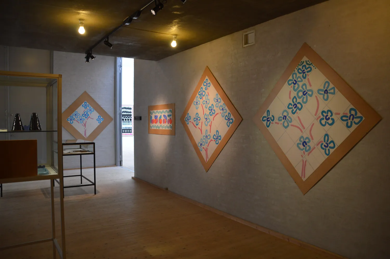
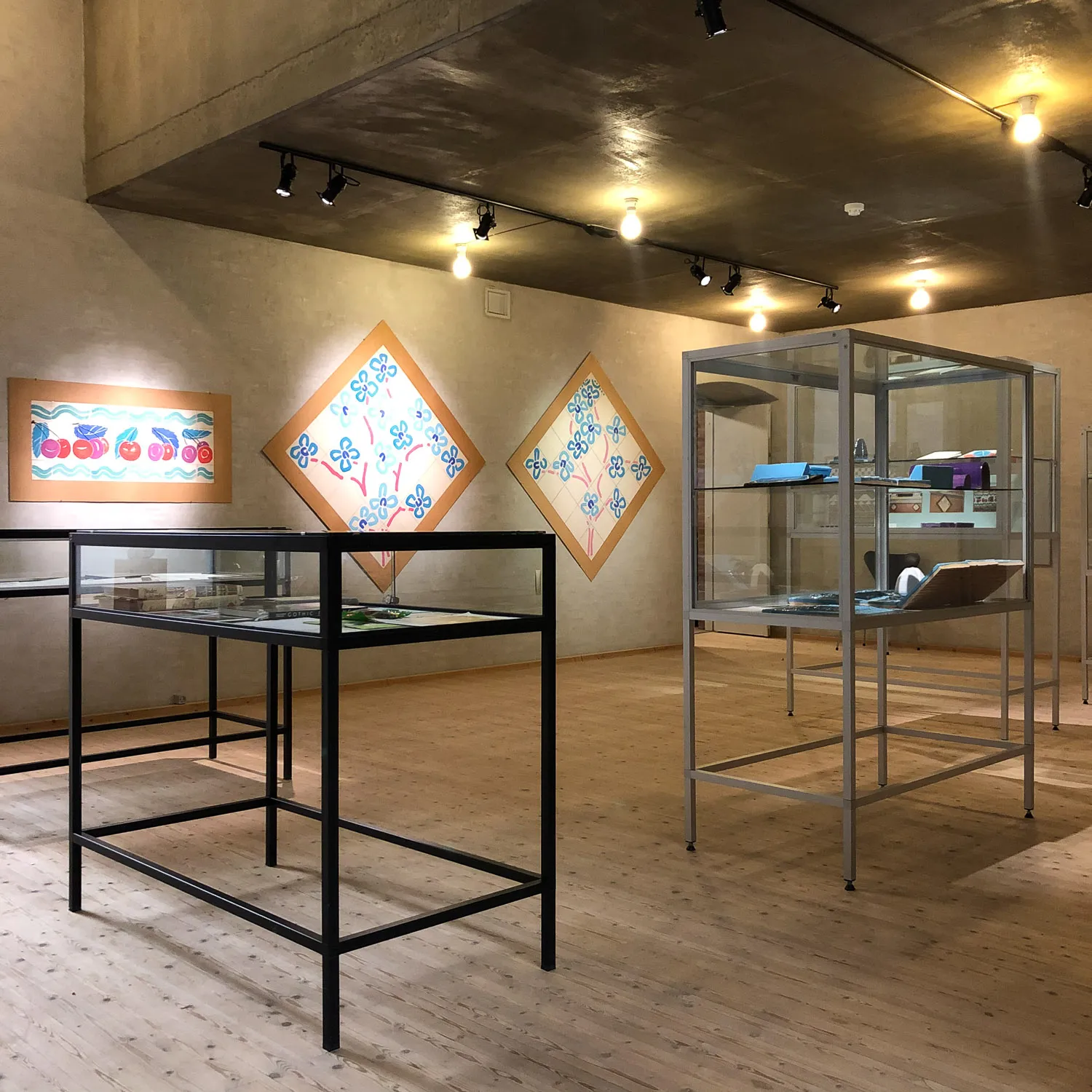
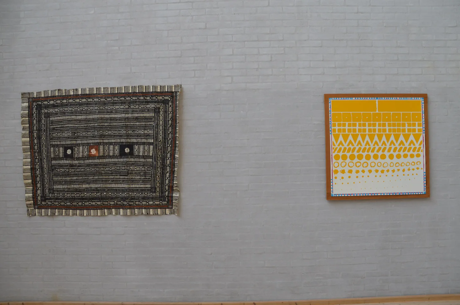
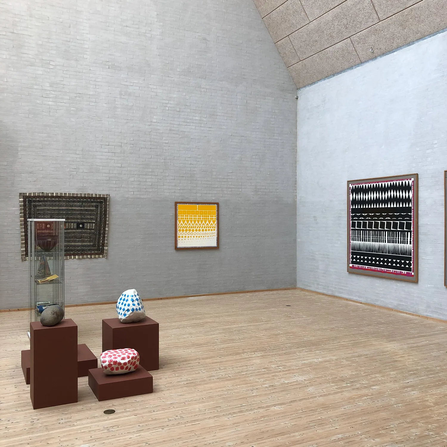
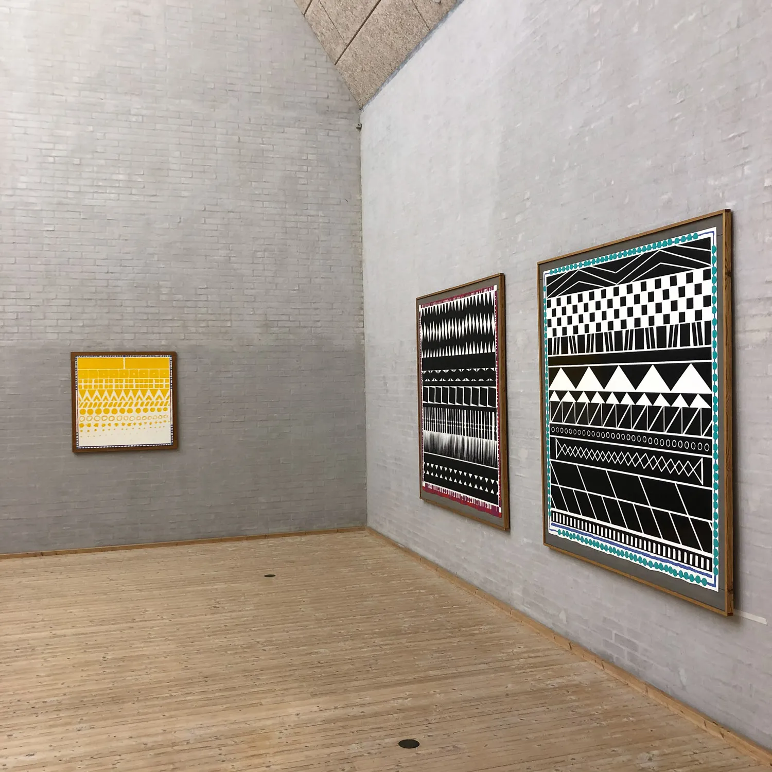
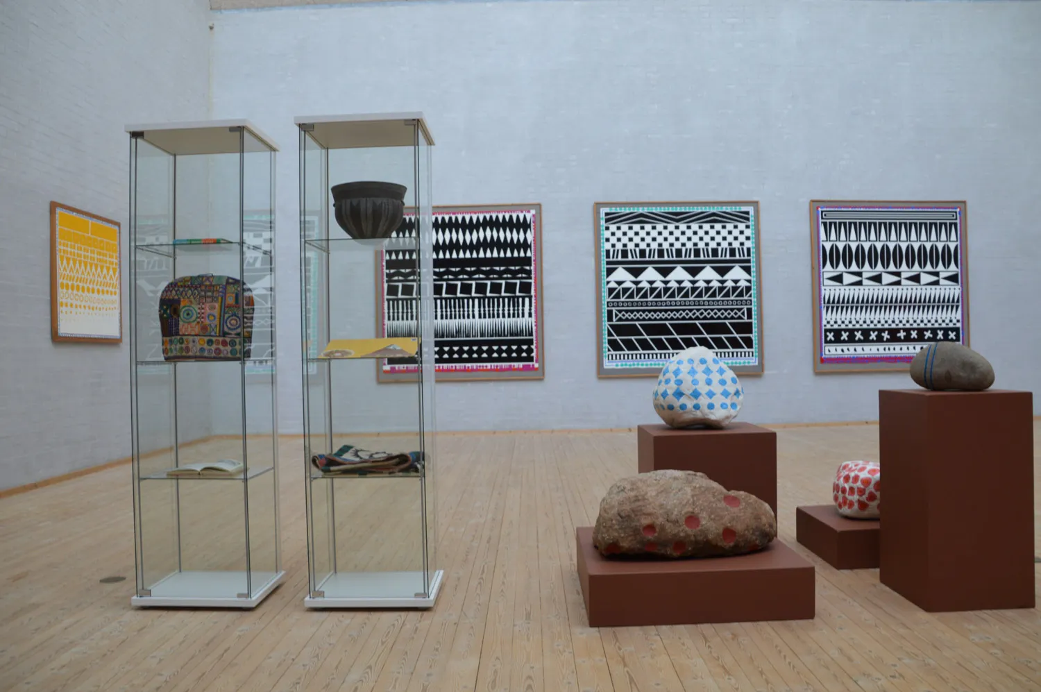
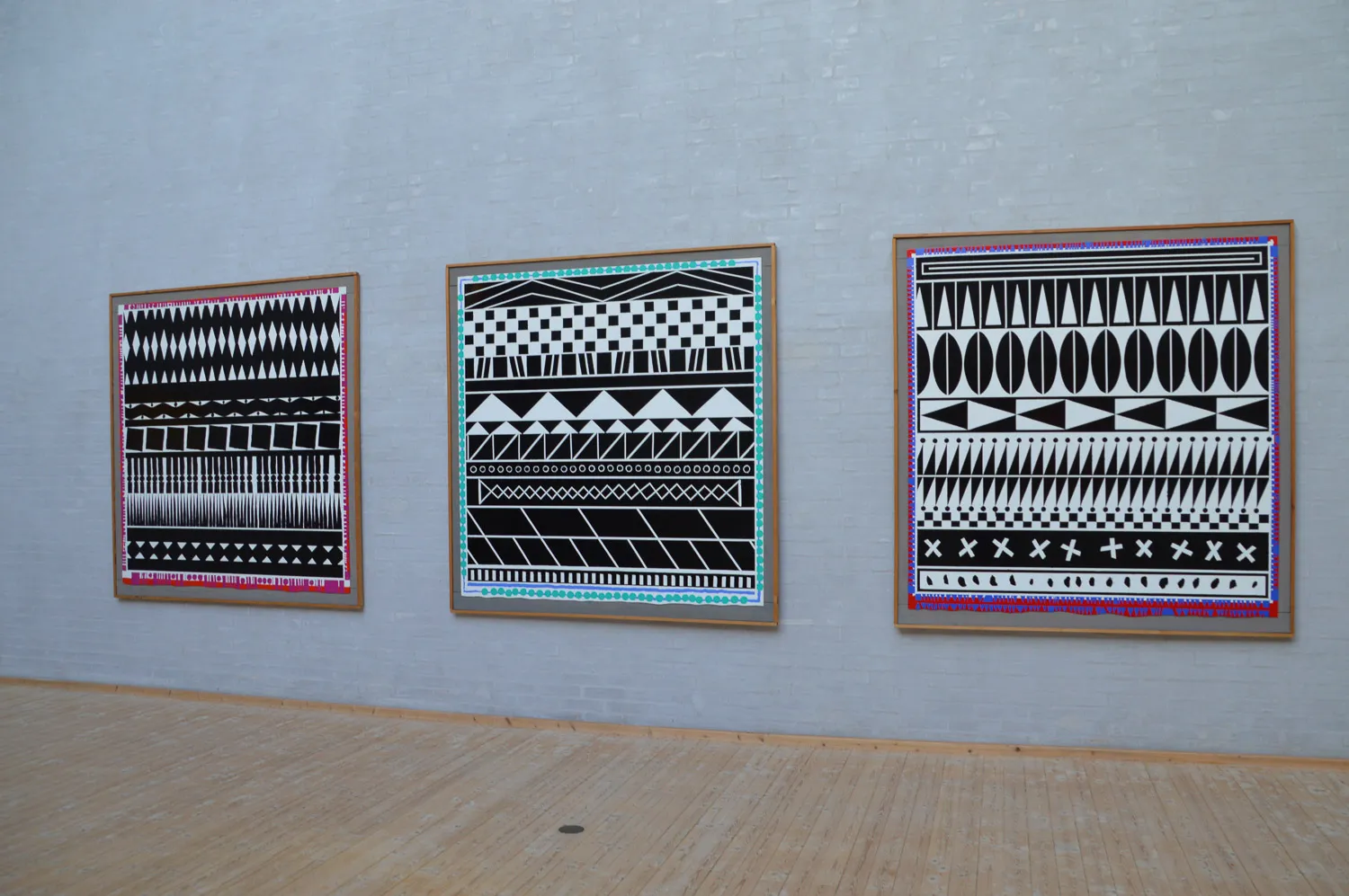
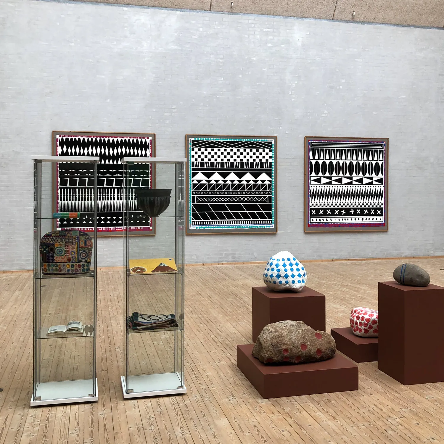
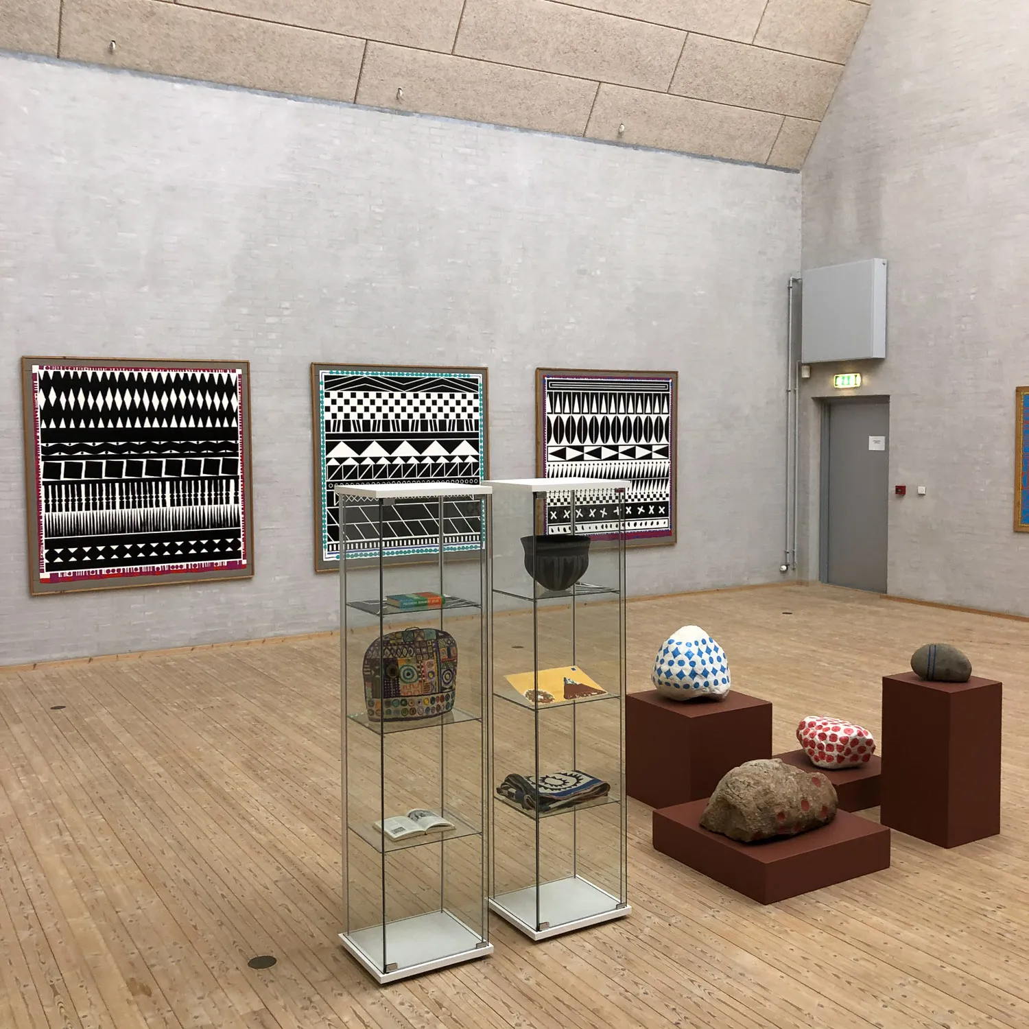
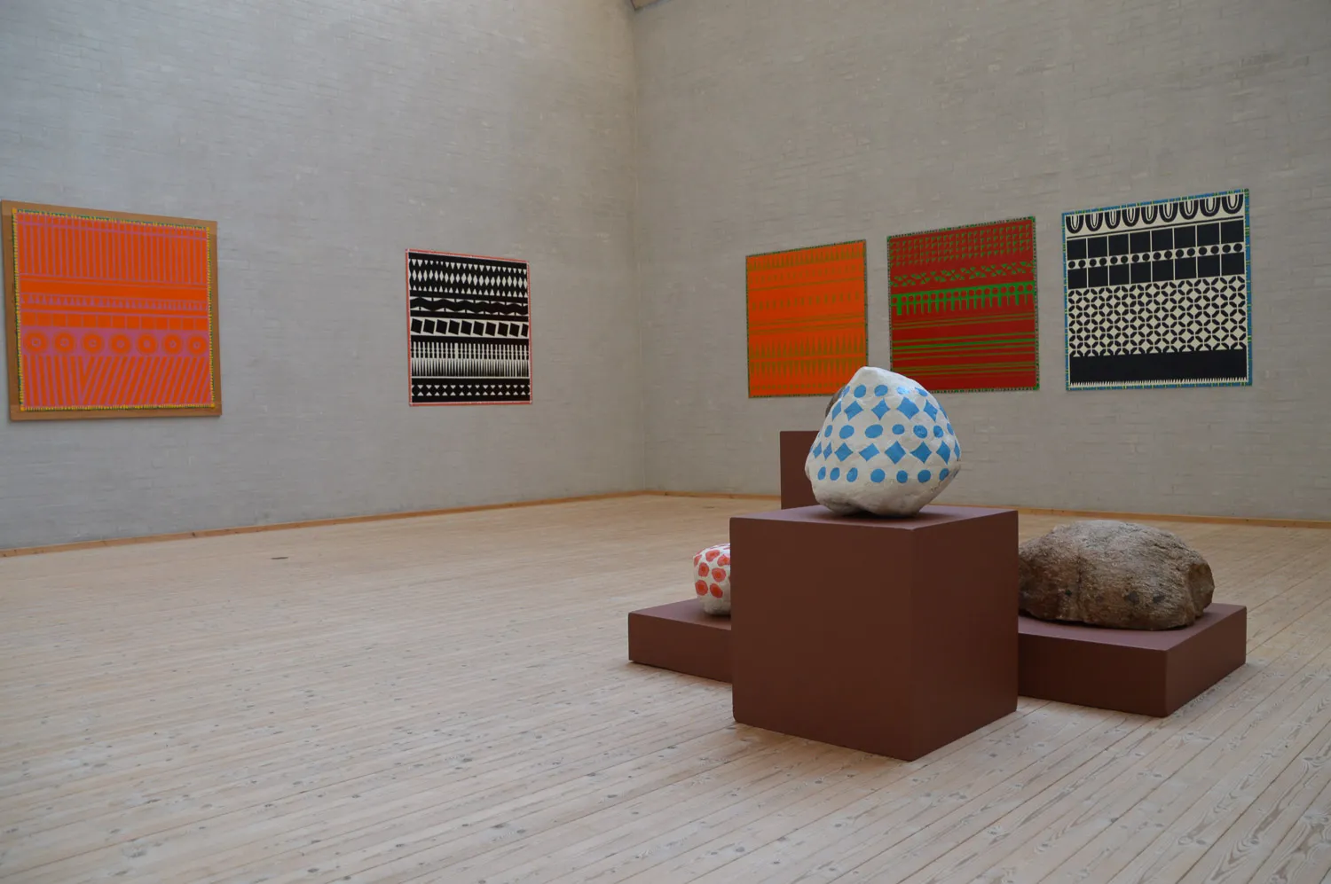
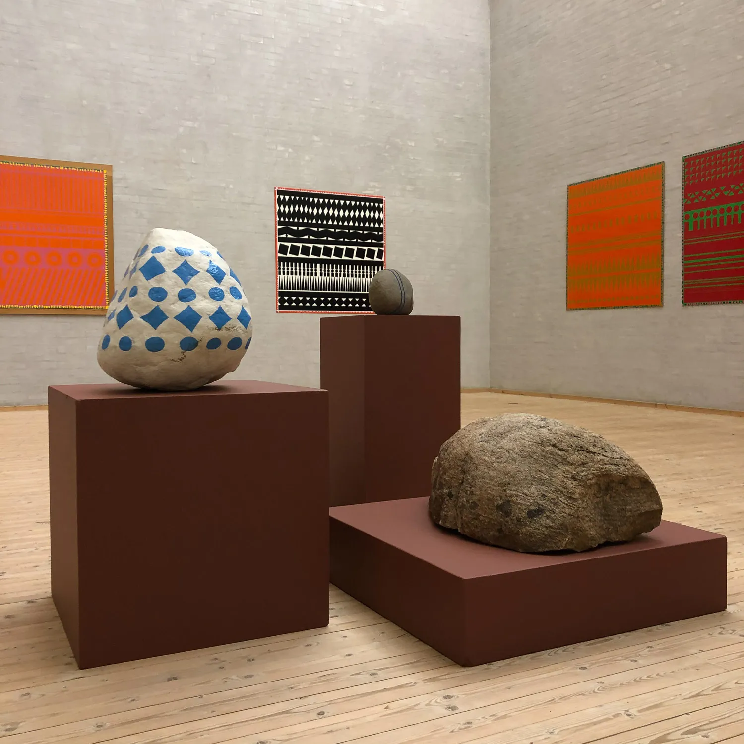
In the ornamental paintings created by my father, Poul Gernes, seemingly endless geometrical patterns are captured in fragments. A segment of eternity seized and framed in by a slender colourful edge. A moment arrested. It reminds us of the brevity of life. Is one’s life only fully consummated once one is dead? Was this the reason why Per Kirkeby, who was tremendously preoccupied with Poul’s ornamental paintings, and who wrote extensively about them, described them as ”melancholic” and ”tragical”? Or was it the black colour that served as the explanation for drawing such a comparison? Poul rarely used black in his paintings even if black-and-white is, graphically, an elementary substance, and black-and-white ornamentation an original expression.
How is one supposed to decipher these ornamental paintings? As a text, perhaps: start in the upper left corner and follow the lines. What story is being unfolded in this wordless language? What is the painting saying? The human brain is always alert and willing: it insists on finding meaning, insists on finding connections. Try, for yourself: the picture tells a story; it’s a little like reading a poem. It’s language. You can understand it and yet you don’t really understand it, fully, because language is being used here in a different way. Traces of symbols, signs, Morse codes communicating with galaxies far beyond our solar system: visual poetry? Why not? The intention of the artist is a swarm of possibilities that turns the viewer into a co-creator. The work is open, democratic. Everyone can be part of it.
It was important to Poul that his work did not carry a message, certainly not one that would depend on interpretation. He wanted his paintings to be decorative and to communicate directly with the viewer, without needing explanation or interpretation. No intermediate mediation between the work and the viewer should be necessary. Not even in form of a title. He would never have used the word “art work” to denote his paintings. Nor would he have called them “pieces”. In my father’s vocabulary, “works” were associated with “masterpieces” – and those come along only seldom. He was always striving for the sublime. Anything falling short of this simply wouldn’t do. However, only posterity will be able to determine whether what we have here are masterpieces.
What did Poul want these paintings to accomplish? What were his intentions? Everybody asks, nobody knows. This is my teenage daughter’s reply to most occurrences that one doesn’t necessarily have the ability (or the inclination) to explain. Poul sometimes spoke about intention as a phenomenon: that it can be so overgrown that one cannot catch sight of what one has done because what one sees is only the intention itself, while the result might not even come close to the level of the ambition. One has got to put the piece away and let oneself be permeated by new, other intentions, and time has to pass before one can judge whether or not one has succeeded in one’s pursuit. The original intention has to be flushed out of the system, out of the eyes, before one will be able at all to see again. I know about this from my own poems. I easily get seduced by something I’ve just written. Not until much later am I able to judge whether the poem works. Or not. Artistic production includes a vast amount of waste.
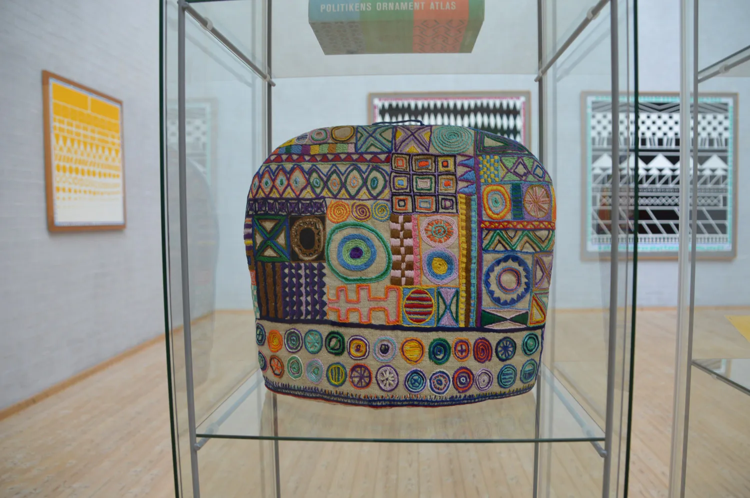
Quite often, not even the artist will fully fathom his or her own intention, but is in the pursuit of a thought, an idea, a sensation, something – which will have to be tested out, tried out. You want to find out how it works. And inspiration. Well, on this note, The Skarpsalling Pot is a close relative. Or aboriginal bark paintings, Egyptian tombs, Central Asian embroidery, religious frescoes, folklore, and so-called “primitive” art. Folk art in general, going all the way back to the cave paintings. Poul was merely placing himself in the slipstream of a global tradition, an archaic artistic expression, which he endowed with his own personal imprint, in enamel paint on Masonite.
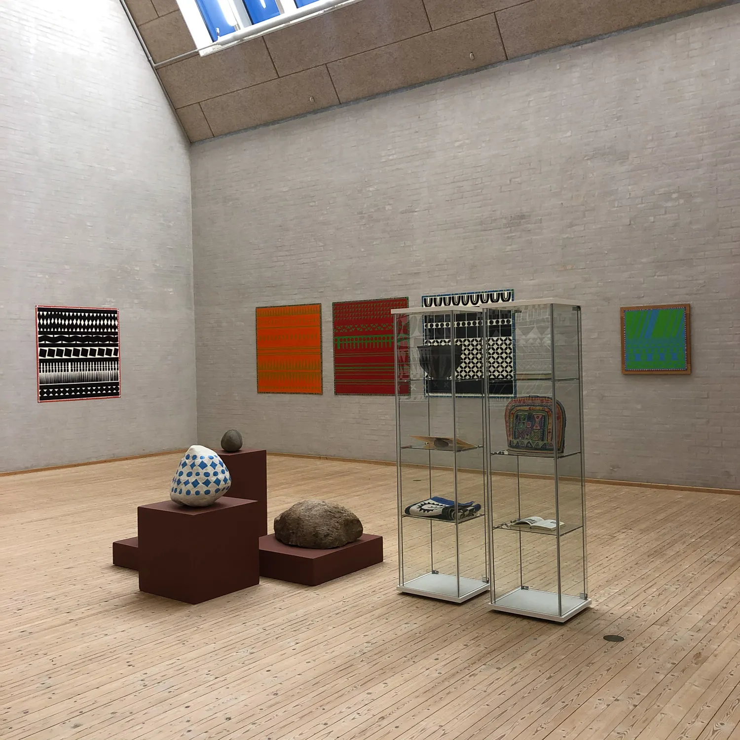
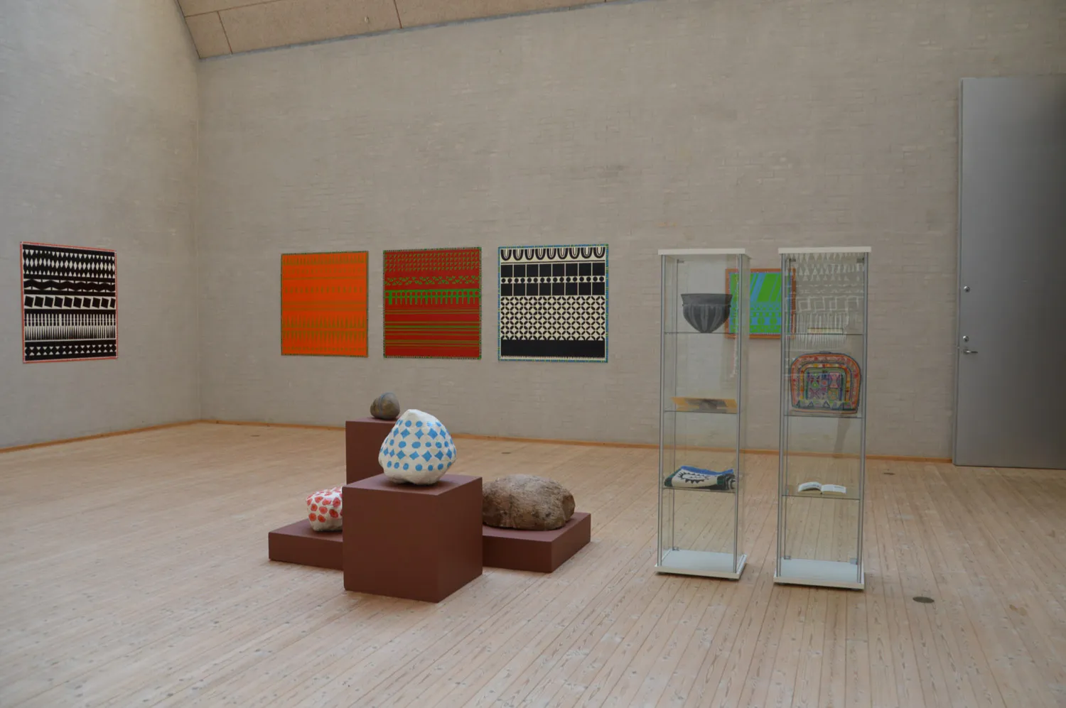
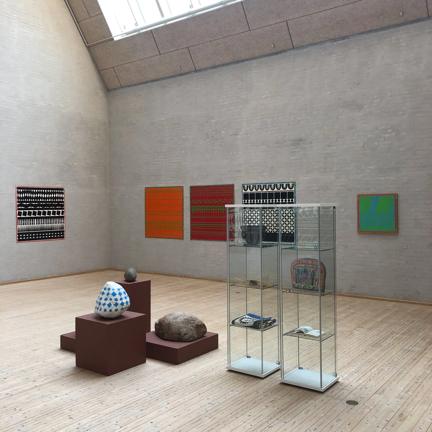
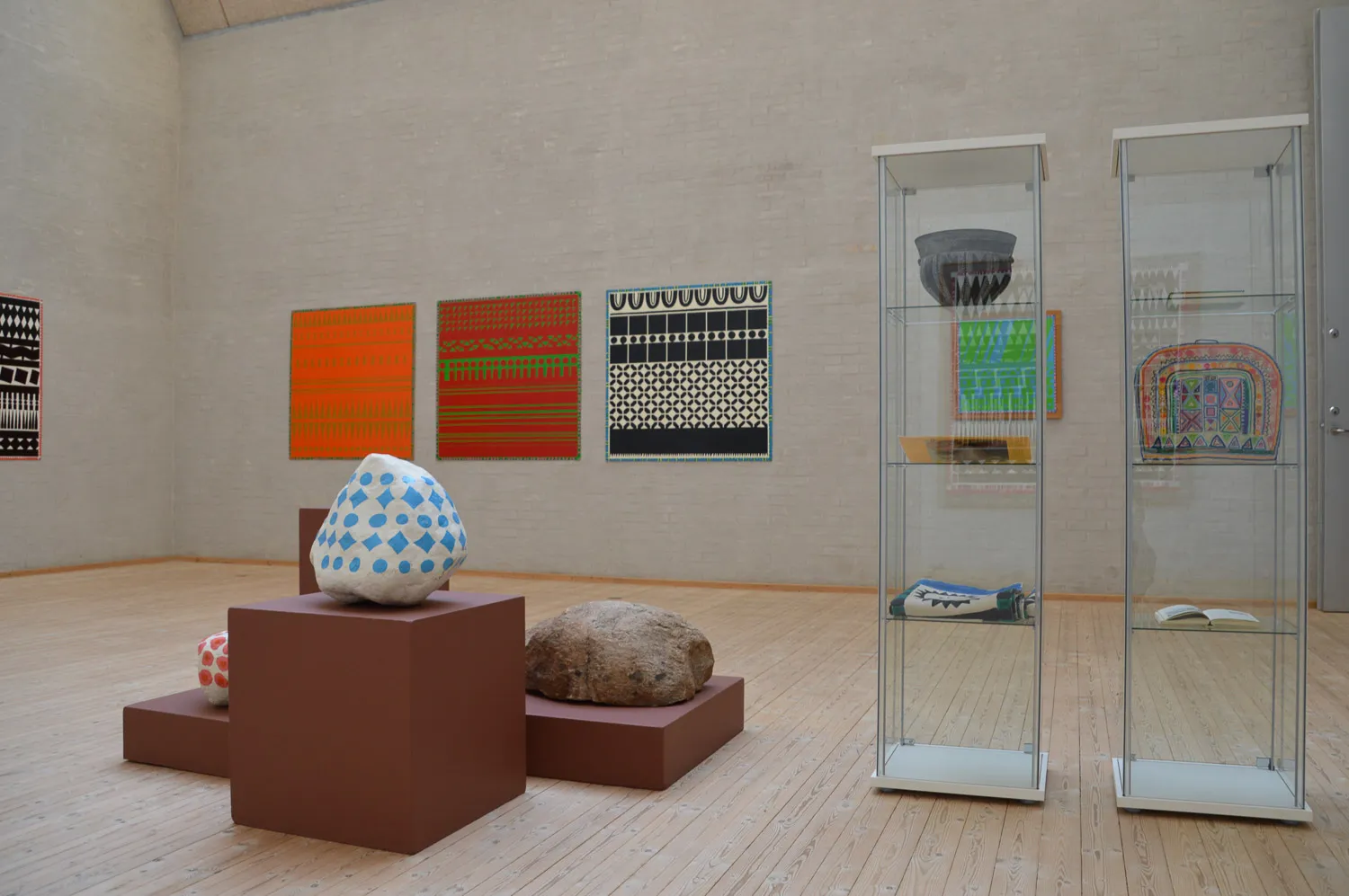
Poul executed the black-and-white ornamental paintings during a period in the beginning of the 1980s. Since that time, these paintings have been exhibited numerous times. As always, using enamel paint on Masonite boards – inexpensive, unpretentious and readily available materials. Most of these paintings are now part of private collections and museum collections, in Denmark and abroad. Three of the large ornamental paintings are installed at the high school in Aars: one in the headmistress’s office, two in the staff room.
The smaller of the ornamental paintings were painted in our home in Sweden by Poul himself. It was partly with the help of assistants that the larger ones were made, on Rosenørns Allé in Frederiksberg where Poul, together with Peter Louis-Jensen and some of the artists from the Arme & Ben group, had rented spaces for a while in a dilapidated industrial building that was soon scheduled to be torn down.
De Unge Vilde (The Young Wild painters) were also spending time on the premises and Værkstedet Værst (Workshop Worst) had its studio community on the ground floor. There was some measure of interaction between the generations; this could best be likened to that which happens between parents and teenagers, and certainly the discussions were heated. In the same building, the Fredsted Tea Company also had storage space. On the staircase, you were met by the combined aromas of bergamot oil and enamel paint. Peter was going through a somewhat homeless phase in his life and he kept a bed there. Poul and Aase – and sometimes me, too – would spend the night there when we were staying over in Copenhagen.
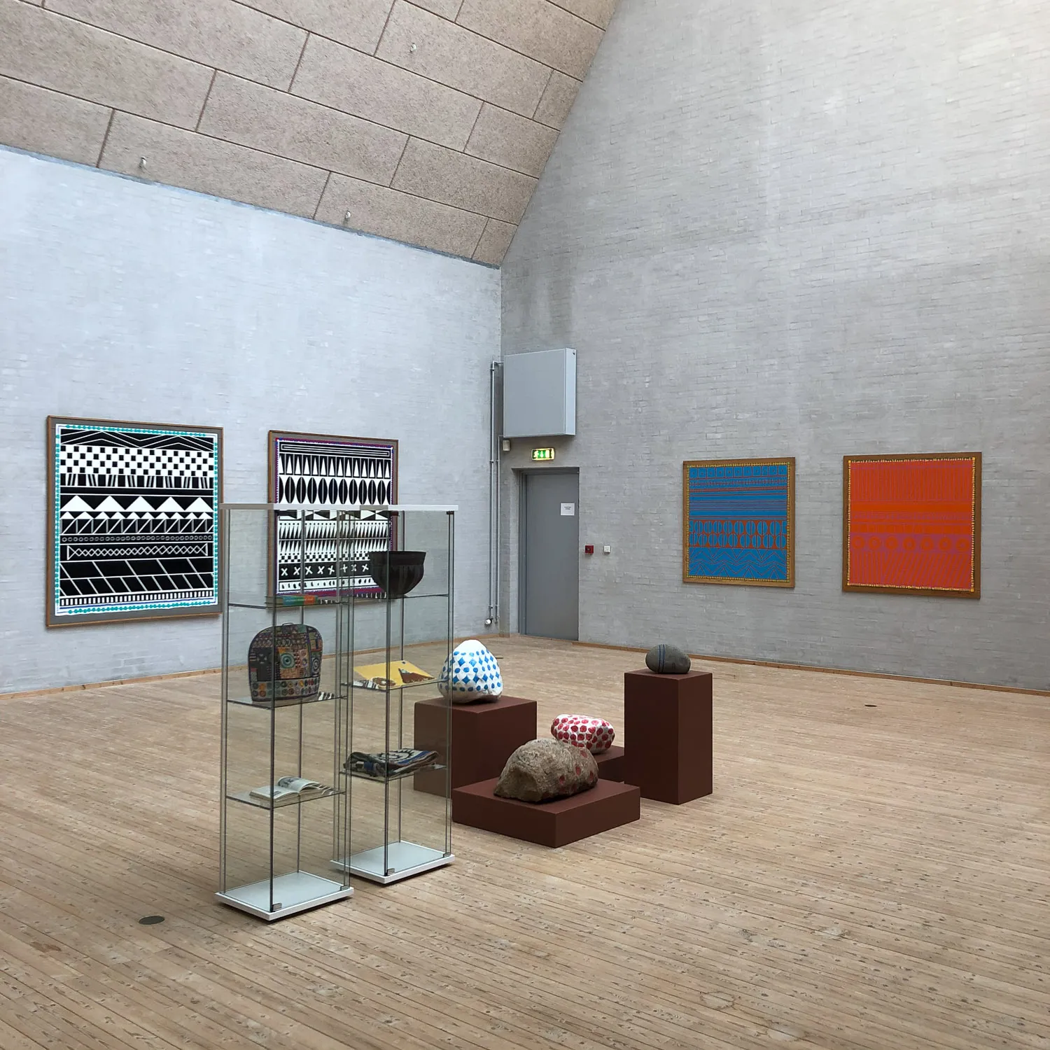
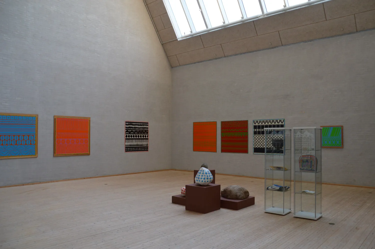
Perhaps it was also for purposes of trying out the ornamental idea in colour that Poul created a smaller number of ornamental paintings in various colour combinations on coloured backgrounds. These paintings are not in possession of the same serial character as many of Poul’s other paintings; they were more like singular – individualised – paintings. The ornamental paintings were actually the last of the ”loose” works from Poul’s hand. During those years, he had a squaring of accounts with the art world, which spurred him on to devote his time exclusively to making site-specific decorations for the remainder of his life. In his view, site-specific works contributed to a beautification of society and since site-specific works were painted directly on the walls, these works would naturally not be susceptible to being included as any part of the art market’s elitist and commercial circulation.
Per Kirkeby must have overlooked the coloured ornamental works. Once, when was I visiting Per in his home on Øregårds Allé in Hellerup, our conversation touched upon Poul’s ornamental paintings. By way of a casual remark, I must have told Per that I happen to know that these works existed in colours, too. For instance, I had a chrome yellow ornamental work hanging on the wall in my home. Per nearly went into shock. Chrome yellow?! All of a sudden, it didn’t add up for him any longer: the tragical, the whole thing about the melancholic — that can’t be chrome yellow! Just when you think you’ve cracked the code pertaining to the work, the artist is going to break the rules that he (perhaps) has set up for himself.
The immediately readable expression, the patterns, the ornaments, the stylized flowers, the pure colours. Anyone can understand it, relate to it, and enjoy it. It has a both relieving and vitalizing effect on the senses, like something that one recognizes and thus does not feel alienated by. Those are the fundamental elements in all the site specific public decorations that Poul and Aase executed before Poul passed away in 1996. Aase continued doing the work afterwards. I helped her whenever I could. We completed works that had been started before Poul’s passing, and Aase also was entrusted with a number of commissions of her own: mostly having to do with designing colour schemes. She worked diligently with a great albeit a solitary force, until she suffered a stroke in 2007. The stroke knocked her out, for some time, and paralyzed her on the right side of her body, and also robbed her of both her spoken and written language, which was the worst part of it all. A severe aphasia. Nonetheless, the stroke did also push her out into coming up with a new artistic expression, wherein she was using her left hand and working with felt-tip pens on paper. It is with these means that she continued to enrich the world until shortly before her own passing in August of 2018.
It was always Aase who mixed the colours. She tuned up and adapted a different and individualised palette for each and every space we decorated. “Gernes colours” rightly ought to be called “Aase colours.” But Aase and Poul didn’t care too much about matters like this, themselves. Other things were of greater importance in Aase and Poul’s artistic world — [their] art should be of use, should improve, should beautify. It was all at once a playful and a deeply serious endeavour. Both of them were trained, in their youth, in respective fields of crafts: Aase as a trained textile printer and Poul as a trained lithographer. Their entry into and their approach to art thus sprung, from the very outset, from handicraft. They were thorough, and diligent and they carried out most of the many site-specific works together, even if Poul was the one whose personality took up most of the space, with his full beard and his uncompromising attitude. Without Aase’s loyal and devoted partnership, Poul would never have managed all that he accomplished. But who did what was subordinate to them, as long as the result was satisfying.
I spent a major part of my childhood, my youth and my early adulthood as a member of the “painting company” I wanted to become a poet and being a periodic co-worker suited me just fine. There was always a need for hands in the busy decorating enterprise. I was intimately familiar with the “language” and the work: I had learned it at my mother’s knee and had it in my blood. In those years, we lived like a nomadic family: we organized the work, prepared our tools, stencils and stamps at home, packed the car with paints and various utensils, and took off. To many different places: schools, factories, town halls, hospitals … We arrived, unpacked, put up the stencils, got started on the work. We usually had to finish the work before the local staff would be returning to work on Monday morning. Often, we worked under pressure. There were nerves and there were mood swings involved. But usually, it all ended on a high note. The colourful results grew from under our hands; patterns, ornaments, stylized flowers. We slept on the floor in classrooms, in office spaces or at the local hostels. I can hardly remember all the places we decorated, what we did where, or one place from the other. It was everyday humdrum, routine and steady work. It was fun. And it was a little crazy.
Poul had a burning desire to educate “decorators” so that the work could be continued by future generations. He devoted his professorship in the Department of Wall and Space at the Royal Academy of Fine Arts in Copenhagen to this specific endeavour. But since he didn’t attract enough “real” academy students to enrol in his program, the headmistress of the Academy (Else Marie Bukdahl) allowed my father, in an altogether extraordinarily arrangement, to advertise for students — then, students came scurrying in from all directions. As a “master,” Poul generously shared his knowledge and his experience with his “apprentices.” He lavishly handed out professional tips, techniques, methods, and he explained his ideology and offered his ethical guidance within the field of site-specific decoration, wishing that others would take over and continue doing the work, as if it were of paramount importance. This was what was important to him. In any event, it was the end of an era that ended when he passed away, and the end of another era when, twenty-two years later, Aase followed him. What now remains is their incomparable and brightly colourful imprint on the world: their art.
To climb the tree with ardent zeal, even while wearing one’s finest silk dress and flimsy sandals, to the great annoyance of the birds that are also eyeballing the voluptuously ripe and juicy cherries. My favourite berry! All that sweetness, nearly ecstatic. Insatiable, with juice running down from the chin. Nearly out of breath, one is spitting out cherry pits, in all directions. But antecedent to this: the unadulterated blossoming! A blessing, that quivering floating vision, and the pale pink snow of the withering process. In Japan, the sakura is a nearly religious worshipping of the cherry blossom. That also reminds us of the volatile brevity of life. Will we be here to see the blossoms next year?
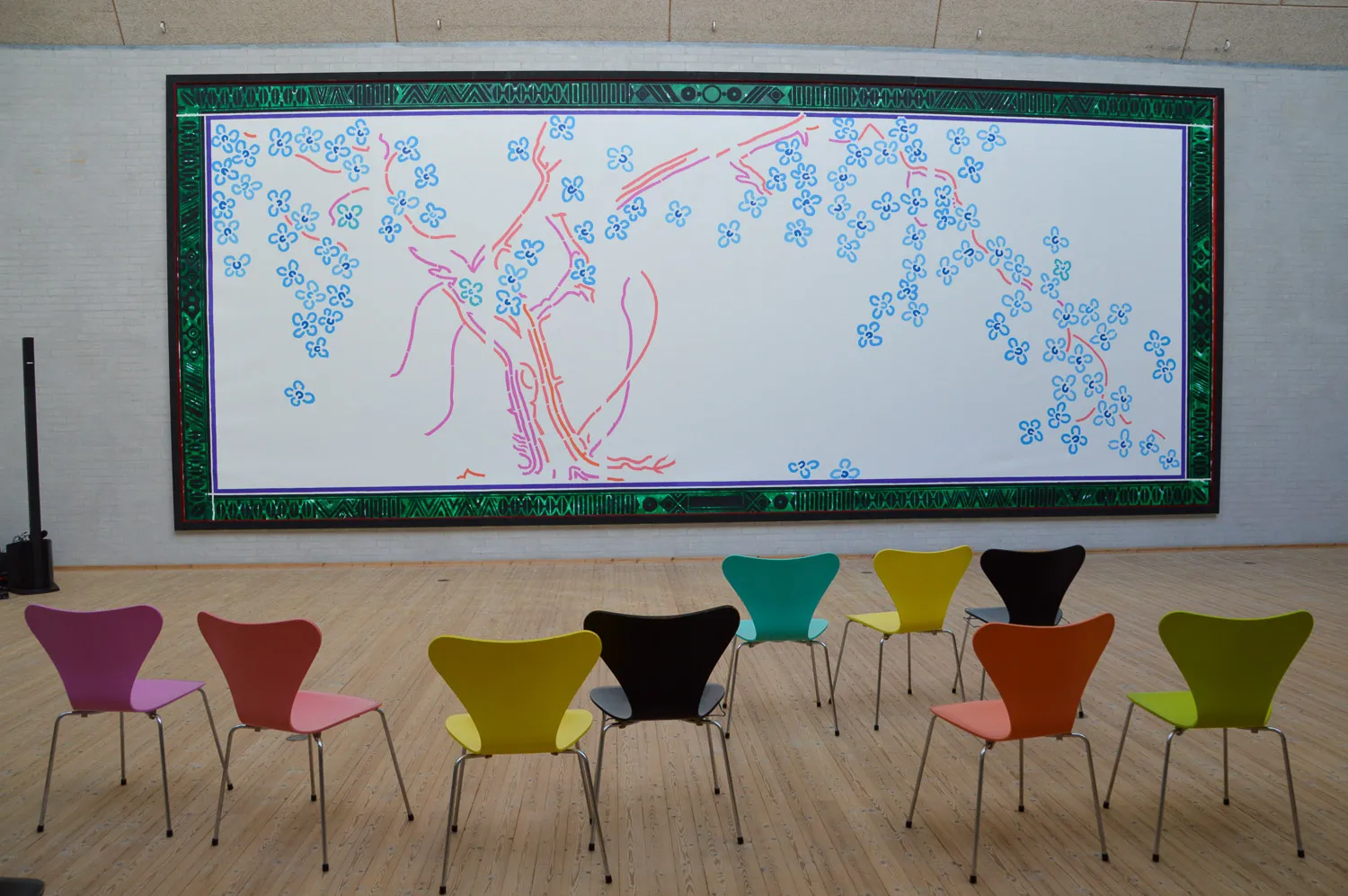
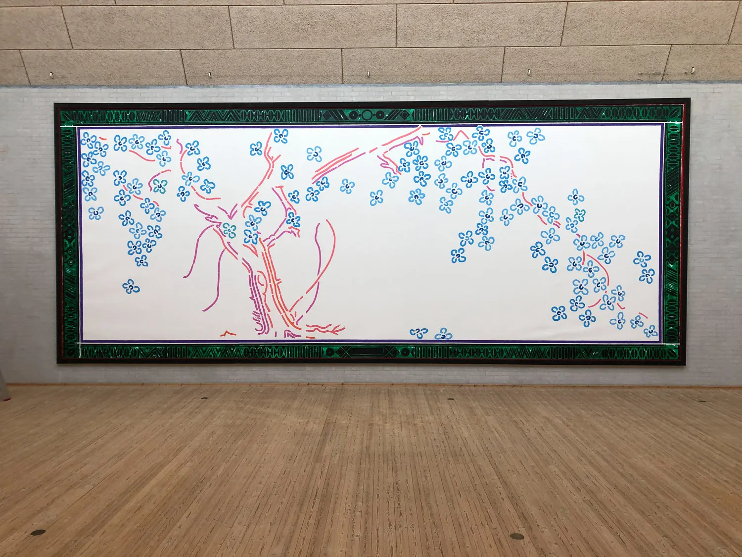
At the high school in Aars during the Easter break in 1983, I wasn’t climbing the tree but rather a tall ladder, wearing my work clothes in order to roll paint into the cut-out holes of stencils created from heavy brown wrapping paper which, after they were lifted carefully off the folding wall in the hall of the school, laid bare the old cherry tree and its lavishness of fine stylized blossoms. It was a joy that is closely related to the pleasure of devouring cherries because it was so very beautiful! This was the kind of work that made the person performing it tremendously happy.
In the following year, we repeated the process. Only this time, with the stencils laid flat on a 4.5 metres tall and 10 metres wide piece of canvas. This time around, the work was to be rolled up and sent to Japan, on the occasion of an invitation to participate in a group show at the Toyama Museum. We were crawling around on all fours on top of this enormous expansiveness. Nothing was too large. Nothing too small. The cherry tree was framed in by an ornamental border-trimming at the edge of the canvas: the organic and the graphic were being united. Nature and culture.
Poul’s courage still makes my heart beat faster when I think about him sending a 45 square meter large painting of a blossoming cherry tree to Japan! Intention and inspiration melt together. Bold yet obvious: the Japanese people certainly love cherry trees. In this case, they were getting one that had been filtered through Poul’s artistic sensibility and adorned with Aase’s bright colours united in a commonly shared aesthetic.
Who wouldn’t have dearly wished to be a fly on the wall at that exhibition?
Ulrikka S. Gernes: “On ornamentation and a little bit on cherries.” In Ulrikka S. Gernes & Bibi Saugman Henriksen (ed.): Kærlighed & Kirsebær – Love & Cherries. Poul Gernes i Aars. Frederiksberg 2020. Translated by Dan A. Marmorstein.
KÆRLIGHED & KIRSEBÆR - Poul Gernes i Aars
Photo: Ulrikka Gernes
KÆRLIGHED & KIRSEBÆR - Poul Gernes i Aars
Photo: Anders Sune Berg
KÆRLIGHED & KIRSEBÆR - Poul Gernes i Aars
Photo: Anders Sune Berg
KÆRLIGHED & KIRSEBÆR - Poul Gernes i Aars
Photo: Ulrikka Gernes
KÆRLIGHED & KIRSEBÆR - Poul Gernes i Aars
Photo: Anders Sune Berg
KÆRLIGHED & KIRSEBÆR - Poul Gernes i Aars
Photo: Anders Sune Berg
KÆRLIGHED & KIRSEBÆR - Poul Gernes i Aars
Photo: Ulrikka Gernes
KÆRLIGHED & KIRSEBÆR - Poul Gernes i Aars
Photo: Anders Sune Berg
KÆRLIGHED & KIRSEBÆR - Poul Gernes i Aars
Photo: Ulrikka Gernes
KÆRLIGHED & KIRSEBÆR - Poul Gernes i Aars
Photo: Ulrikka Gernes
KÆRLIGHED & KIRSEBÆR - Poul Gernes i Aars
Photo: Ulrikka Gernes
KÆRLIGHED & KIRSEBÆR - Poul Gernes i Aars
Photo: Ulrikka Gernes
KÆRLIGHED & KIRSEBÆR - Poul Gernes i Aars
Photo: Ulrikka Gernes
KÆRLIGHED & KIRSEBÆR - Poul Gernes i Aars
Photo: Ulrikka Gernes
KÆRLIGHED & KIRSEBÆR - Poul Gernes i Aars
Photo: Ulrikka Gernes
KÆRLIGHED & KIRSEBÆR - Poul Gernes i Aars
Photo: Ulrikka Gernes
KÆRLIGHED & KIRSEBÆR - Poul Gernes i Aars
Photo: Ulrikka Gernes
KÆRLIGHED & KIRSEBÆR - Poul Gernes i Aars
Photo: Ulrikka Gernes
KÆRLIGHED & KIRSEBÆR - Poul Gernes i Aars
Photo: Anders Sune Berg
KÆRLIGHED & KIRSEBÆR - Poul Gernes i Aars
Photo: Ulrikka Gernes
KÆRLIGHED & KIRSEBÆR - Poul Gernes i Aars
Photo: Anders Sune Berg
KÆRLIGHED & KIRSEBÆR - Poul Gernes i Aars
Photo: Anders Sune Berg
KÆRLIGHED & KIRSEBÆR - Poul Gernes i Aars
Photo: Anders Sune Berg
KÆRLIGHED & KIRSEBÆR - Poul Gernes i Aars
Photo: Ulrikka Gernes