Decoration
Decoration
Vestervang School
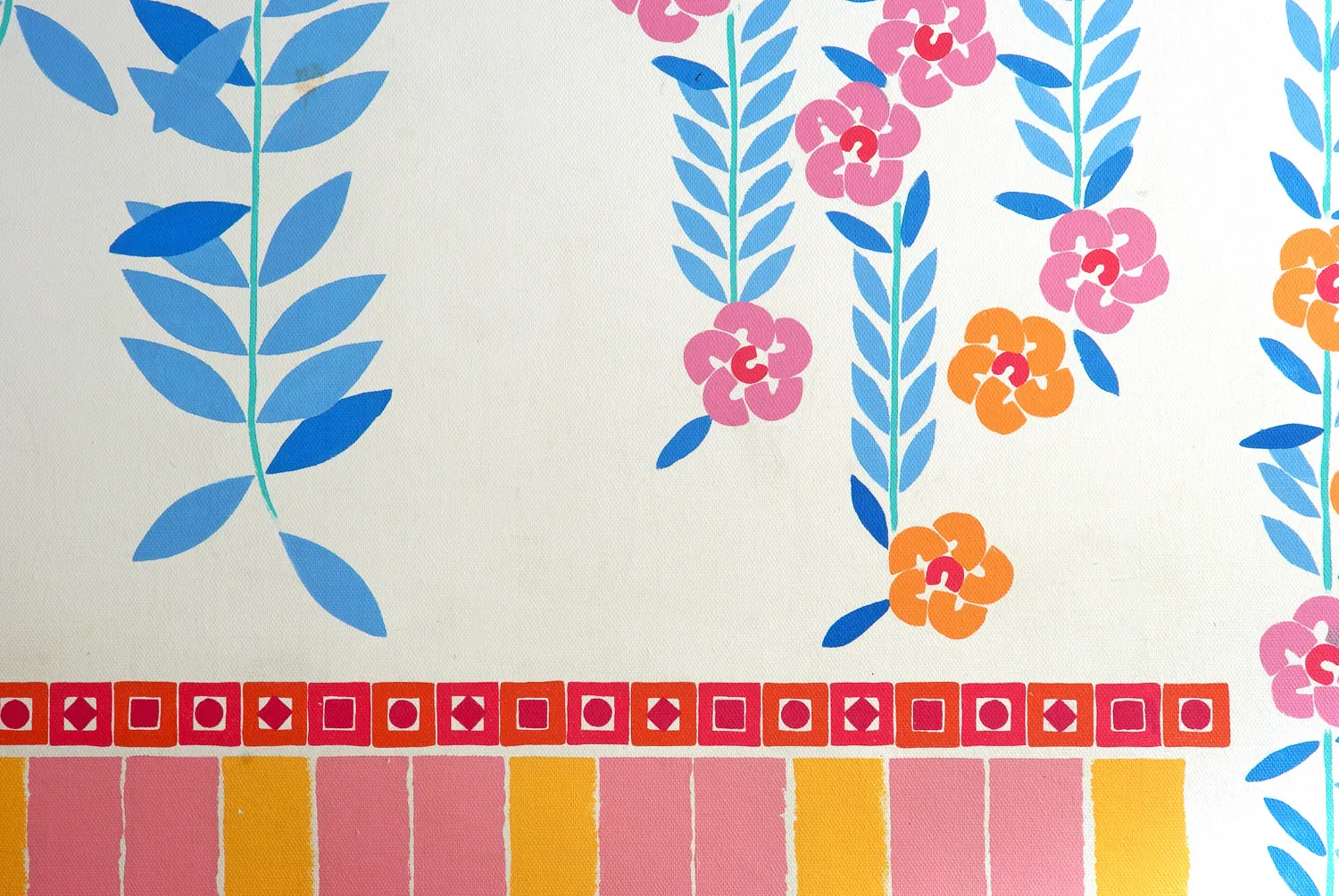
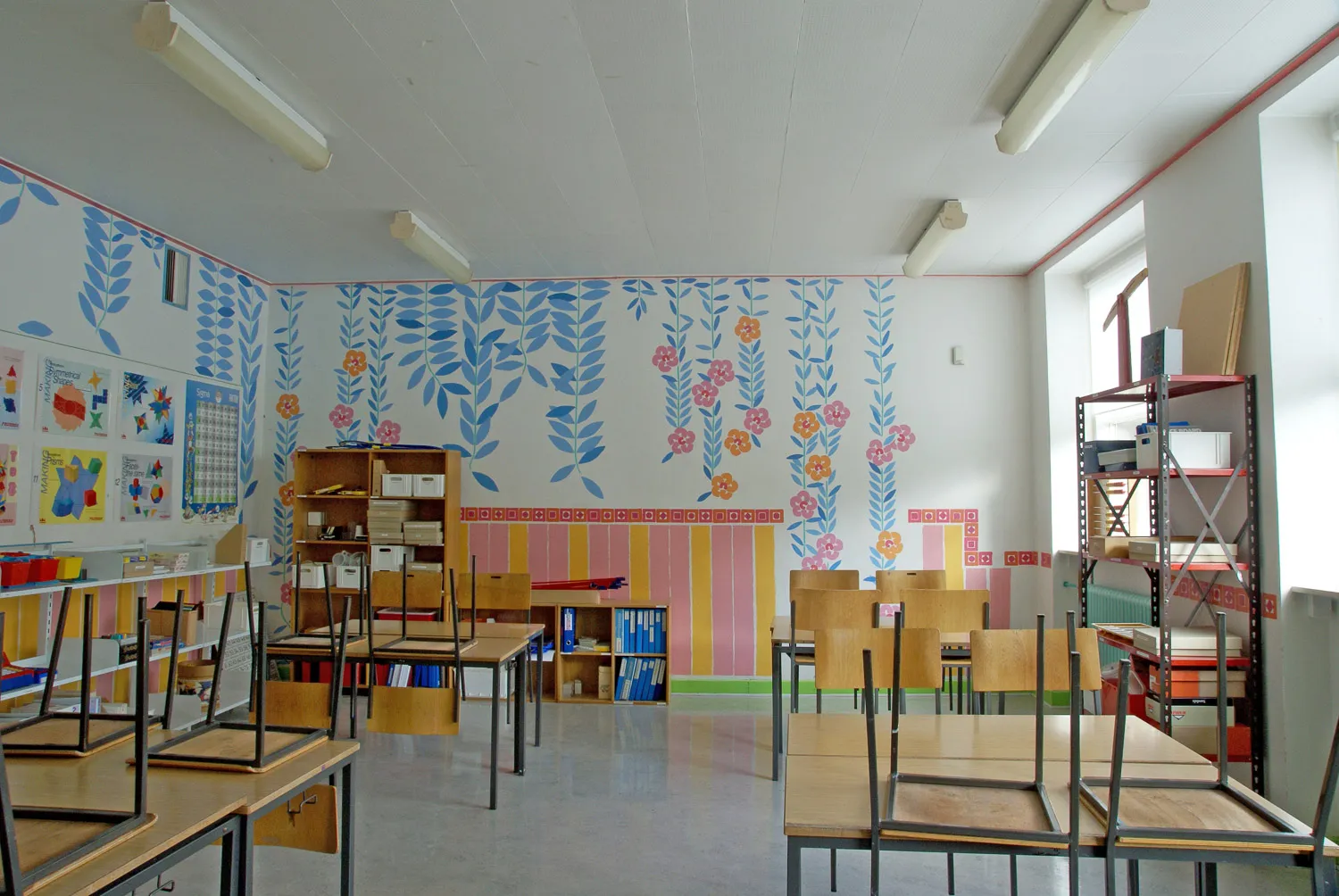
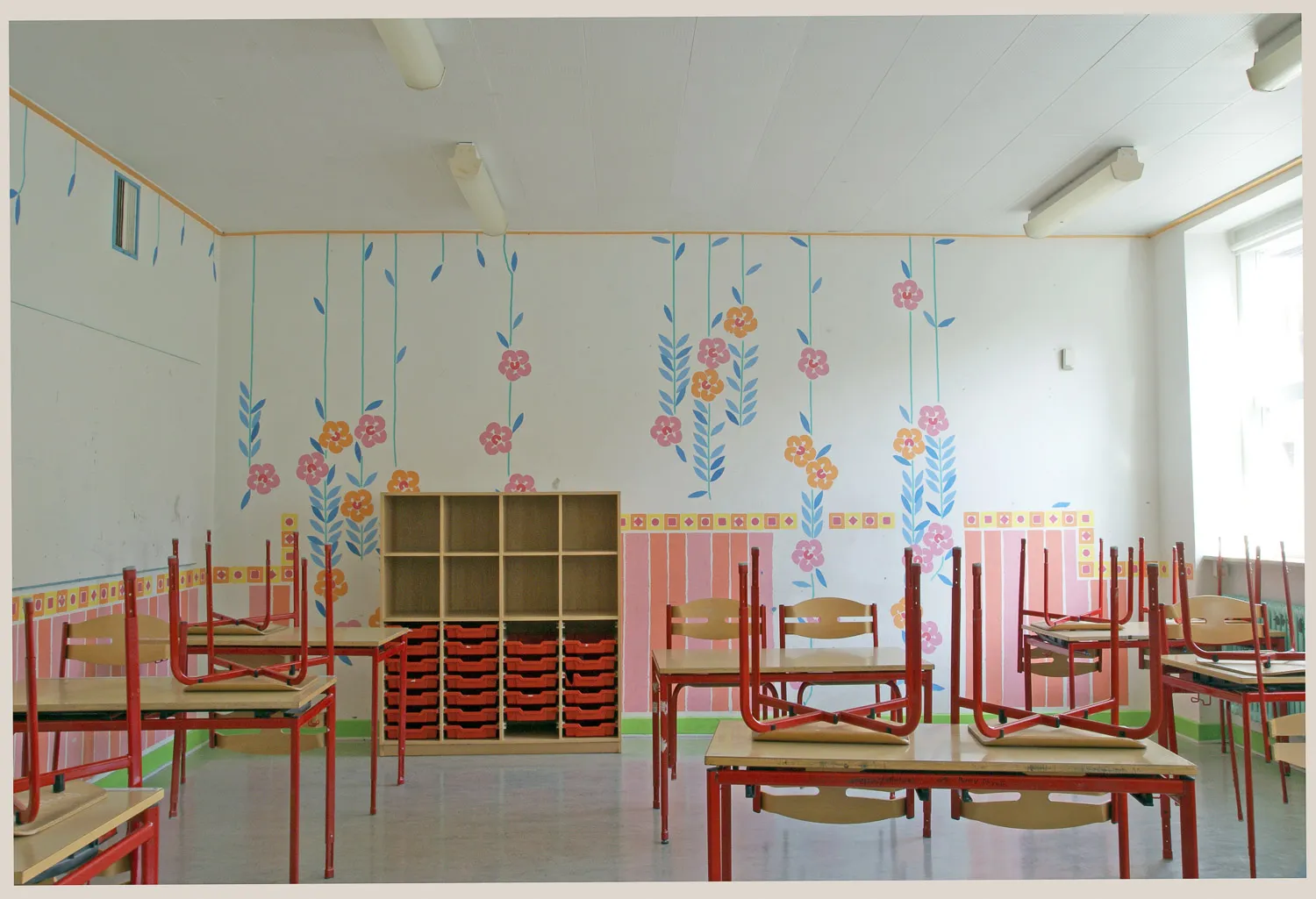
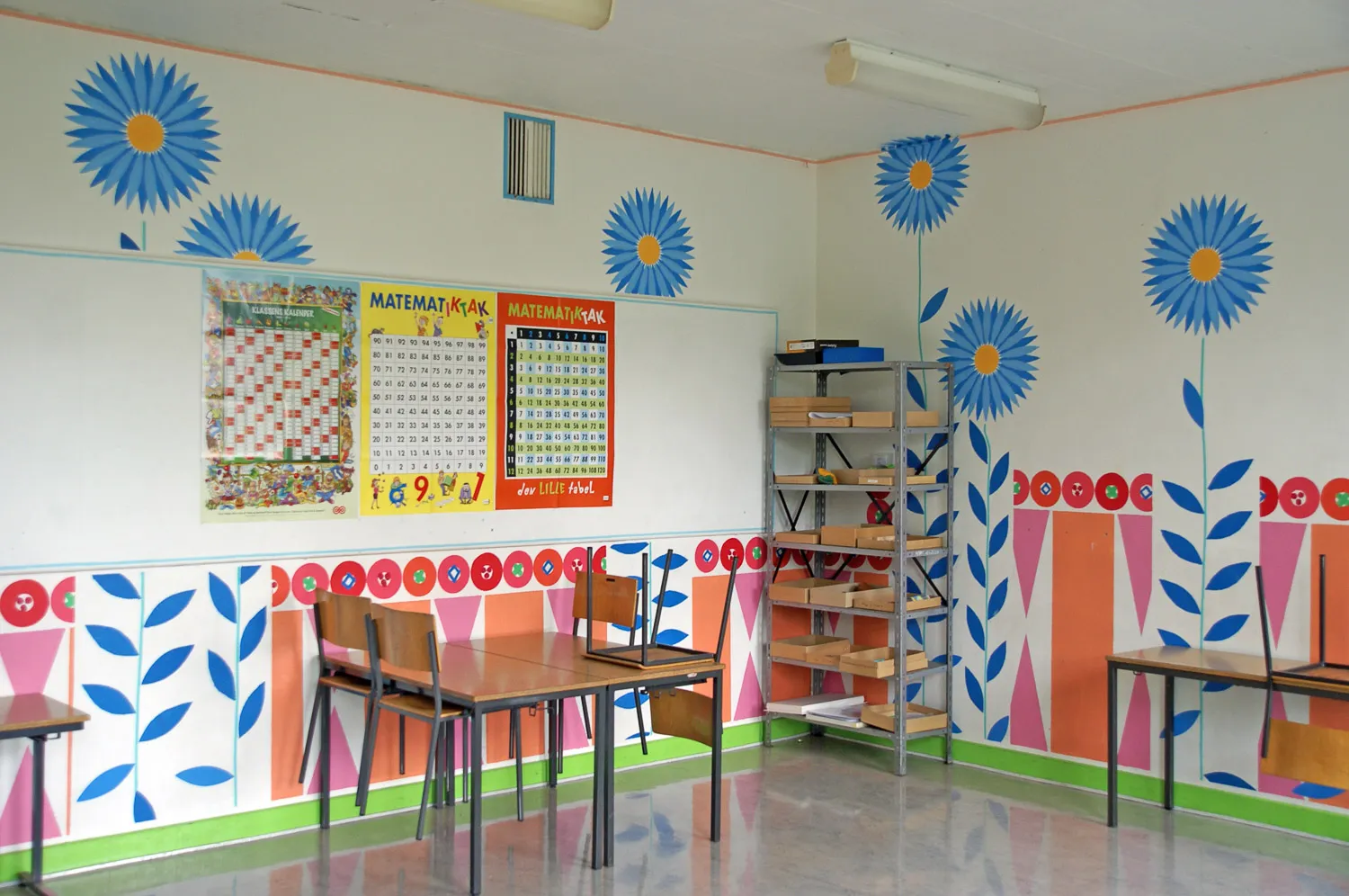
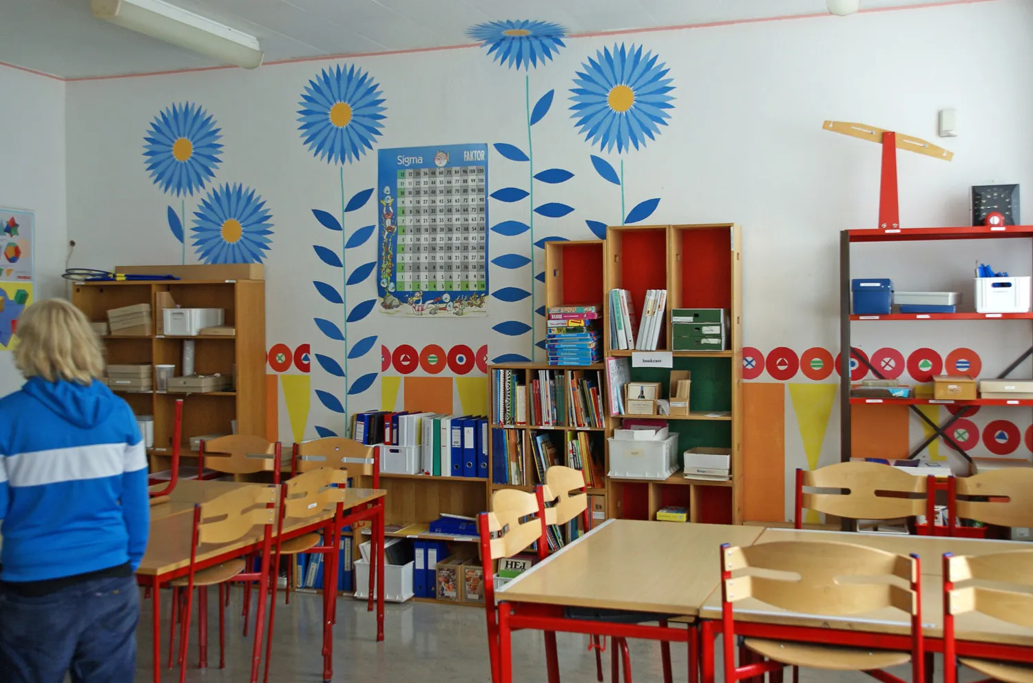
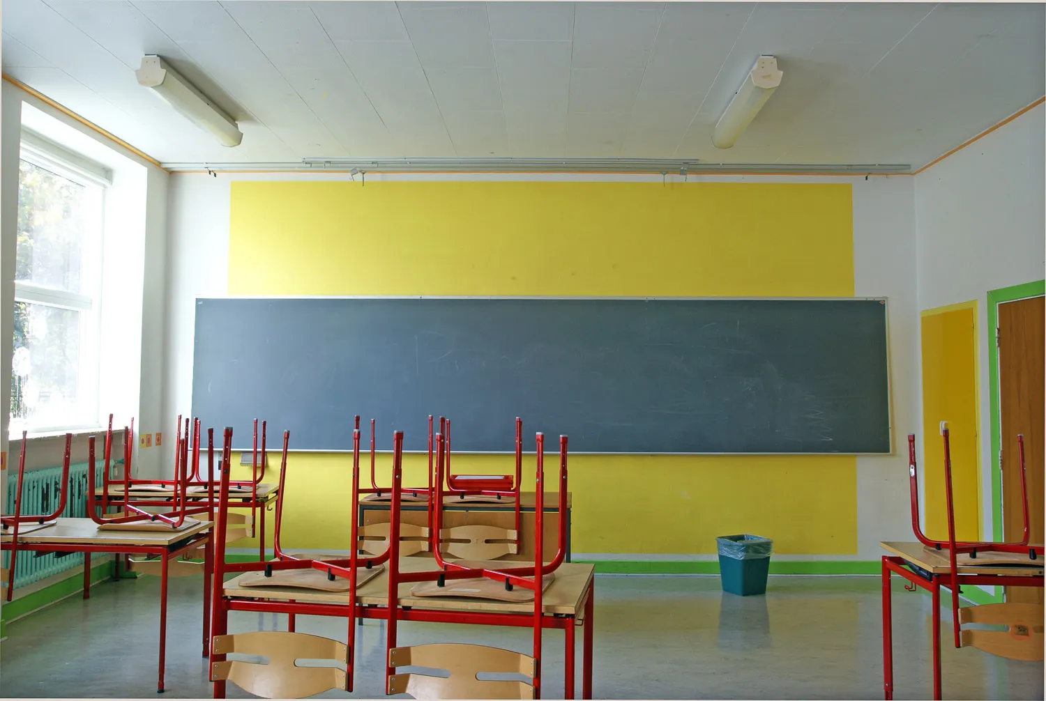
What’s wrong is that so many school environments are foolish, begins Poul Gernes. Architects these days are delivering something akin to mere lavatories. They are completely colorless. And they are not at all suited to the function they are meant to serve. In a school, the classrooms must be the primary focus. These are the rooms where students are supposed to learn – but at the same time, such rooms are also spaces to exist in. One should feel good, feel alert and energetic. And that’s impossible if one is sitting in a room with a gray floor and some dingy walls, without anything to brighten things up.
In a classroom, you need to be awake and comfortable. That’s why, in several places, I have painted the wall behind the blackboard lemon yellow. It’s a color that makes you wake up – both as a child and as an adult. And it’s a color that provides the maximum contrast to black. Just think about how that contrast is used on traffic signs… The combination of jet black and yellow is a very powerful signal.
But the teacher must also be taken into account, Gernes continues. He or she must also feel awake in the room, but not in quite the same way as the students. The teacher should be able to stand or sit facing a warmer color. So, on the back wall in many classrooms, we have painted chrome yellow, orange, and salmon – almost like women’s lingerie used to be in the old days. But a touch of cool pink is necessary to take the slight stuffiness out of it, which might otherwise be distracting.
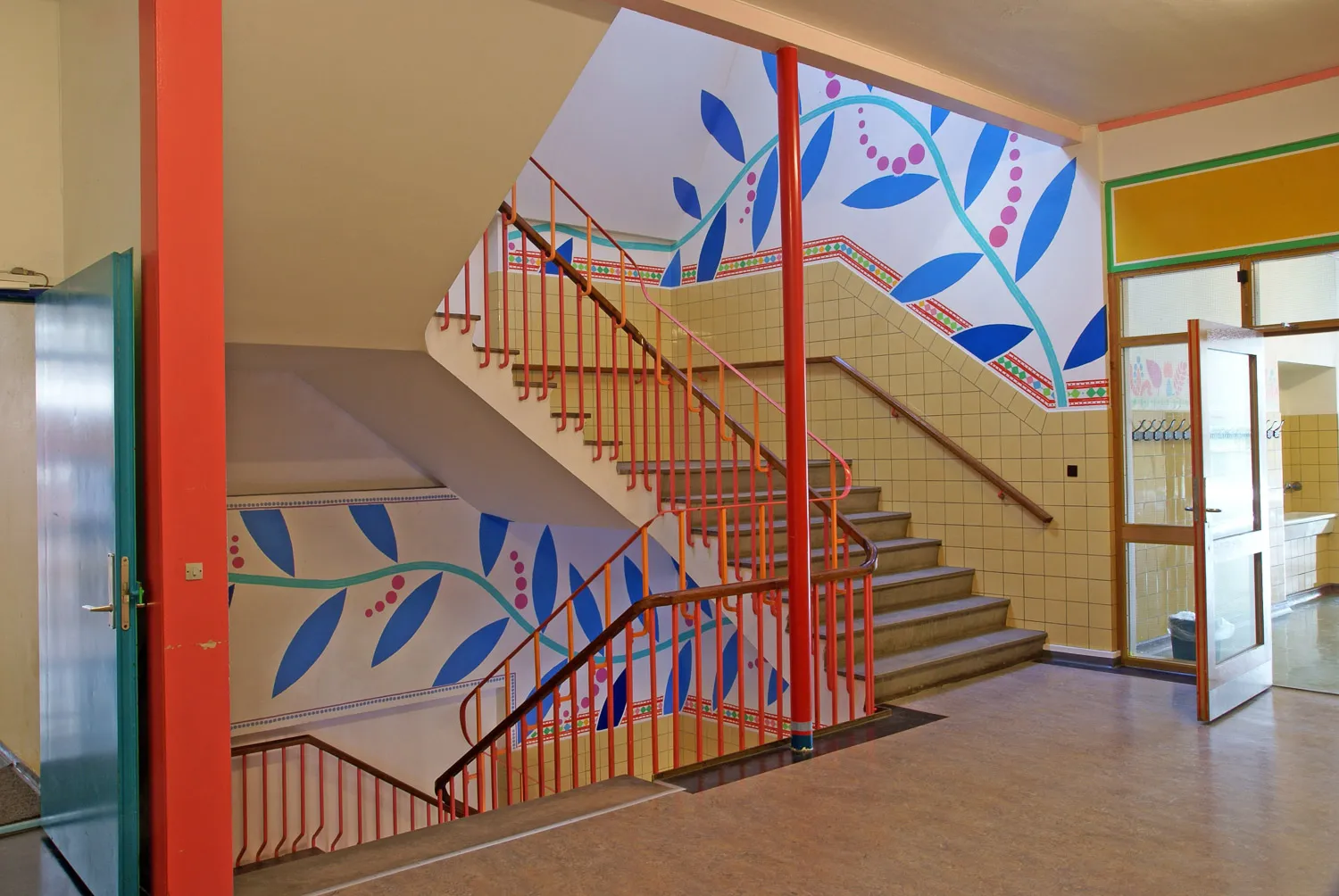
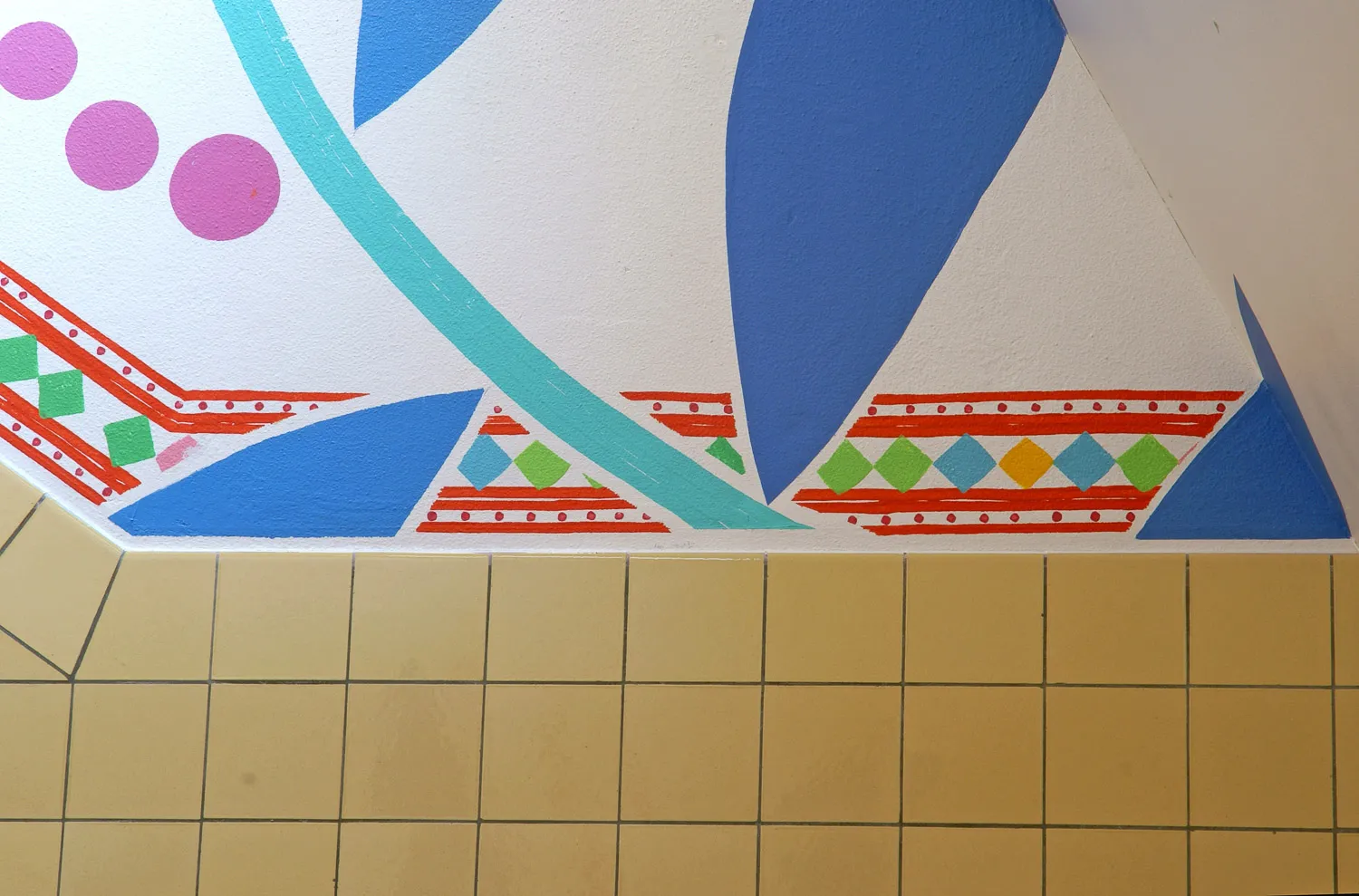
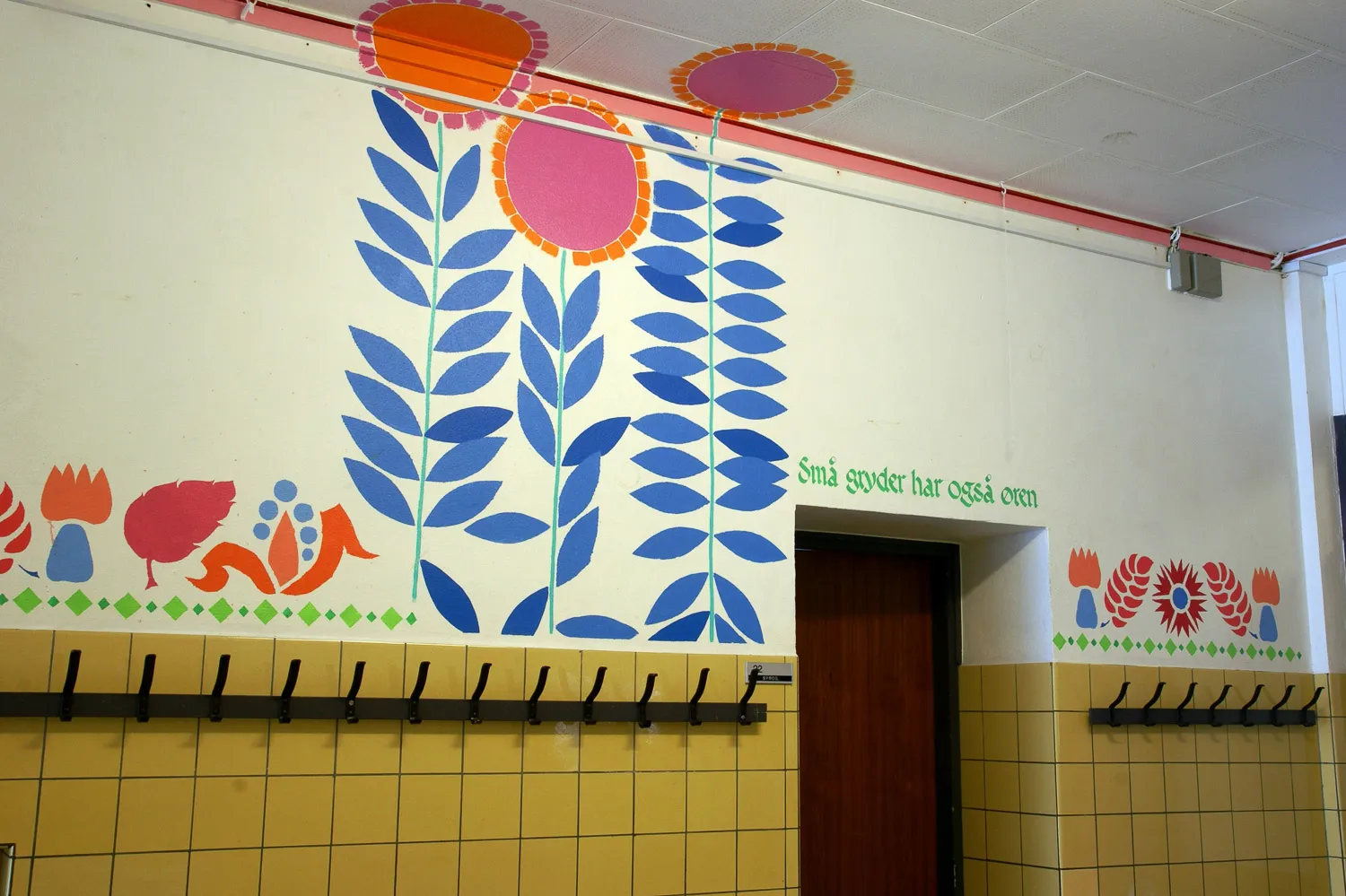
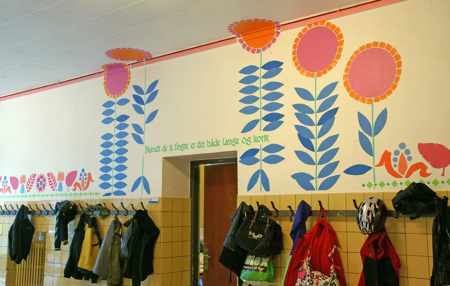
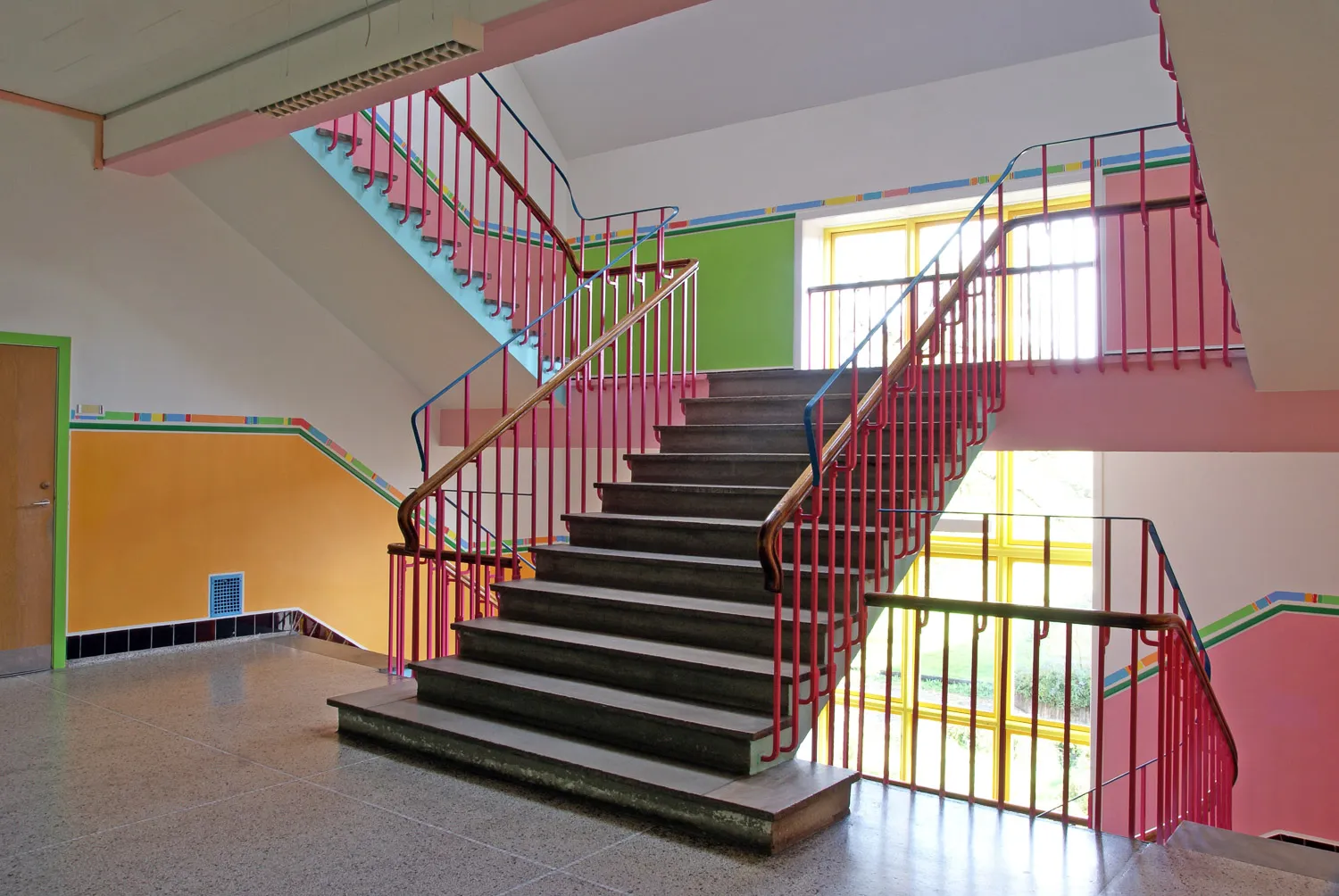
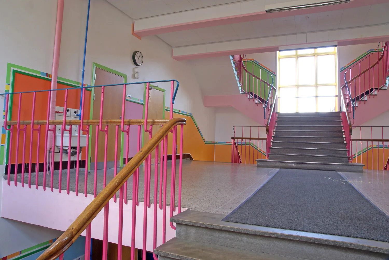
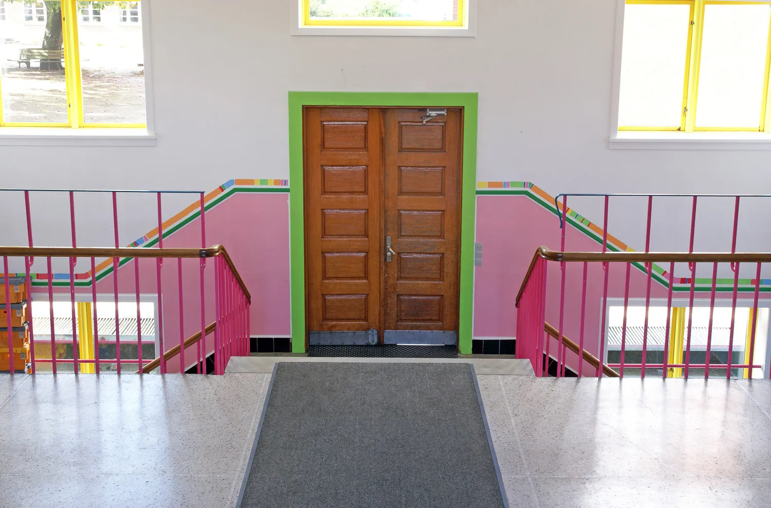
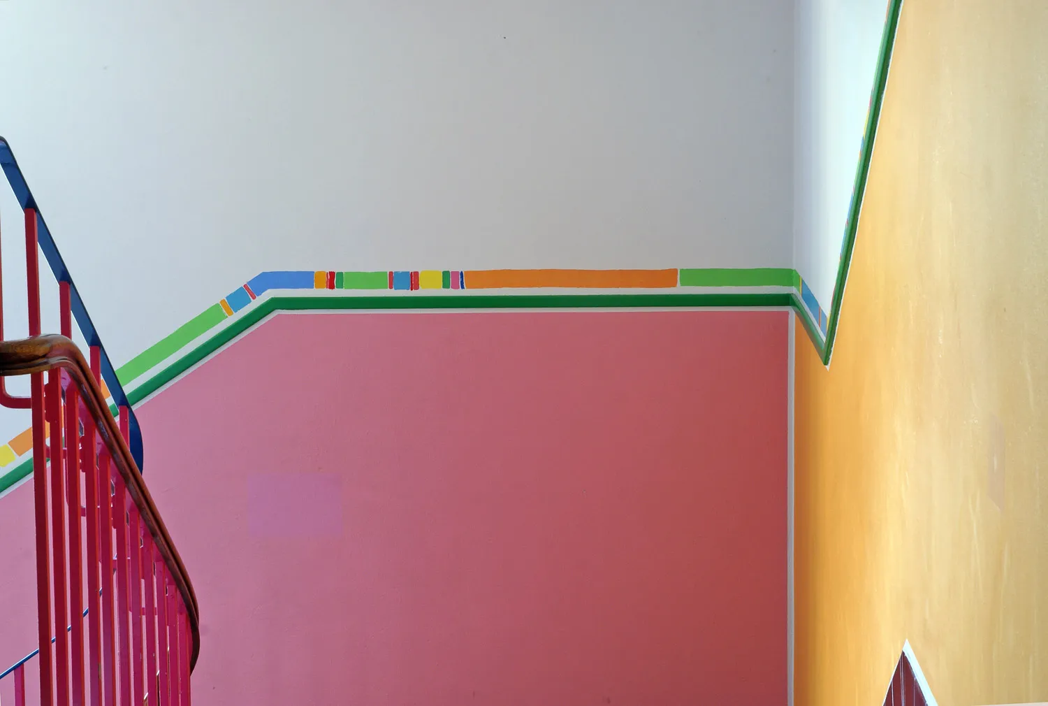
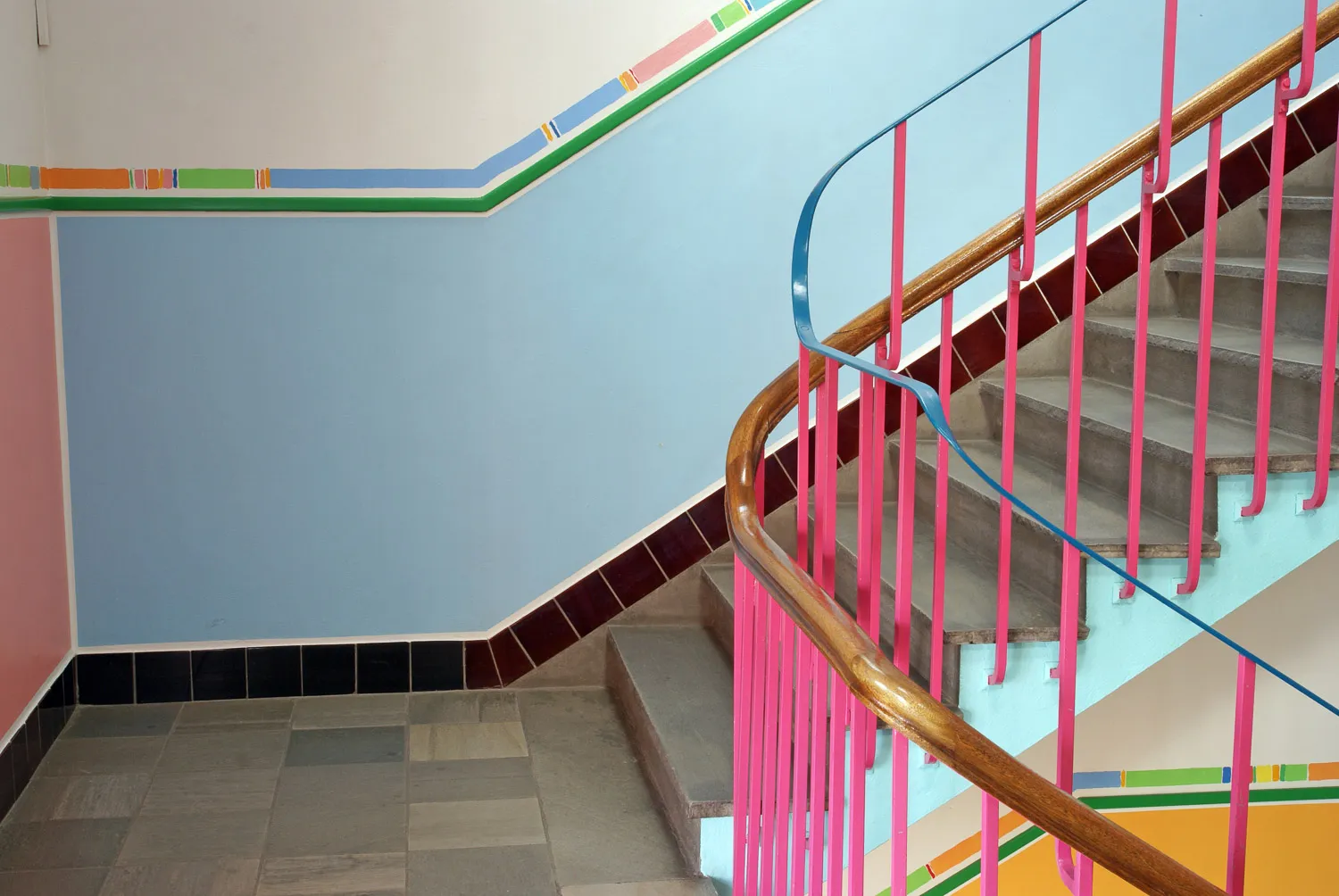
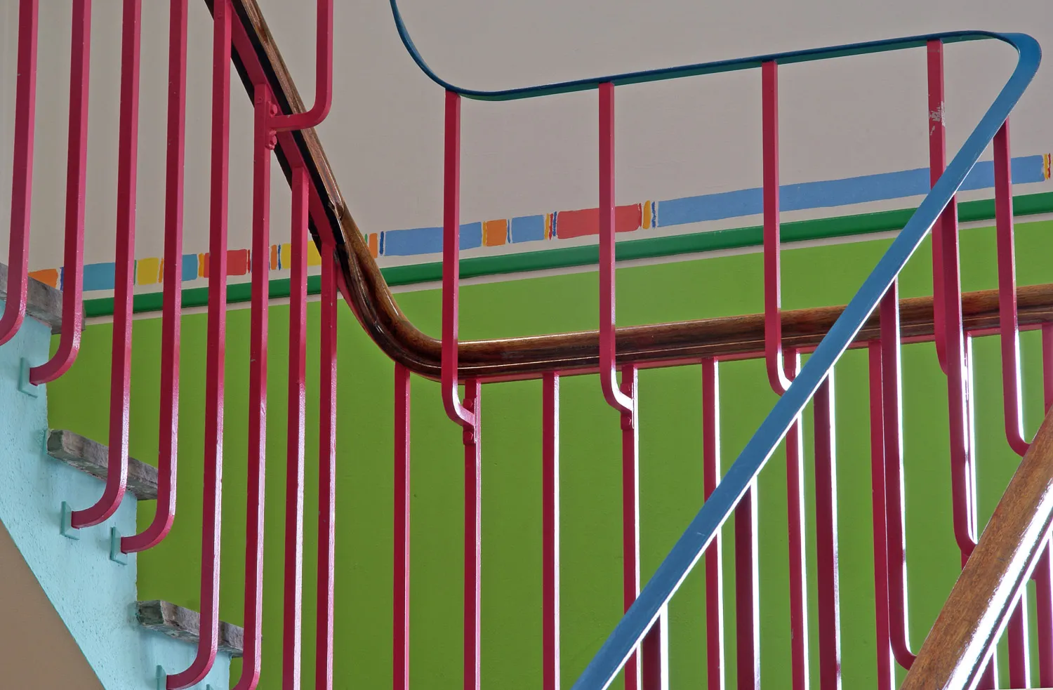
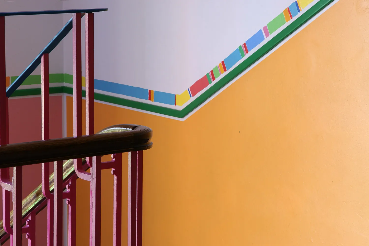
In hallways and stairwells, different colors are needed. The children and teachers should be able to sense that different functions apply there. So, we often work with a white base and blue and green tones. That provides a good contrast to the classrooms, with their yellow and pink shades.
But it’s important to use pure colors. They must be spectral colors. That means the kind of colors you see when sunlight splits into color groups as it passes through a prism. Spectral colors have pure wavelengths. They are the most vibrant, harmonious, and energy-transmitting.
It’s different, for example, with ochre, moss green, beige, and the like. These colors are also called tertiary colors. They are mixed from multiple wavelengths and therefore don’t have the same energy-transmitting effect. Medium brown is a bad color in a school environment. It provides a sense of security, but not alertness. And yet, it has been used for centuries.
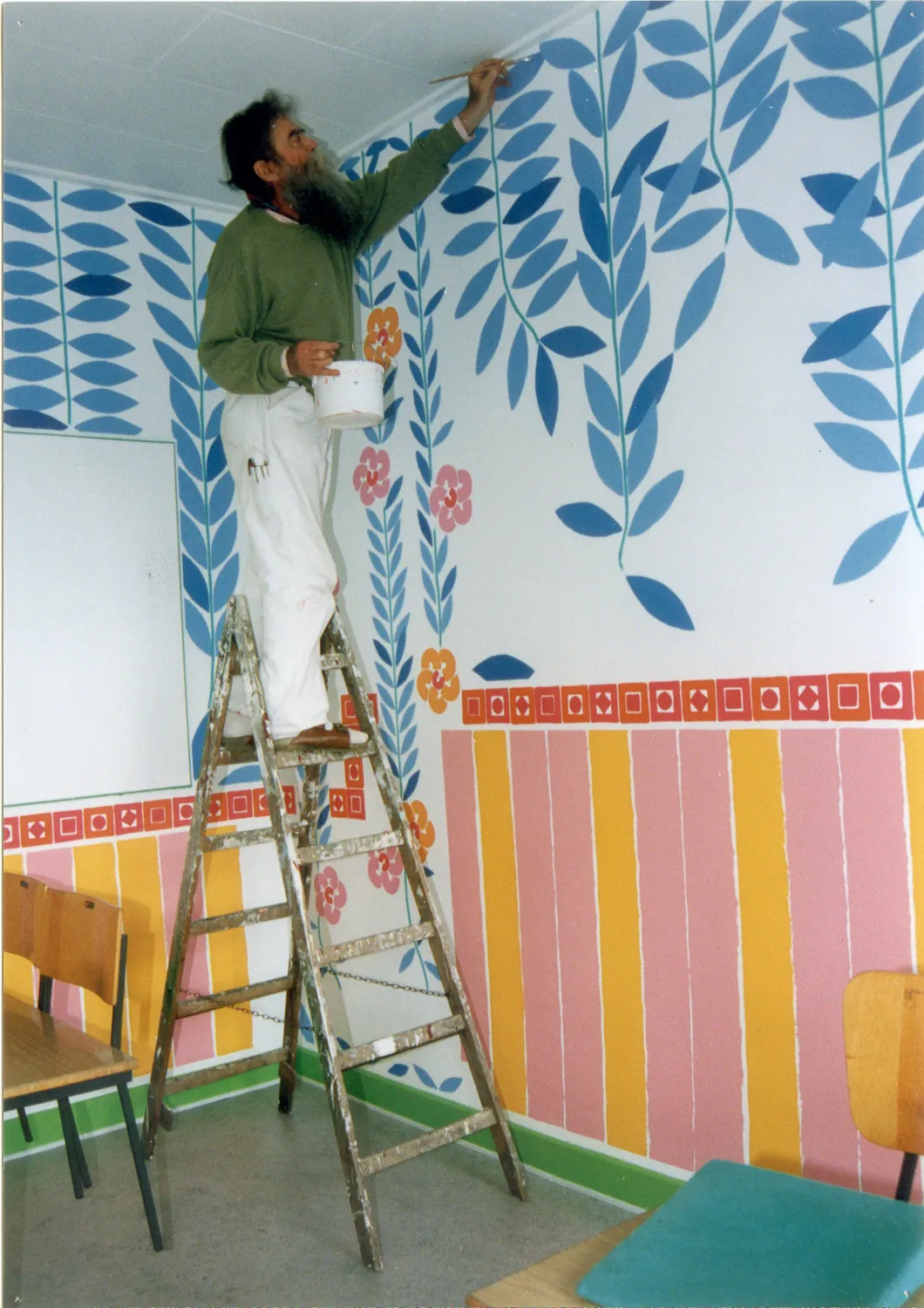
Gernes explains how his decorations come about: There are usually a few of us, and we prefer to work collectively and anonymously. Because it’s about the decoration itself and its uplifting effect on the function… That’s what matters. So, it’s the painting company Gernes at work: myself, my wife, and various assistants. Often, they have been students from the Art Academy. So, we are continuing the old workshop traditions.
But we don’t touch the major wall painting itself. That’s a matter of professional boundaries. We’re not trying to take anyone’s job. But we do intervene in the choice of colors that go on the walls.
Yes, it’s Poul who decides! Jansen asserts.
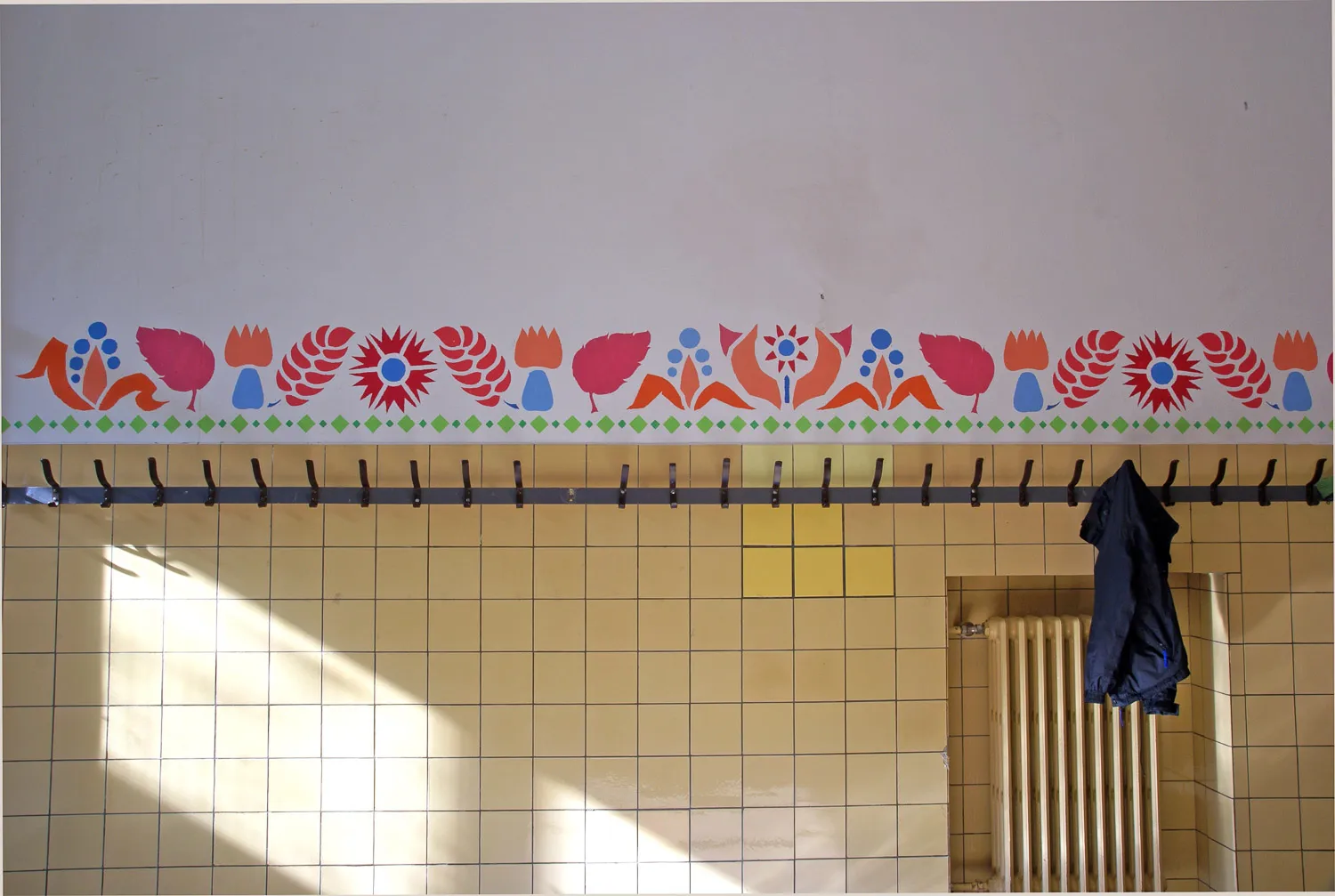
As for the actual decoration, Gernes continues, it’s done with blocks covered with foam rubber. We call them stamps. The stamp can absorb enough paint for about ten imprints. And then we start in the corners and continue until the floral pattern, ornament, or whatever it may be, fills the entire wall. Often, the final gap is too small for another imprint. So, to finish, we usually dip the tip of a finger and place a small dot. That’s to say: We are aware of it…
In this way, we have created something that is neat and clean in its lines – and something that is clearly made by human hands. It’s very important that you can see: This was made by hand. That way, we bring life to many environments that have been damaged by all things rational and industrialized.
It is a piece of Danish art we are creating, Gernes emphasizes. I do not believe in internationalism in visual art. Pictures, decorations, and all art should be created right in their intended place, adapted to the conditions there.
Vagn Skovgaard-Petersen og Peder Skyum-Nielsen: "Skriften og væggen – samtale med Poul Gernes og Georg Jansen" [The writing and the wall – conversation with Poul Gernes and Georg Jansen]. In Uddannelseshistorie. 27th yearbook for Selskabet for Dansk Skolehistorie 1993, p. 21-26. Abbreviated. Translation by Klara Karolines Fond.
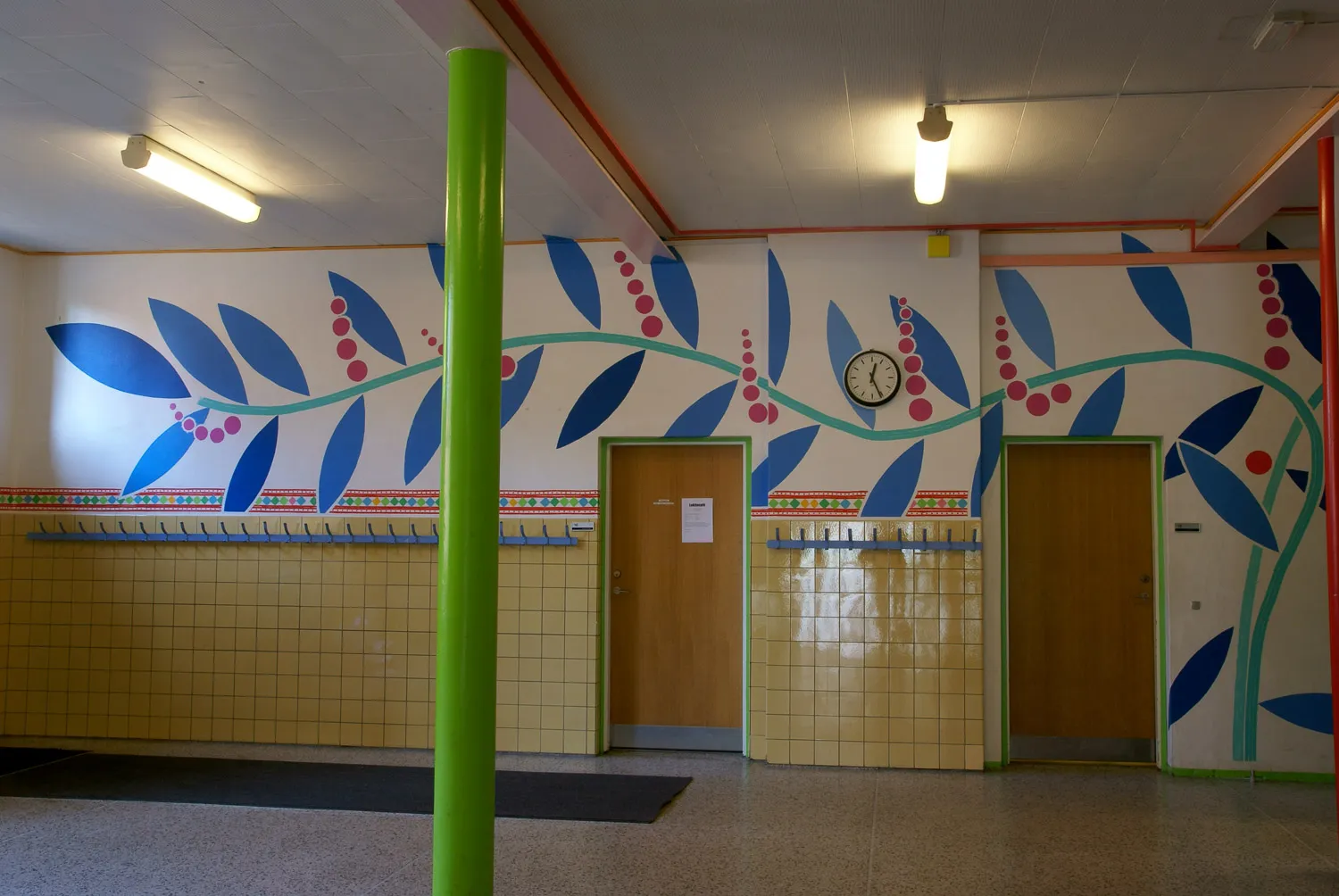
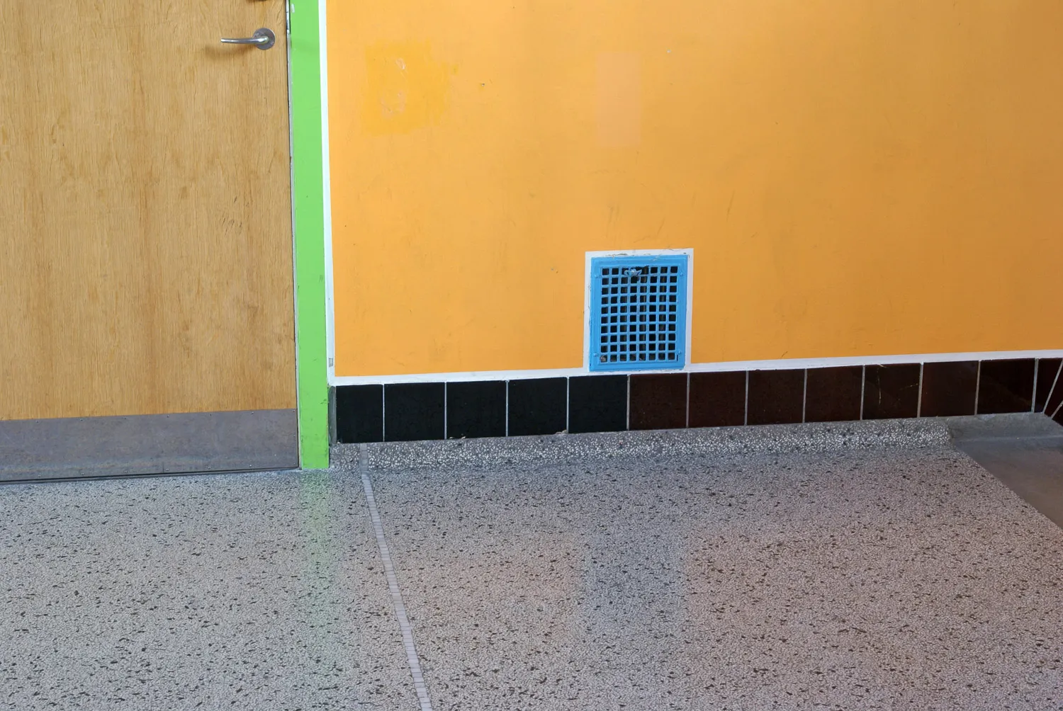
School principal Tove Ertner Larsen sent two mustard-yellow tiles to Poul Gernes – as an example of how dull and sad-looking the school was. Gernes made a colour and decoration plan for two stairwells and hall areas, where the tiles were used. In the course of four weekends, Vestervang School was decorated by Poul Gernes, Henrik Norn and Eva Karin Thomsen. Parents helped in four classrooms. Large monochrome surfaces were painted by craftsmen. In the hallways, adages were painted by the steady hand of Henrik Norn.
Vestervang School in Herning is one of the confident end well-executed decorations of Gernes' late production. The colour scheme in one stairwell is just perfect. The vine decoration is masterfully developed: expansive in its movement, with amusing crossings of ornamental borders and berries. Now the classrooms have been painted over, but the stairwells and hallways are still intact.
Finn Thybo Andersen: Poul Gernes Decoration Projects. London 2018, p. 80. Translated by Dan A. Marmorstein. Excerpt.
Vestervang School
Photo: Finn Thybo Andersen
Vestervang School
Photo: Finn Thybo Andersen
Vestervang School
Photo: ukendt
Vestervang School
Photo: Finn Thybo Andersen
Vestervang School
Photo: Finn Thybo Andersen
Vestervang School
Photo: Finn Thybo Andersen
Vestervang School
Photo: Finn Thybo Andersen
Vestervang School
Photo: Finn Thybo Andersen
Vestervang School
Photo: Finn Thybo Andersen
Vestervang School
Photo: Finn Thybo Andersen
Vestervang School
Photo: Finn Thybo Andersen
Vestervang School
Photo: Finn Thybo Andersen
Vestervang School
Photo: Finn Thybo Andersen

Vestervang School
Photo: Finn Thybo Andersen
Vestervang School
Photo: Finn Thybo Andersen
Vestervang School
Photo: Finn Thybo Andersen
Vestervang School
Photo: Finn Thybo Andersen
Vestervang School
Photo: Finn Thybo Andersen
Vestervang School
Photo: Finn Thybo Andersen
Vestervang School
Photo: Finn Thybo Andersen
Vestervang School
Photo: Finn Thybo Andersen
Vestervang School
Photo: Finn Thybo Andersen
Vestervang School
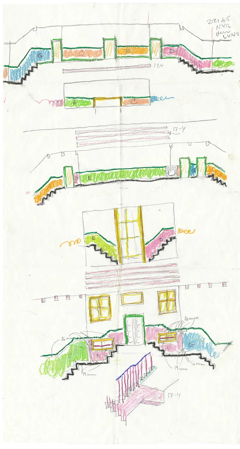
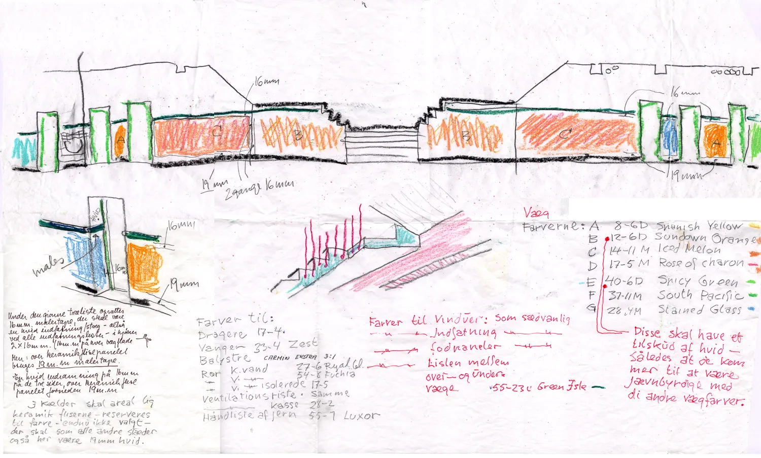
Preparatory study for the colour scheme of one of the school's stairwells
Photo: skan
Vestervang School
Preparatory study for the colour scheme of one of the school's stairwells
Photo: skan

Vestervang School
Preparatory study for the colour scheme of one of the school's stairwells
Photo: skan