Decoration
Decoration
Herlev Hospital, inpatient building
Artistic decoration can be experienced in most public and many large private buildings, and there are numerous fine and successful examples, such as Thorvaldsens Museum, Copenhagen City Hall, and Herning Art Museum in the former Angli factories, among others. However, few places have implemented the artistic vision as comprehensively as here, where every room reflects a single artist’s holistic concept and a determined realization that continues to captivate.
The artistic decoration was and is intended for the everyday lives of patients, their relatives, and the staff.
In this context, the hospital’s foyer serves as an overture to what users of the building will encounter throughout its spaces. Through the intervention of the Danish Arts Foundation, the hospital acquired two significant works—by Else Fischer-Hansen and Poul Gernes—which address all those who frequent this large building.
However, the architects and Poul Gernes aimed for more than foyer decoration. Poul Gernes’ ideas about a broad, popular art and the architects’ desire for a rich interior colour palette led to the trial of a polychromatic colour scheme in a full-scale test floor for the ward building, constructed at Gentofte Hospital. It turned out that the experiment resonated with both patients and staff, and, most importantly, with the decision-making regional politicians.
For Poul Gernes, the task of decorating and colour-coordinating a hospital aligned perfectly with his ethical and artistic principles of creating a popular, humanistic, and democratic art deeply integrated into everyday life.
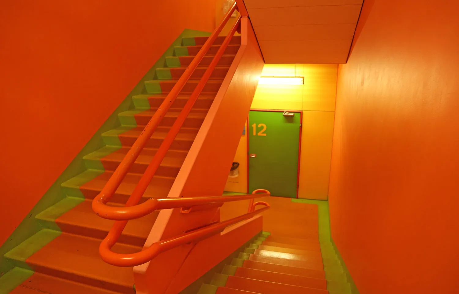
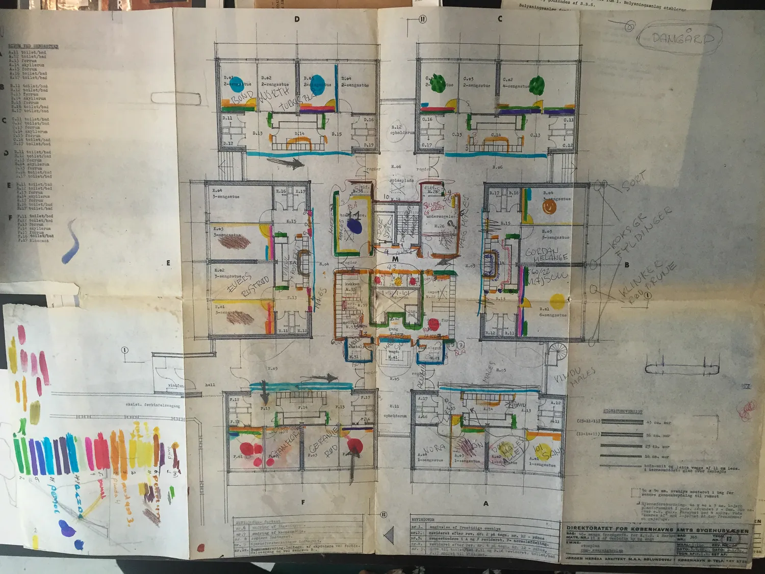
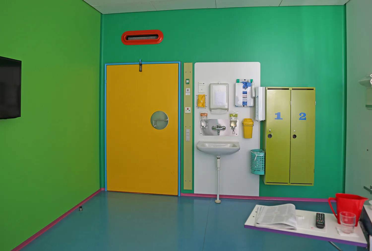
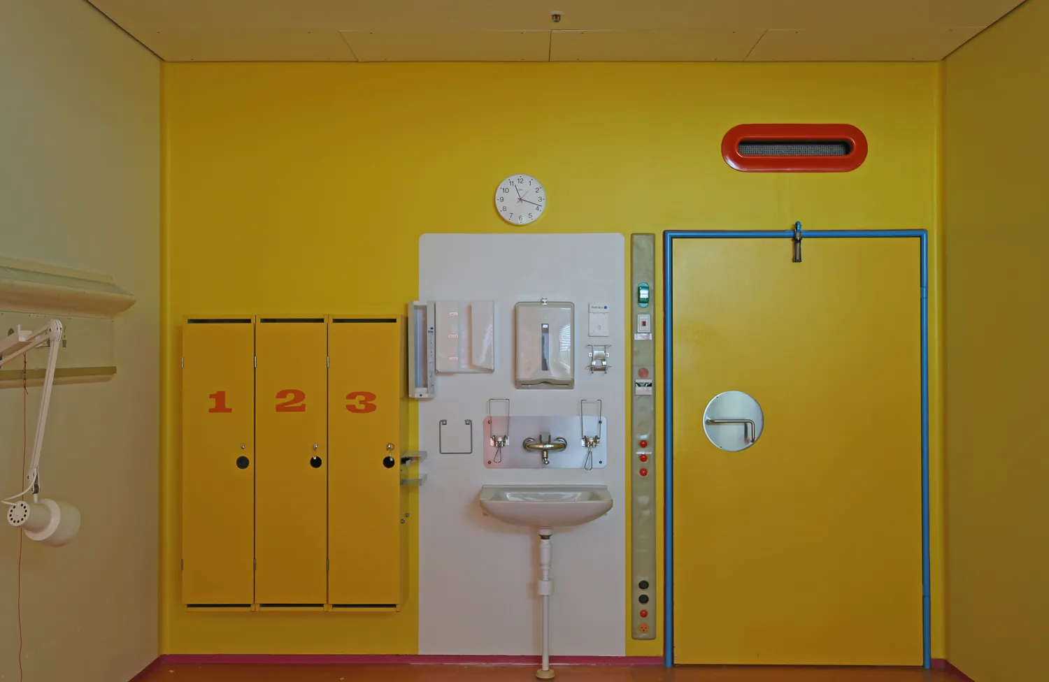
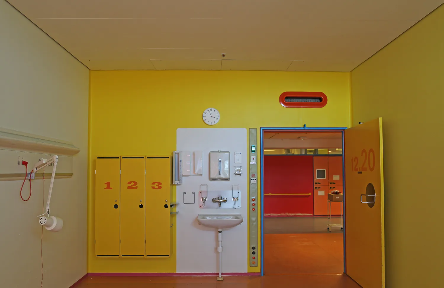
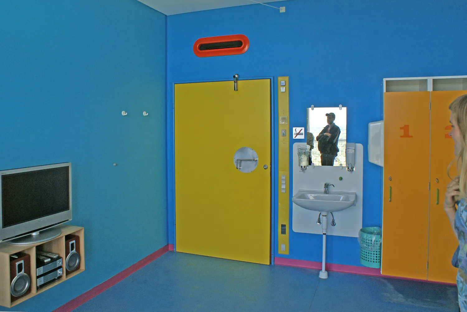
Although Poul Gernes occasionally flirted with a “randomness principle” in the application of colours, his use of colour at Herlev Hospital is never random. He exclusively used pure, clear spectral colours, never mixed hues, and developed meticulously thought-out principles for the application of colours in the spaces, considering their function and orientation towards the cardinal directions. There were also specific guidelines for the colours of furniture, fixtures, and technical installations. Furthermore, considerations were made regarding wayfinding within the large hospital, as well as factors related to maintenance, budgeting, workflow, and cleaning procedures.
In 1977, the architectural firm Bornebusch, Brüel, and Selchau prepared an operational manual for Herlev Hospital, which detailed approximately 200 colour codes, types of paint, colours, manufacturers, and product numbers for the materials used in the construction. This section of the operational manual was expanded in 1983 with a colour manual prepared by the architectural firm Stærmose and Isager. This manual defined all applied colours with their NCS colour codes, specifying the paint type, gloss level, and application location. Poul Gernes himself approved this manual as the foundation for general maintenance and future modifications to the hospital building.
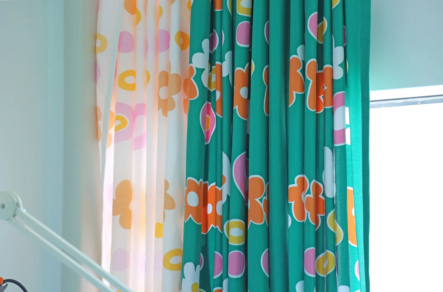
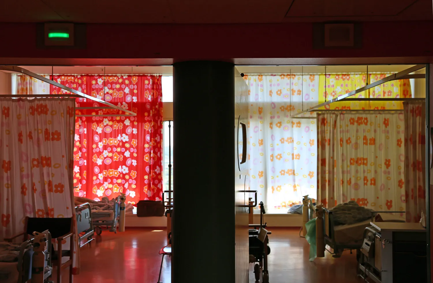
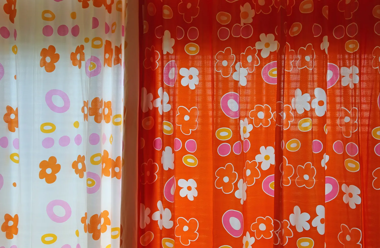
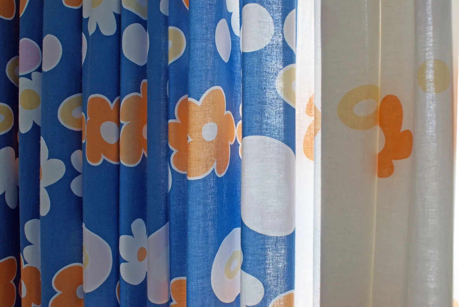
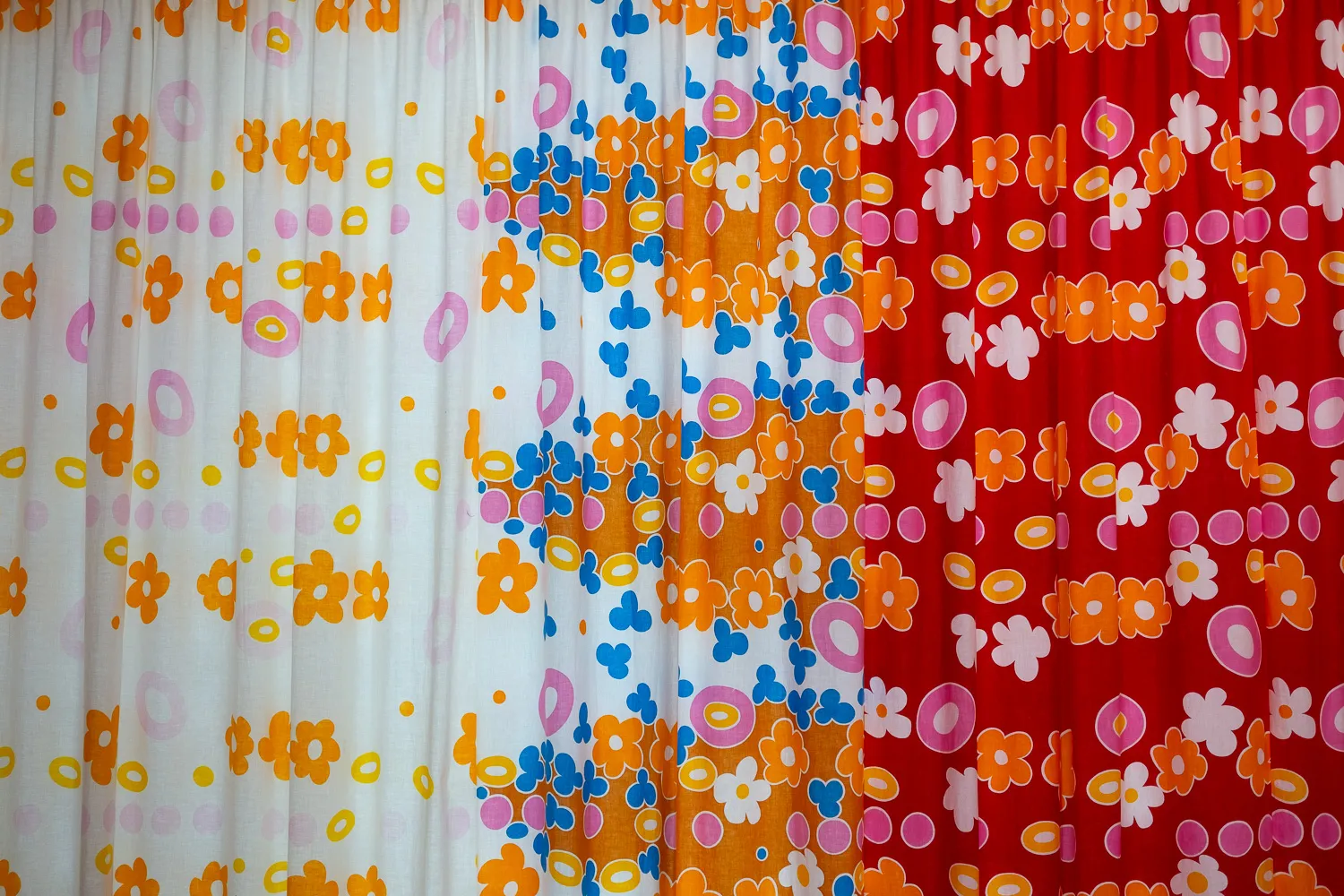
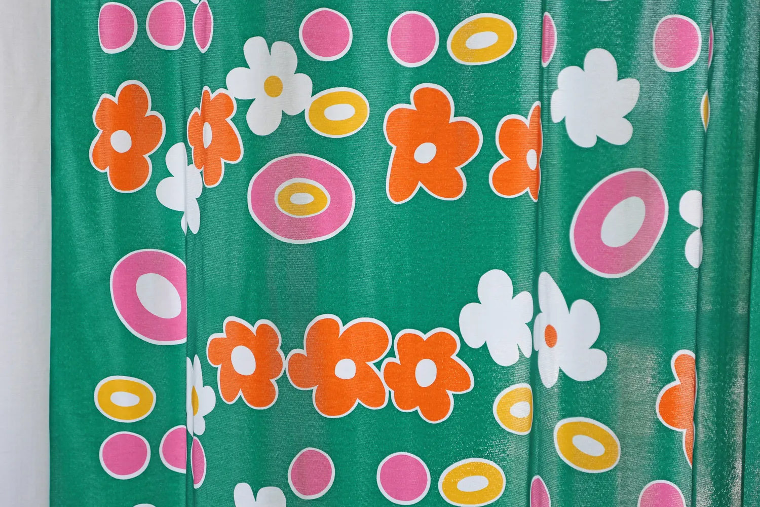
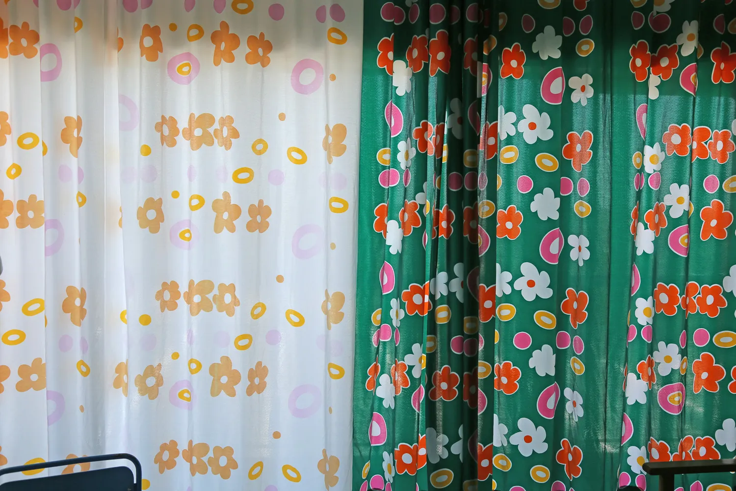
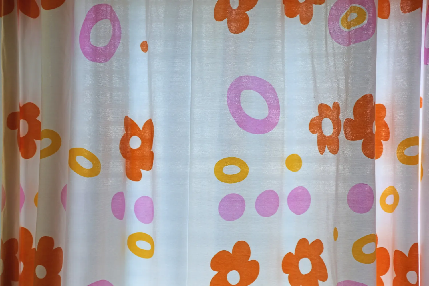
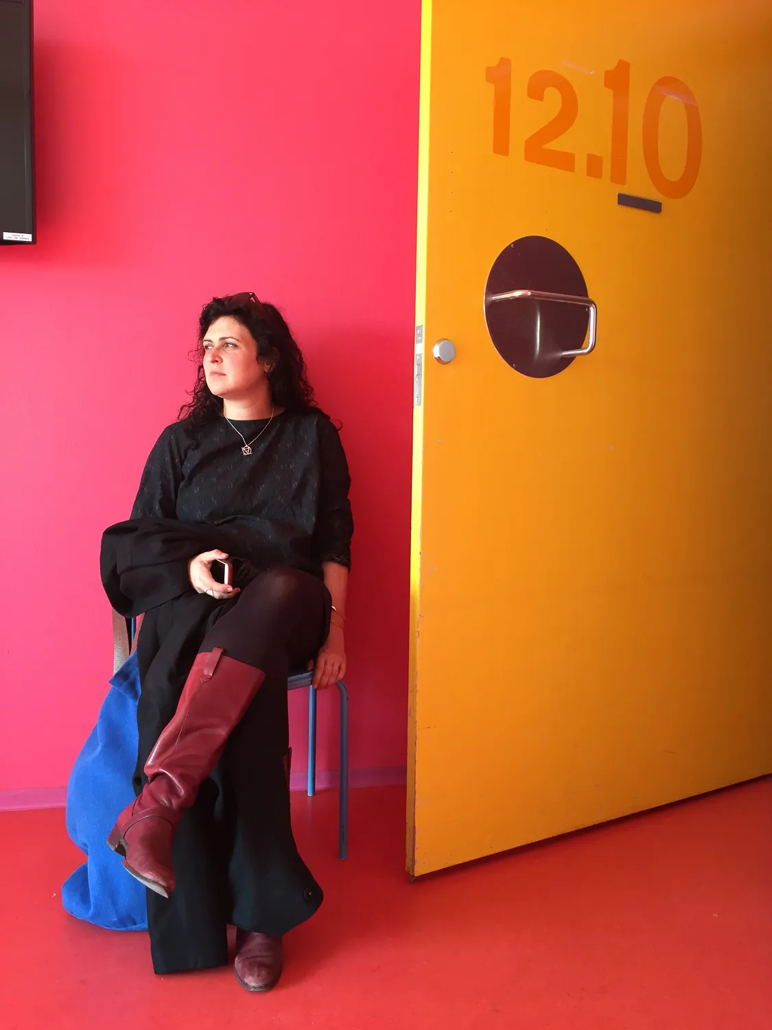
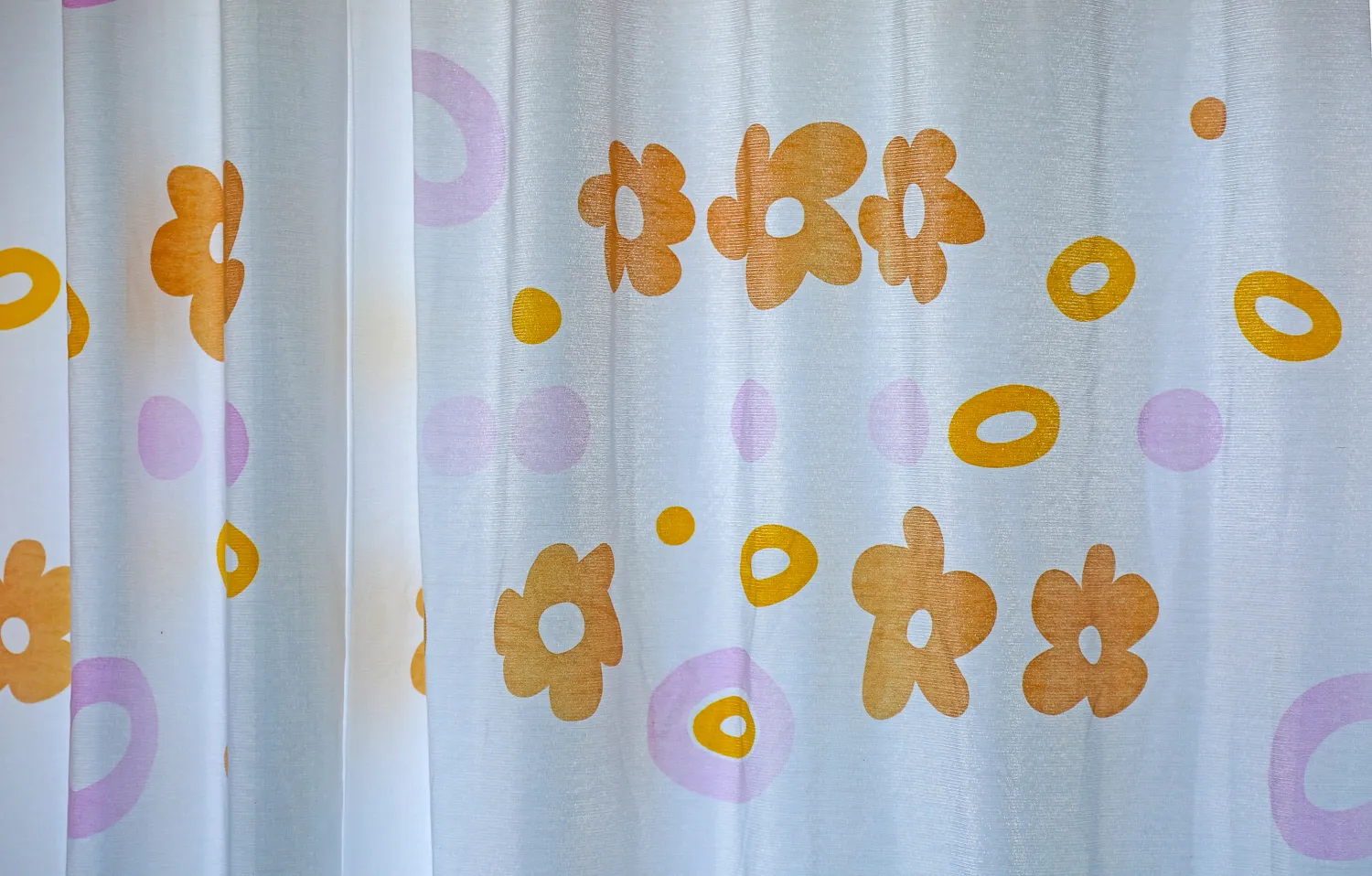
It is important to note that Poul Gernes’ colour scheme encompasses all the hospital’s floors, walls, and ceilings, as well as doors, door frames, baseboards, fixtures, signage, and built-in furniture. Additionally, he designed the colours for all loose furniture, curtains, hospital beds, and internal transport containers. The colour white, alongside the polychromatic hues, was deliberately included in the overall colour scheme.
In an unpublished appendix to the Operational Manual dated July 1, 1977, regarding Herlev Hospital’s colour system, the architect and artist listed the following:
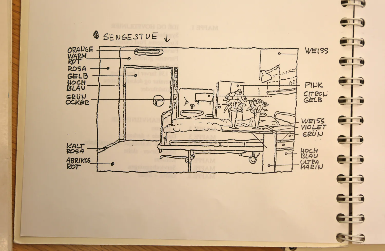
The colour programme covers, beyond the ward building’s wall colours, which are oriented towards the cardinal directions (6 x 5 shades), the following main themes:
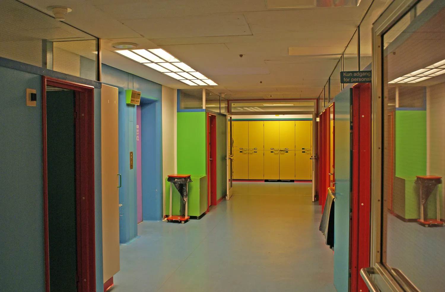
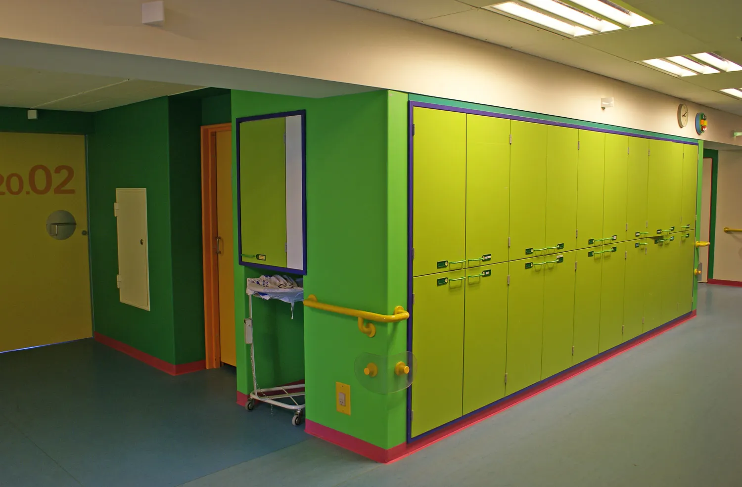
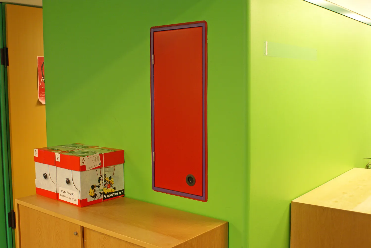
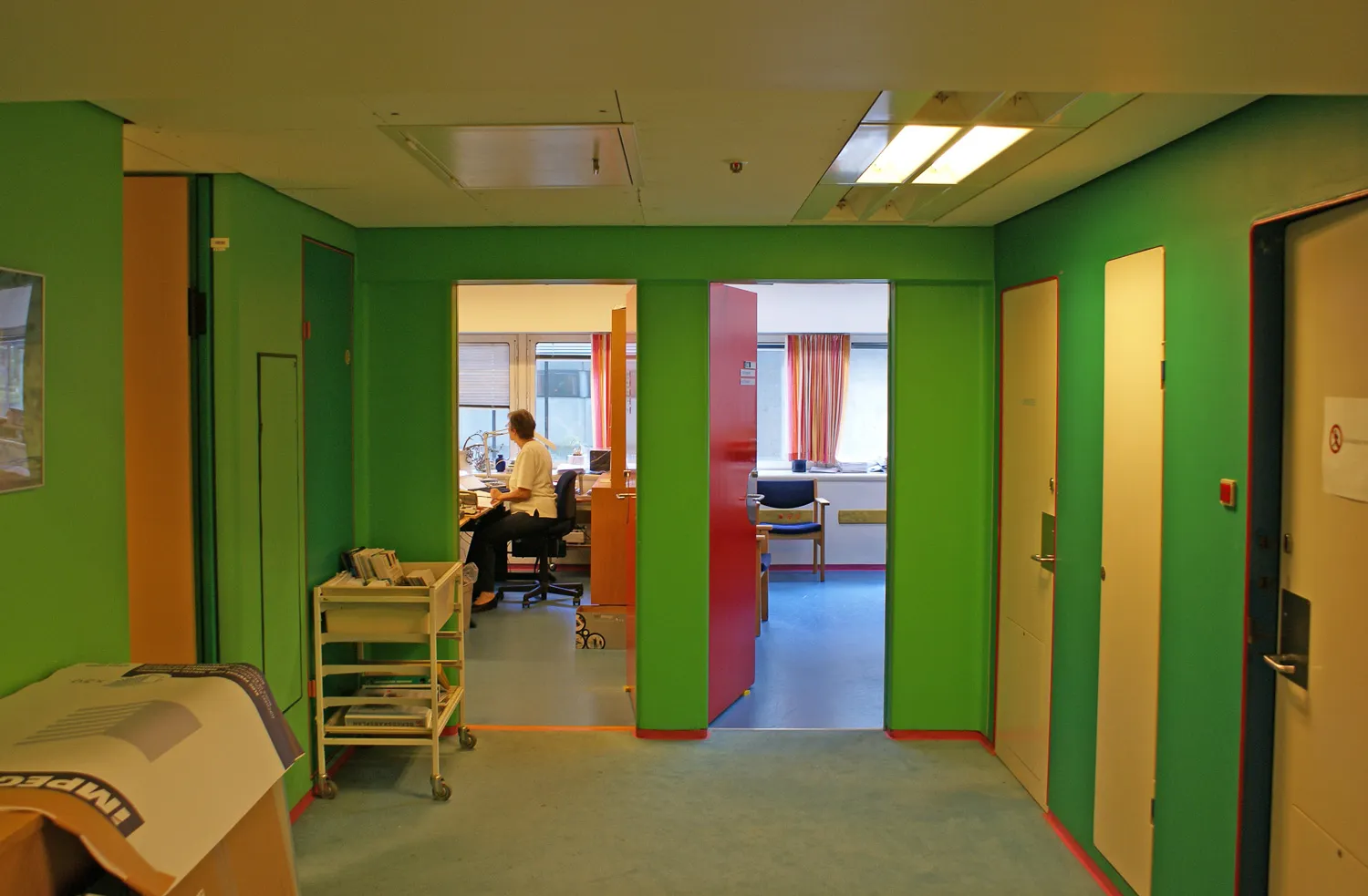
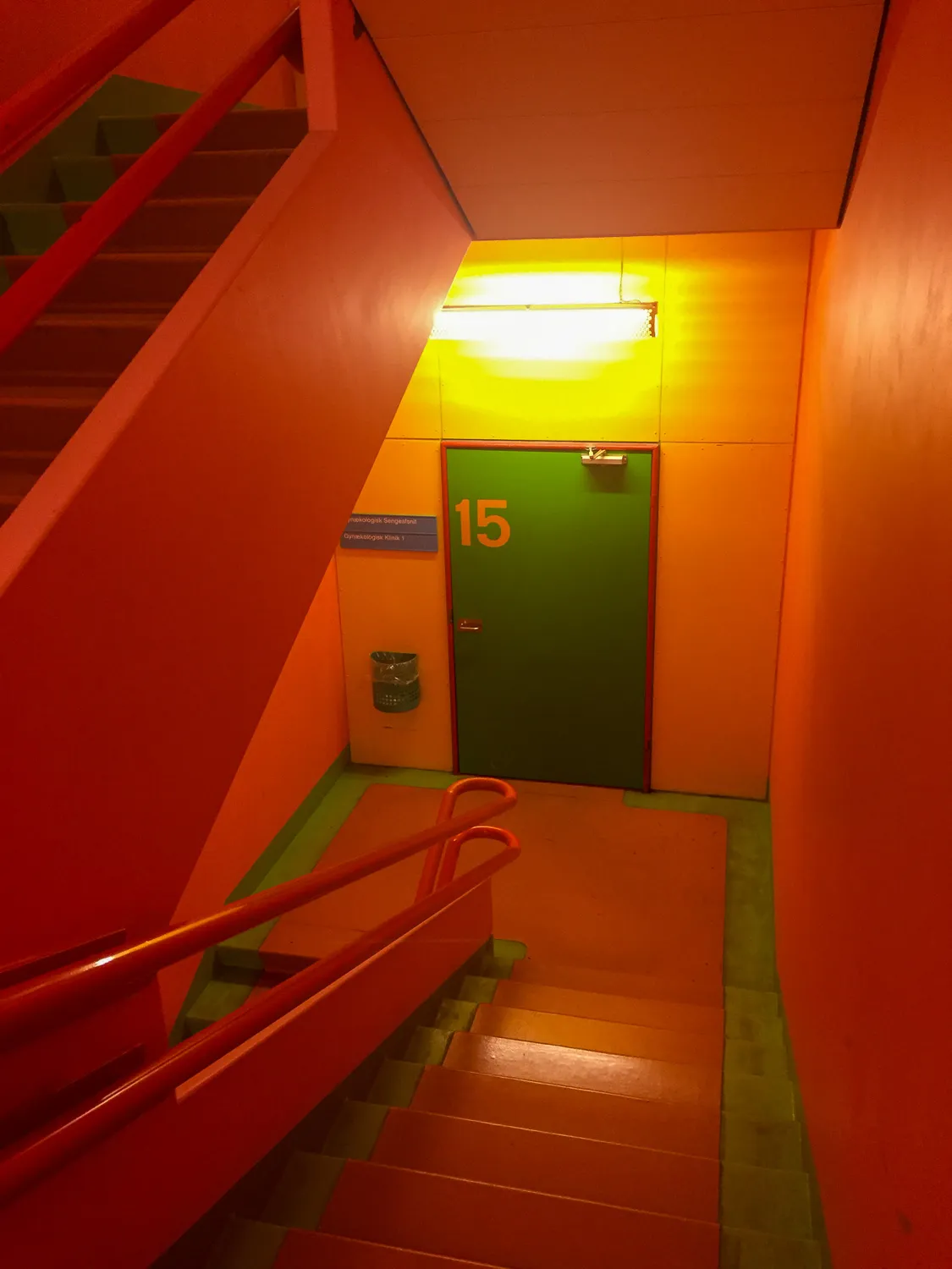
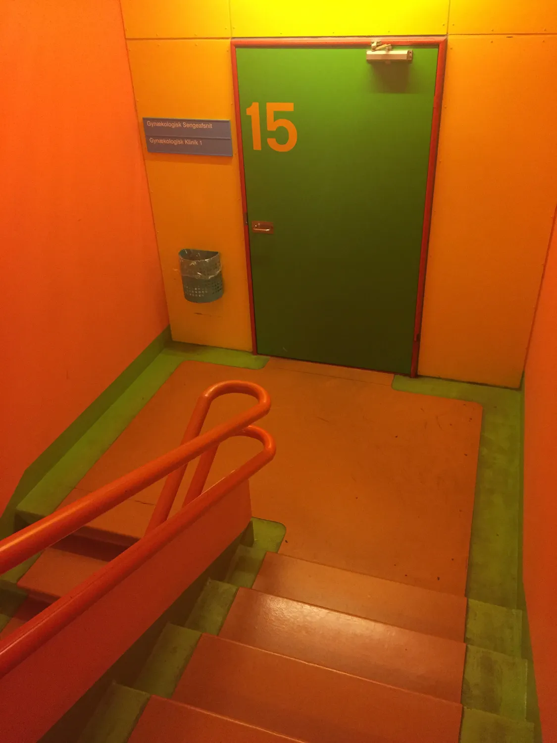
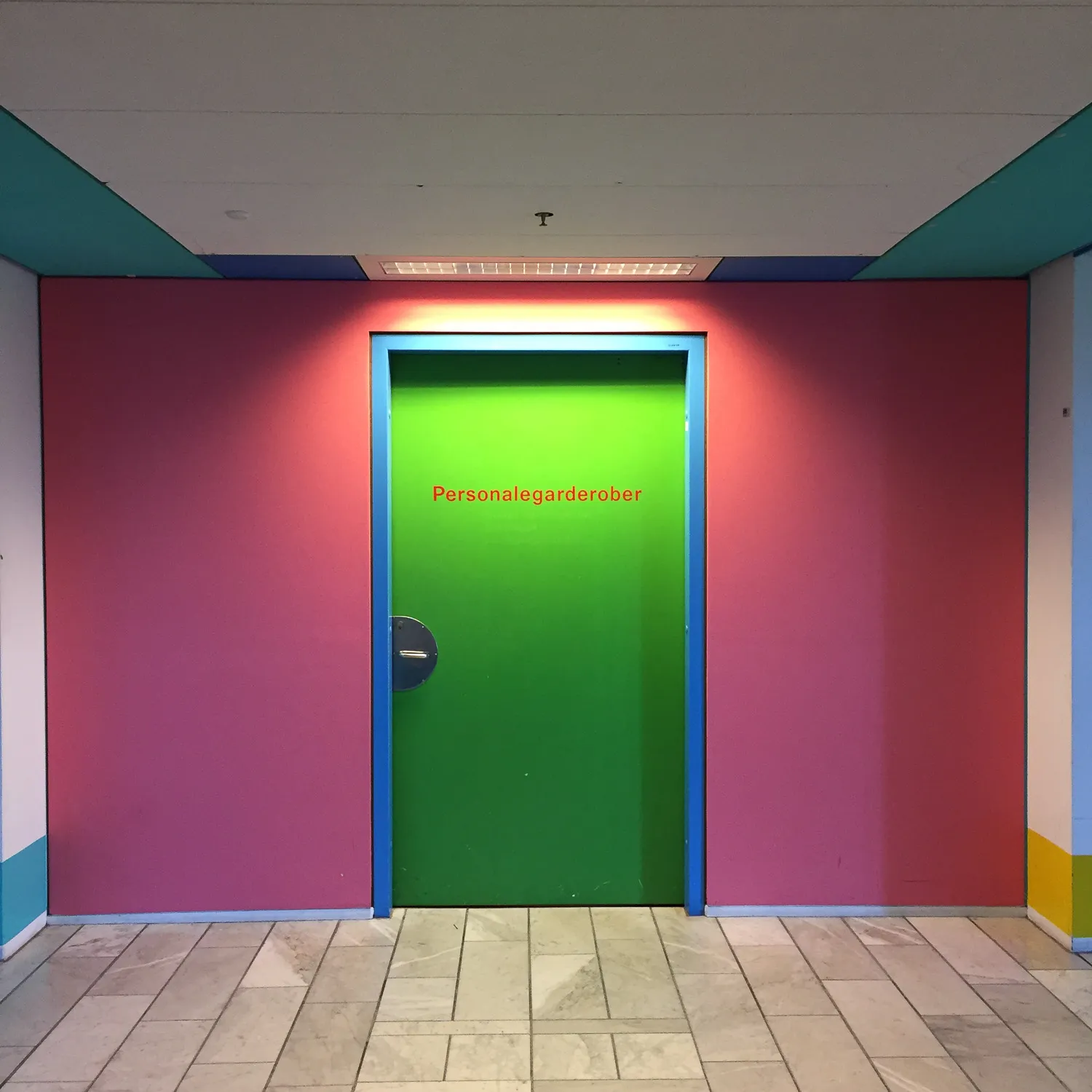
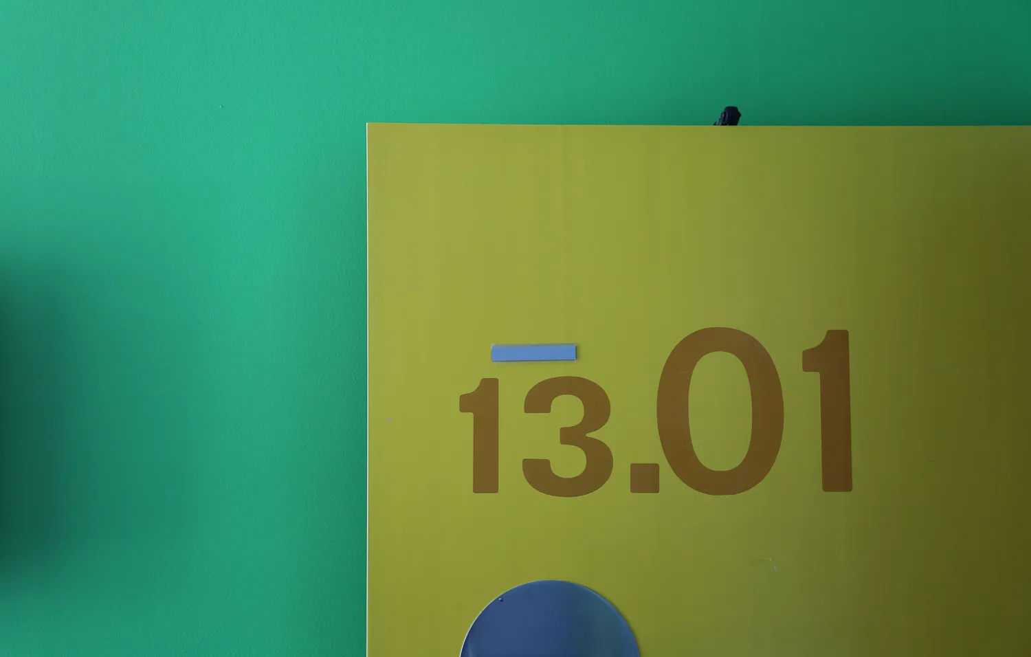
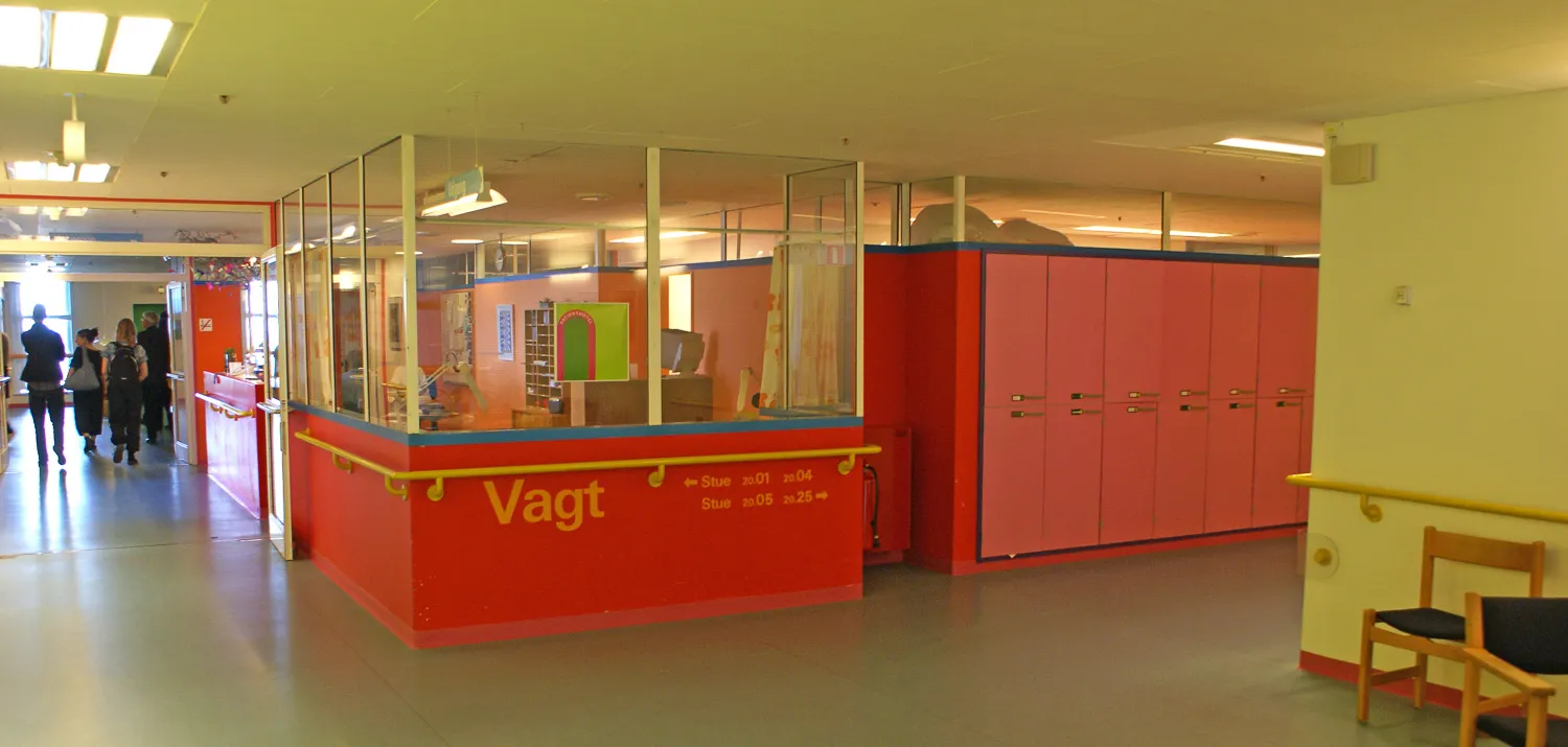
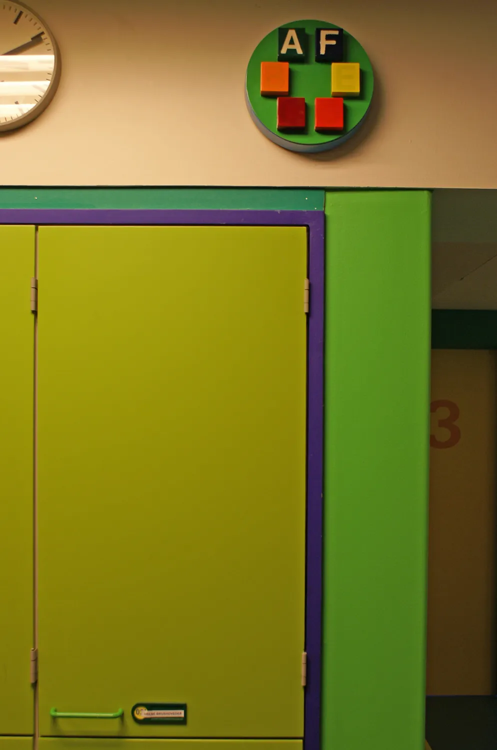
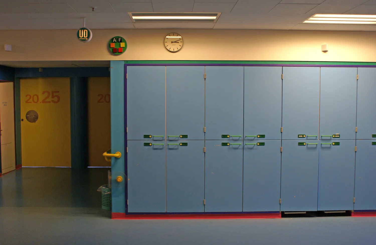
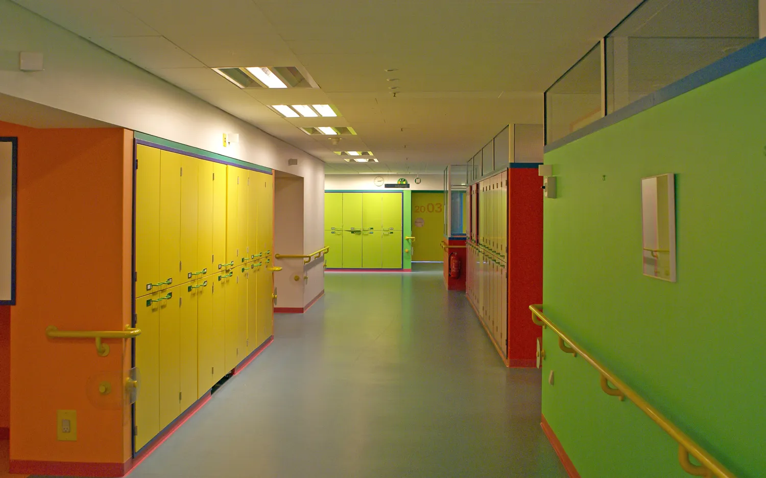
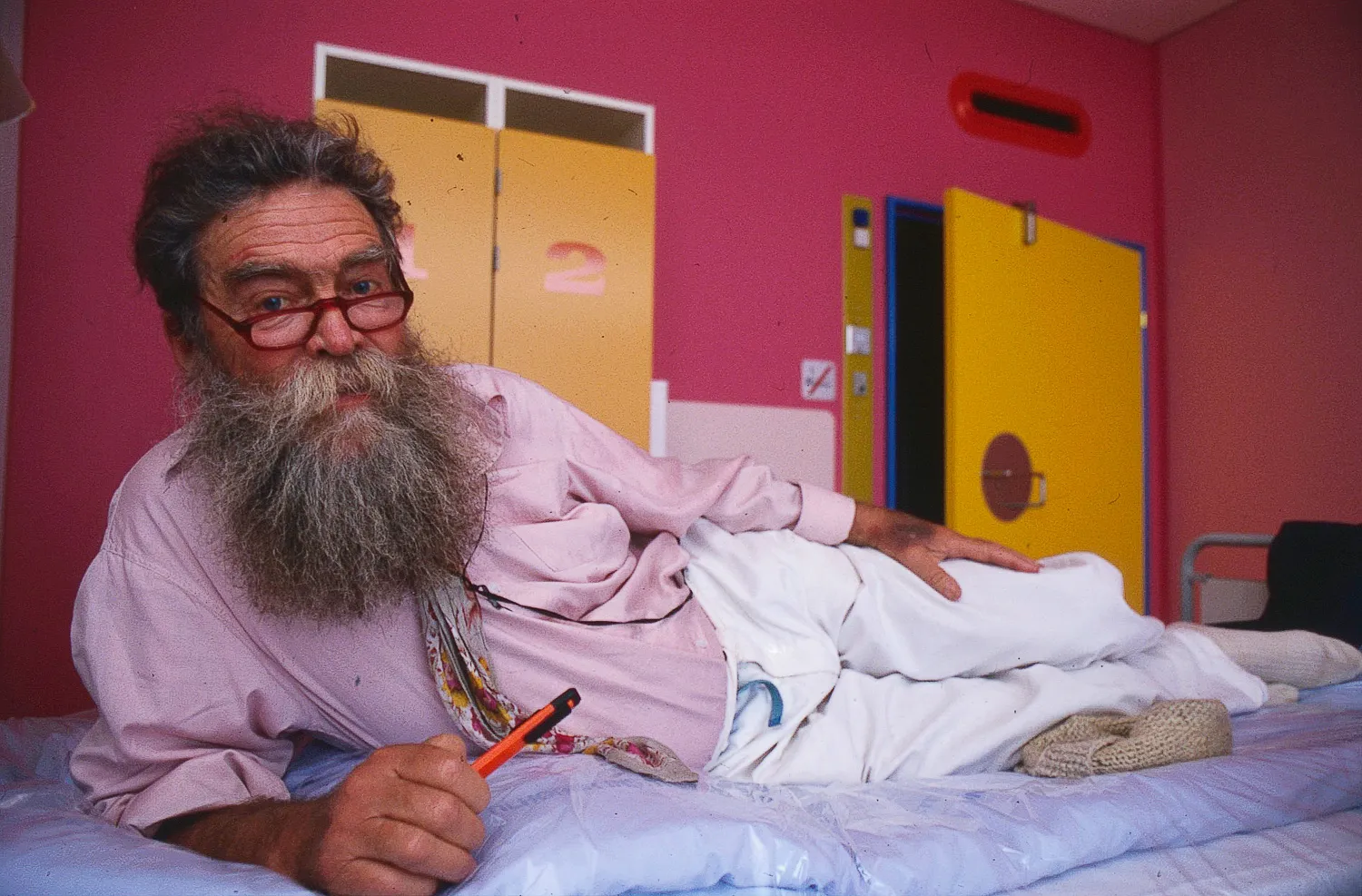
Door colours: There are 21 different colours, each indicating what lies behind the door. For instance, YELLOW 21 always leads to patient rooms, operating rooms, or senior staff offices. Colour 26 CYCLAMEN always leads to secretary offices, while Colour 31 BLUE always indicates examination rooms, doctors’ washrooms, induction rooms, etc.
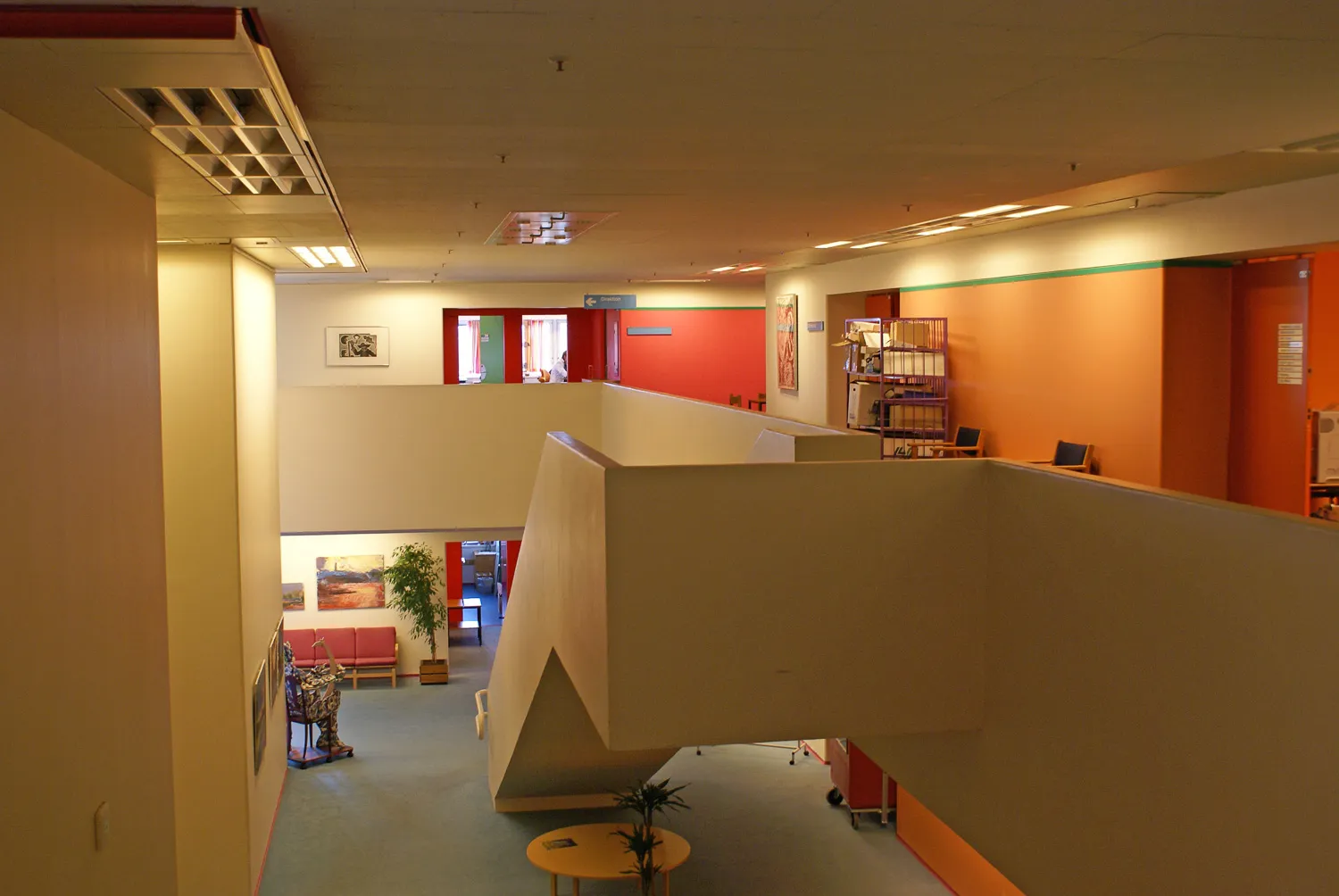
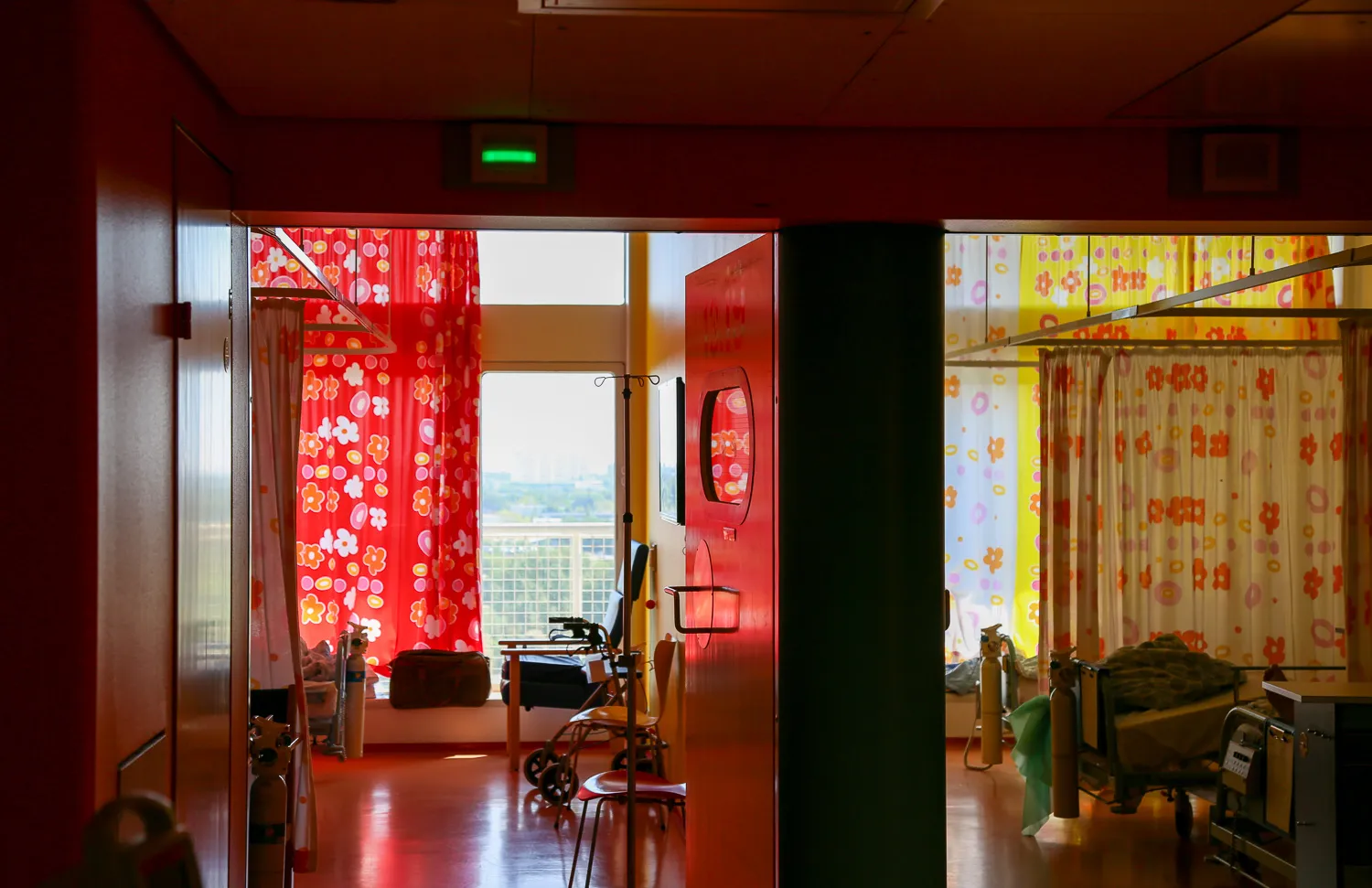
Band colours: divide the hospital into treatment areas. For example, the maternity ward is recognizable by Colour 177 SPRING GREEN, while the ophthalmology clinic is identified by Colour 172 LIGHT BLUE.
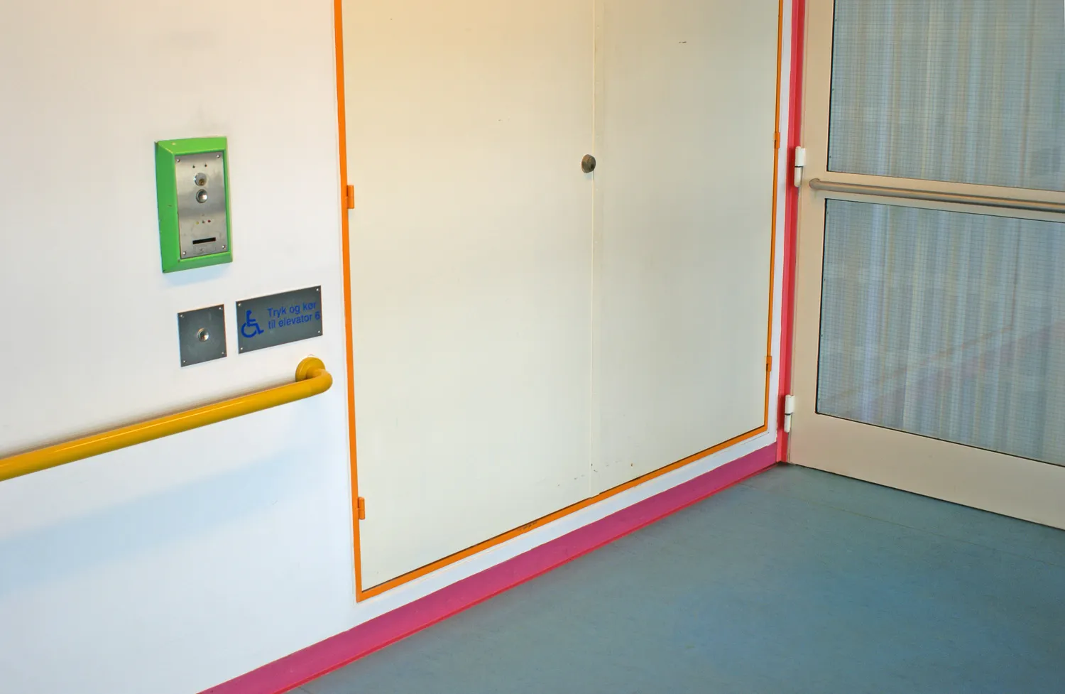
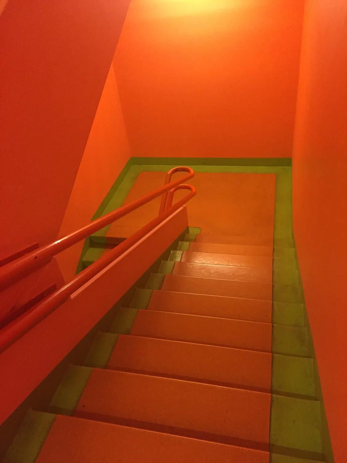
Doorframe colours: assist with orientation within the building. All frames in the southern row of squares are RED, the second row ORANGE, the third YELLOW, the fourth GREEN, the fifth BLUE, the sixth ULTRAMARINE, and the seventh VIOLET (the last two not yet implemented). Additionally, east-west corridor ceilings are WHITE, while north-south corridors have RED ceilings.
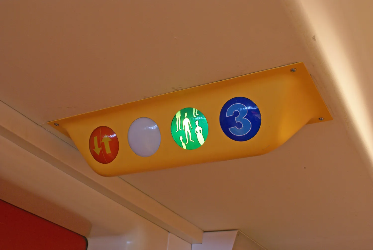
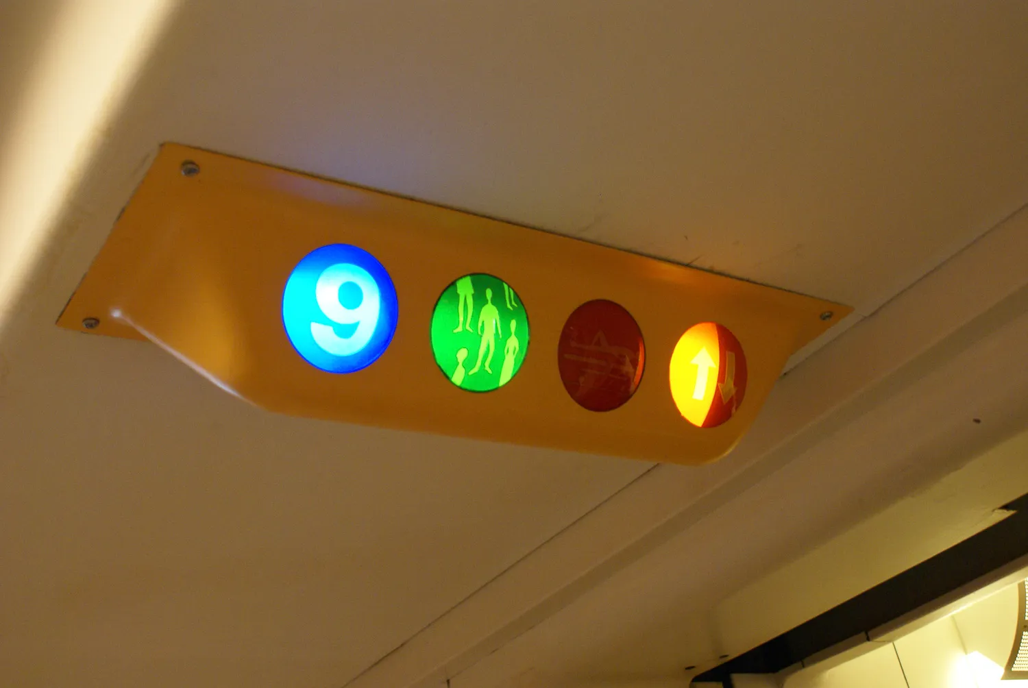
Fixtures: The towers in the ward building are aligned with the cardinal directions. RED, being the warmest colour, indicates south, while BLUE indicates north, and so on.
Flooring: In the treatment building’s corridors, two colours are used: BLUE marks traffic lanes, while GREEN marks parking areas. In the ward building, floor colours correspond to the cardinal directions: RED, ORANGE, and BLUE.
Transport Carts: These are also colour-coded. Clean, unclean, food, and medication transport are each assigned distinct colours.
Signposts: Colour is also incorporated into the signage. Directional signs leading into areas are BLUE, exits are GREEN, prohibition signs are RED, and other markings correspond to the colours of their respective areas.
Traffic Safety: Colours are also used for safety purposes: red edge strips on glass doors, CYCLAMEN striping on trucks, RED protective barriers, warning colours in floor coverings, and more contribute to safety.
Summary
On Colours: The above primarily concerns the practical use of colours.
On Environment: An equally important aspect of the colour scheme is its role in shaping the environment. The aim was to create a welcoming, engaging, and friendly atmosphere for the benefit of patients and their families, while also fostering a positive work environment for staff. A significant contribution also comes from the wide range of coloured details and a curtain programme offering extensive choice.
On Economy: Maintenance costs for repainting can be significantly reduced because the multicoloured interior is considerably more durable than the conventional hospital interior.
The quotation above does not explicitly state that the wall colours in the ward building are carefully attuned to natural light conditions characteristic of their orientation. Thus, cool blue and green shades dominate in rooms facing north, yellow and apricot shades dominate in east- and west-facing rooms, and warm red hues characterize patient rooms facing south. This colour scheme not only gives each room its unique character but also creates a striking visual effect when darkness falls, as the hospital’s interior lighting enhances the play of colours from the outside.
Additionally, it was the intent of both the architect and the artist that high-quality, preferably Danish, original art - including paintings and graphic works - should complement the overall decoration. These artworks were consciously placed in patient rooms, lounges, waiting areas, and staff offices, making Herlev Hospital home to a significant collection of graphic works by Danish artists.
Recommendation
The comprehensive artistic treatment of Herlev Hospital’s colour scheme makes this integrated work a unique achievement in modern Danish art and architecture.
The precise guidelines of the Operational Manual and Colour Manual have been followed in both maintenance and renovation work, with one notable and unfortunate exception on floor 03 of the ward building (Block 01). It has generally been possible to source current paint types and pre-coloured materials, ensuring that Poul Gernes’ artistic vision remains realizable.
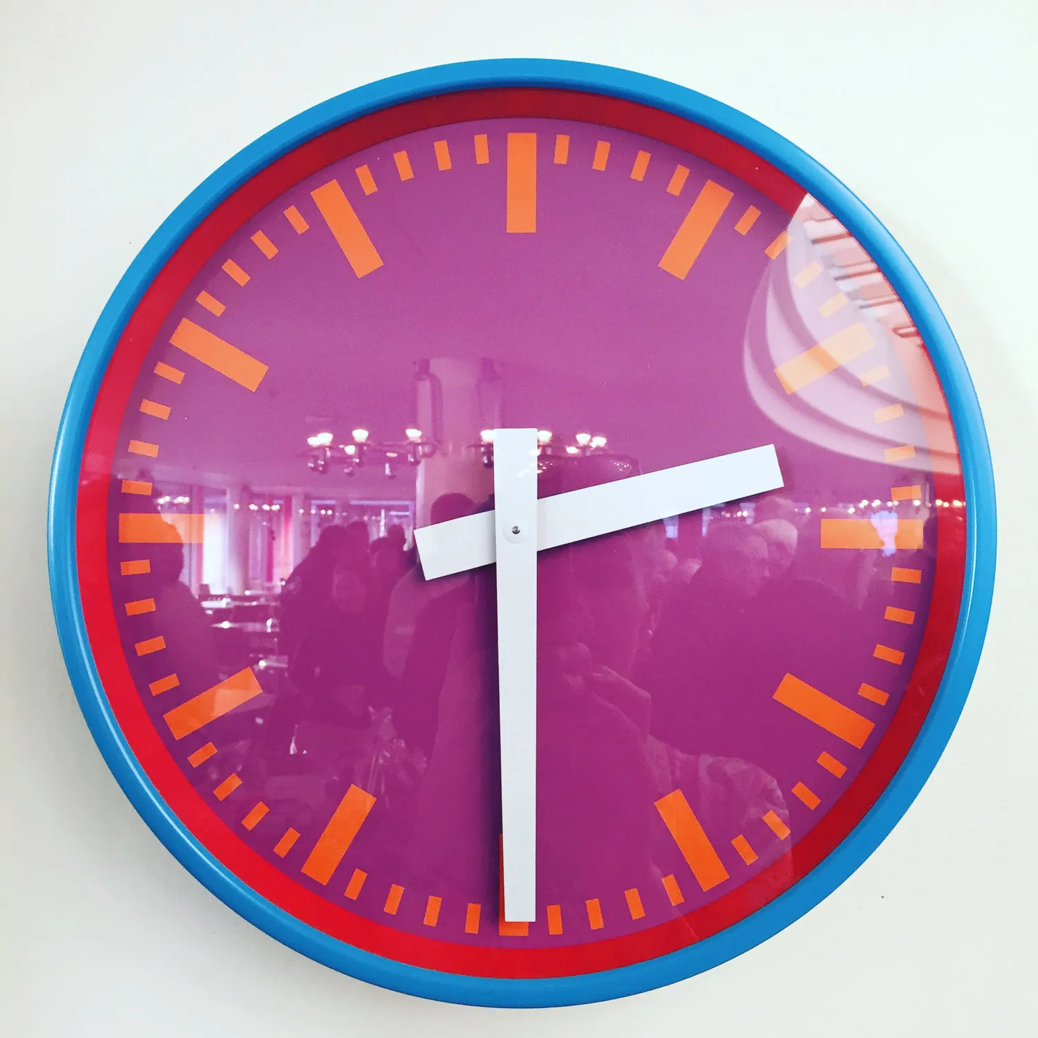
The greatest challenges have involved the smallest details, such as switches, buttons, and installation outlets. Some margin must be expected when sourcing standard commercial products, though smaller, custom-ordered batches can often be produced to match specific colour requests. This was evident when a proposed reorder of Poul Gernes’ multicoloured clock for Herlev Hospital was considered.
A anecdote tells of the hospital’s first head nurse, who initially opposed Poul Gernes’ bright colours for hospital beds, believing that her patients should not die in a parrot-coloured bed. However, she later regretted this decision, and when additional beds were later procured for Herlev Hospital, the light blue colour was selected from Poul Gernes’ workshop through the intervention of Jørgen Selchau and Gehrdt Bornebusch.
Sven Felding: Herlev Hospital som Kulturarv – Bevaringsvejledning. Kulturstyrelsen 2014. Excerpt. Translation by Klara Karolines Fond.
Herlev Hospital, inpatient building
Photo: Dermot Tatlow
Herlev Hospital, inpatient building
Photo: Finn Thybo Andersen
Herlev Hospital, inpatient building
Photo: Finn Thybo Andersen
Herlev Hospital, inpatient building
Photo: Finn Thybo Andersen
Herlev Hospital, inpatient building
Photo: Finn Thybo Andersen
Herlev Hospital, inpatient building
Photo: Finn Thybo Andersen
Herlev Hospital, inpatient building
Photo: Finn Thybo Andersen
Herlev Hospital, inpatient building
Photo: Ulrikka Gernes
Herlev Hospital, inpatient building
Photo: Finn Thybo Andersen
Herlev Hospital, inpatient building
Photo: Ulrikka Gernes
Herlev Hospital, inpatient building
Photo: Finn Thybo Andersen
Herlev Hospital, inpatient building
Photo: Finn Thybo Andersen

Herlev Hospital, inpatient building
Photo: Finn Thybo Andersen
Herlev Hospital, inpatient building
Photo: Finn Thybo Andersen
Herlev Hospital, inpatient building
Photo: Finn Thybo Andersen
Herlev Hospital, inpatient building
Photo: Finn Thybo Andersen
Herlev Hospital, inpatient building
Photo: Finn Thybo Andersen
Herlev Hospital, inpatient building
Photo: Finn Thybo Andersen
Herlev Hospital, inpatient building
Photo: Finn Thybo Andersen
Herlev Hospital, inpatient building
Photo: Finn Thybo Andersen
Herlev Hospital, inpatient building
Photo: Finn Thybo Andersen
Herlev Hospital, inpatient building
Photo: Ulrikka Gernes
Herlev Hospital, inpatient building
Photo: Ulrikka Gernes
Herlev Hospital, inpatient building
Sarra Brill 2016
Photo: Ulrikka Gernes
Herlev Hospital, inpatient building
Photo: Ulrikka Gernes
Herlev Hospital, inpatient building
Photo: Ulrikka Gernes
Herlev Hospital, inpatient building
Photo: Ulrikka Gernes

Herlev Hospital, inpatient building
Photo: Finn Thybo Andersen
Herlev Hospital, inpatient building
Photo: Finn Thybo Andersen
Herlev Hospital, inpatient building
Photo: Finn Thybo Andersen
Herlev Hospital, inpatient building
Photo: Finn Thybo Andersen
Herlev Hospital, inpatient building
Photo: Finn Thybo Andersen
Herlev Hospital, inpatient building
Photo: Finn Thybo Andersen
Herlev Hospital, inpatient building
Photo: Finn Thybo Andersen
Herlev Hospital, inpatient building
Photo: Finn Thybo Andersen
Herlev Hospital, inpatient building
Photo: Finn Thybo Andersen
Herlev Hospital, inpatient building
Photo: Finn Thybo Andersen
Herlev Hospital, inpatient building
Photo: Finn Thybo Andersen
Herlev Hospital, inpatient building
Photo: Finn Thybo Andersen
Herlev Hospital, inpatient building
Photo: Finn Thybo Andersen
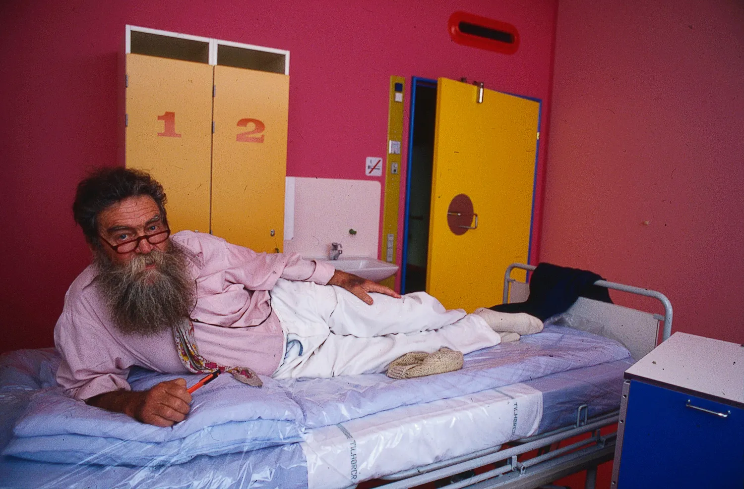
Herlev Hospital, inpatient building
Poul Gernes at Herlev Hospital 1992
Photo: Dermot Tatlow